

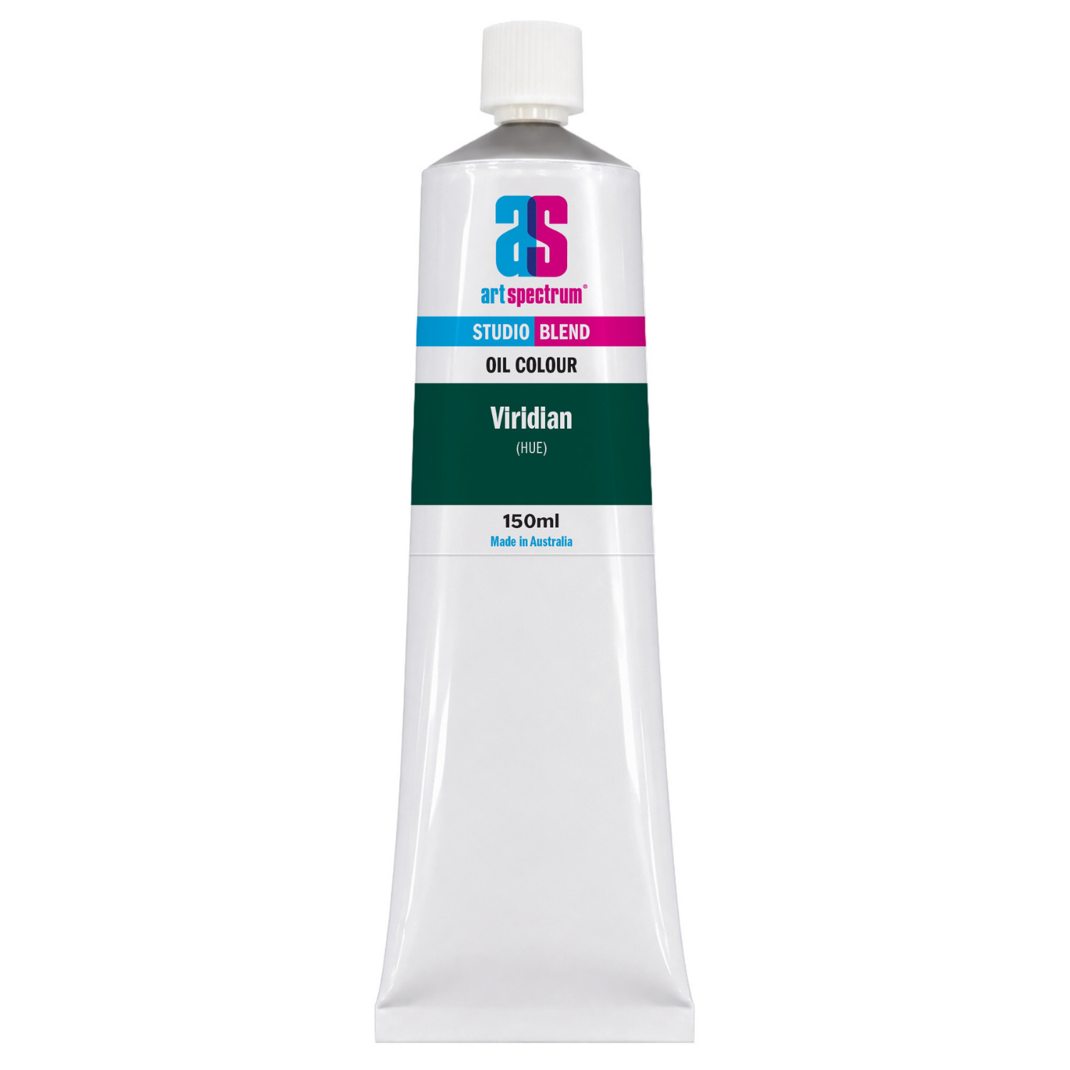
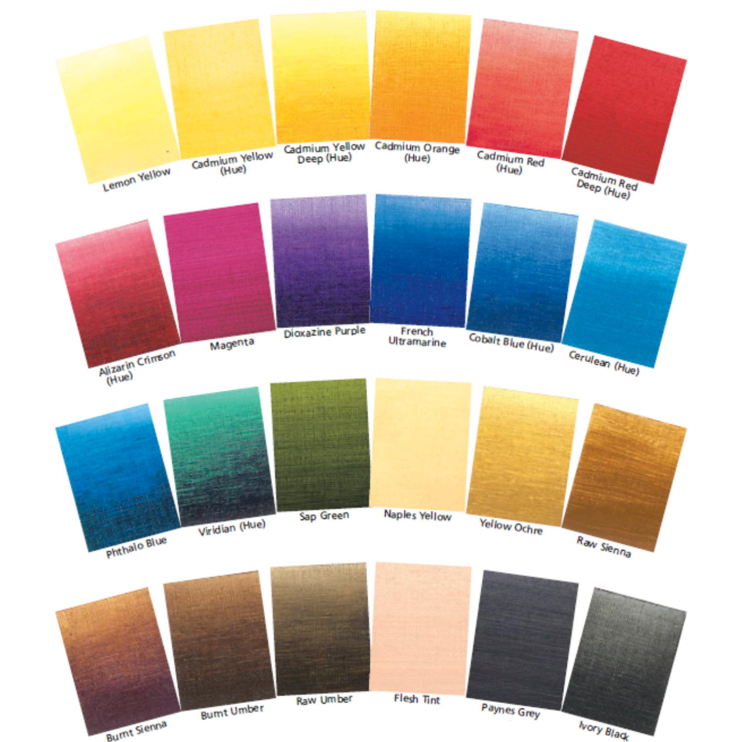
Art Spectrum Studio Blend Oil 150ml Viridian Hue
Our everyday low price
or 4 interest-free installments of $9.99 with

Own it now, pay later

Viridian Hue is the cool, blue-biased chromatic green for ocean water, coastal subjects, and the blue-green end of the colour spectrum. Where Sap Green is warm and naturalistic for foliage, Viridian Hue sits distinctly cooler: a clear, transparent blue-green that accurately captures the colour of shallow tropical water over sand, glass-like wave faces, and the deep teal tones of open water in strong sun. Art Spectrum Studio Blend Oil Viridian Hue uses a phthalocyanine-based formulation that matches the colour and optical qualities of the original Viridian (PG18) pigment, delivering the same cool, transparent blue-green with excellent lightfastness and the broad compatibility of synthetic phthalocyanine chemistry.
What Makes This Colour Special
The defining colour character of Viridian Hue is its coolness: it sits distinctly on the blue side of the green spectrum, which is why it describes ocean and coastal water more accurately than the warmer, more yellow-green Sap Green. Most tropical and subtropical ocean water, when viewed without the influence of the sky reflection, reads as a blue-green in the Viridian register, particularly in the shallow areas where the sandy or coral bottom is visible through the water column. The transparency of the paint is essential to capturing this effect: a transparent Viridian Hue glaze over a pale ground allows the lighter tone of the bottom to show through, simulating the way shallow clear water looks from above.
The complementary relationship between Viridian Hue and the warm red-orange earth colours is the most important mixing dynamic for Australian coastal subjects. Red-orange (such as Burnt Sienna or Cadmium Red Hue) is the direct complement of blue-green (Viridian Hue), meaning the two colours neutralise each other toward grey when mixed in equal amounts, and vibrate strongly as complements when placed next to each other on the canvas. For coastal rock and beach scenes, the contrast between the orange-red of wet sandstone, iron-stained rock, or rusted surfaces against the blue-green of adjacent water is a classically Australian coastal colour relationship that is most accurately mixed using Viridian Hue and the relevant warm earth or red colour in concert.
Why Art Spectrum Studio Blend Oil Belongs on Your Palette
- The essential Australian tropical water colour. The luminous blue-green of Whitsundays, Great Barrier Reef, and Queensland coastal water is Viridian Hue territory. No other single colour captures the clear, tropical ocean blue-green more directly.
- Transparent for luminous water glazing. The transparency of Viridian Hue is the key to painting the see-through quality of shallow tropical water. Glazed over a pale ground, it gives the luminous, sand-visible-below quality that makes tropical water look tropical.
- ASTM I lightfastness. Phthalocyanine pigments are among the most stable synthetic organics. Viridian Hue will not fade or shift under any normal conditions.
- Distinct from Sap Green. Viridian Hue is cool and blue-biased; Sap Green is warm and yellow-biased. The two greens serve entirely different subjects: Viridian for water and complementary contrast in coastal paintings; Sap Green for foliage and naturalistic vegetation. Both have a place on the palette.
- Australian-made since 1966. Art Spectrum has produced artists' materials from their Epping, Victoria facility for over six decades.
Getting the Most Out of This Tube
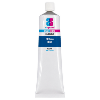
For painting tropical and subtropical water, begin by laying in the pale underpaint that represents the sandy or coral bottom in very shallow areas. A mixture of Titanium White with a small amount of Yellow Ochre or Raw Sienna gives the pale, warm tone of sand seen through clear water. Allow this to dry, then glaze thinned Viridian Hue over the dry underpaint, allowing the pale layer to show through. The depth of the glaze controls the apparent depth of the water: a very thin glaze gives very shallow, almost transparent water; a heavier glaze gives the stronger blue-green of chest-deep tropical water. For the open water beyond the shallow zone, mix Viridian Hue with Phthalo Blue and a touch of Titanium White to give the richer, darker teal-blue of open ocean.
For the breaking, foaming edges of waves and surf, mix Viridian Hue with Titanium White and a trace of Phthalo Blue to give the clean, intense blue-green of the transparent face of a wave just before it breaks, where the sunlight passes through the thin water and the colour is at its most saturated and brilliant. This is a colour unique to surfing beaches in strong sunlight, and Viridian Hue is the basis of the mix. The foam itself, where the water is aerated and white, uses Titanium White modified with a very small amount of Viridian Hue to keep the foam reading as slightly cool rather than a flat, warm white.
For coastal scenes dominated by warm ochre, sandstone, and rust-coloured subjects, Viridian Hue mixed in small quantities into the dark shadow areas will introduce a cool, complementary note that increases the visual impact of the warm subject colours. The eye reads the warm-cool contrast as increased vibrancy in both colours, making the ochre sand appear warmer and the Viridian shadow appear more richly blue-green. This technique of using small amounts of the complement in shadow areas is one of the fundamental colour tools of coastal painting.
About Art Spectrum Studio Blend Oil: Melbourne Made Since 1966
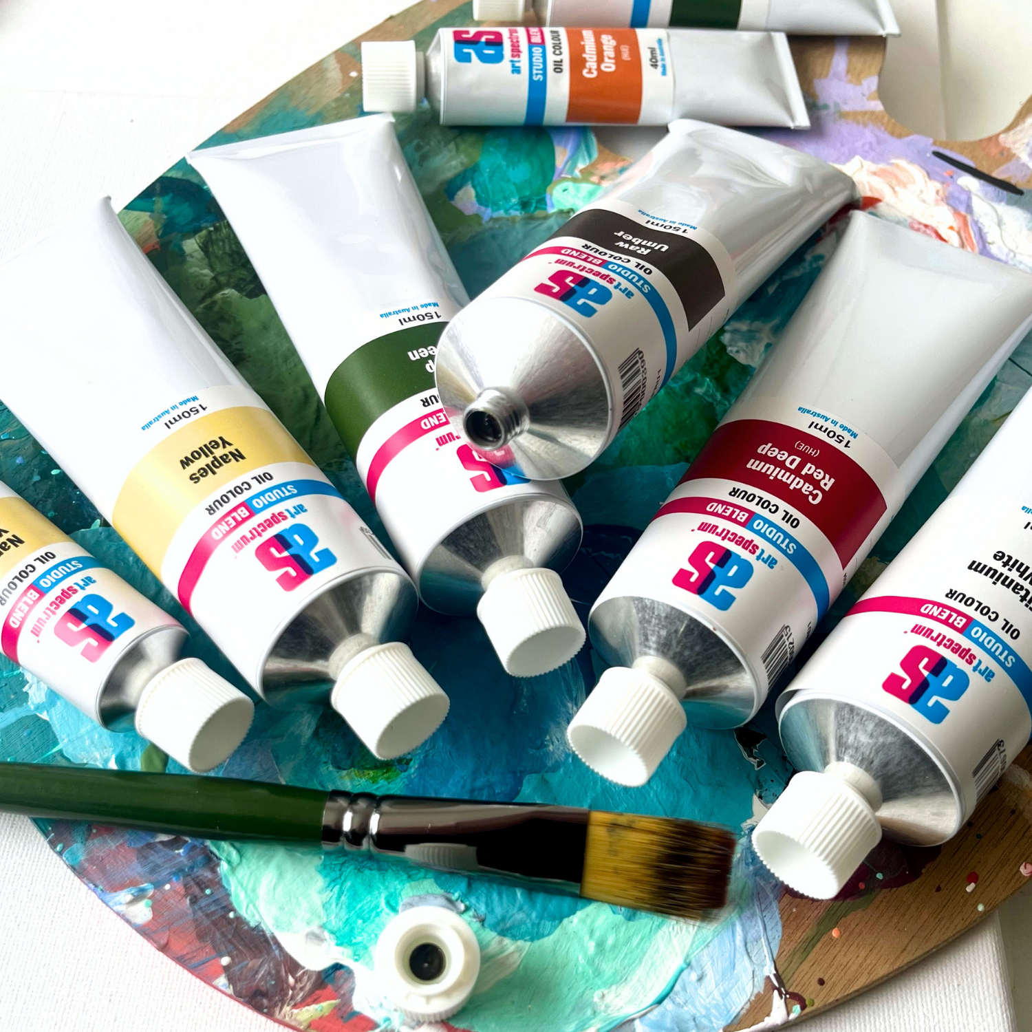
Art Spectrum has been manufacturing artists' materials in Epping, Victoria since 1966. The Studio Blend Oil range is the rebrand of the former Art Prism range, with fresh new packaging and artwork. The formula is unchanged: same pigments, same linseed oil base, same manufacturing standards. It is a studio-grade oil paint designed for working artists who want reliable, lightfast colour at a practical price. The 26-colour palette covers the complete mixing spectrum and is fully compatible with all Art Spectrum oil mediums and varnishes.
What is Viridian Hue used for in oil painting?
Viridian Hue is the cool, transparent blue-green for ocean and coastal water painting, complementary colour contrast against warm earth and red subjects, and the cool end of the green spectrum in any painting where both warm and cool greens are needed. In Australian coastal painting it is the essential colour for tropical water: Whitsundays, Great Barrier Reef, and the blue-green of subtropical ocean. Its transparency also makes it effective as a glazing colour over warm underlayers, shifting ochre and warm-earth tones toward cool, shadowed tones without covering them.
What is the difference between Viridian Hue and Sap Green?
Viridian Hue is cool and blue-biased: a transparent blue-green for water, coastal subjects, and the cool end of the green range. Sap Green is warm and yellow-biased: a transparent warm green for foliage, eucalyptus, and the naturalistic green of vegetation. The two are complementary in function rather than substitutes for each other. Viridian Hue describes the colour of clear ocean water; Sap Green describes the colour of living plant tissue. Both are transparent, but in different registers of the colour spectrum. A complete palette for Australian coastal and landscape subjects uses both.
How do I paint the colour of Australian tropical water using Viridian Hue?
For shallow water where the sandy or coral bottom is visible, begin by laying in a pale underpaint of Titanium White with a small amount of Yellow Ochre or Raw Sienna to represent the warm-pale sandy bottom. When dry, apply a thin glaze of Viridian Hue thinned with linseed oil over the underpaint. The transparency of Viridian Hue allows the pale ground to show through, simulating the look of clear shallow tropical water. The thickness of the glaze controls depth: thin for very shallow water, heavier for deeper. For the mid-depth and open water, mix Viridian Hue with Phthalo Blue and Titanium White to give the richer, more saturated blue-green of open tropical ocean. Add Paynes Grey for the dark, deep-water passages in the shadow of a wave.
Is Viridian Hue the same as Viridian in oil painting?
Viridian Hue is formulated to match the colour and transparency of classical Viridian (PG18, hydrated chromium oxide) using a phthalocyanine pigment rather than the traditional chromium oxide hydrate. The colour is visually equivalent in hue and transparency. The key practical difference is that phthalocyanine-based Viridian Hue has strong tinting strength (similar to all phthalocyanine pigments) and mixes slightly differently in very small quantities, while classical Viridian PG18 was softer in tinting behaviour. For most painting applications, the visual result is indistinguishable, and Viridian Hue is used in exactly the same way as classical Viridian.
Is Art Spectrum Studio Blend Oil the same as Art Prism?
Yes. Art Spectrum Studio Blend Oil is the direct successor to the Art Prism range with new packaging and artwork only. The formula, pigments, and linseed oil base are unchanged. If you have used Art Prism Viridian Hue previously, this product is identical in colour and performance.
Art Shed Online is an authorised Australian stockist of Art Spectrum products. All Art Spectrum Studio Blend Oil colours are sourced through official distribution channels. We ship Australia-wide.
(APVH1)
| SKU | APVH1 |
| Barcode # | 9323926000352 |
| Brand | Art Spectrum |
| Shipping Weight | 0.0168kg |
| Shipping Width | 0.550m |
| Shipping Height | 0.040m |
| Shipping Length | 0.200m |
| Shipping Cubic | 0.004400000m3 |
Others Also Bought
More From This Category