

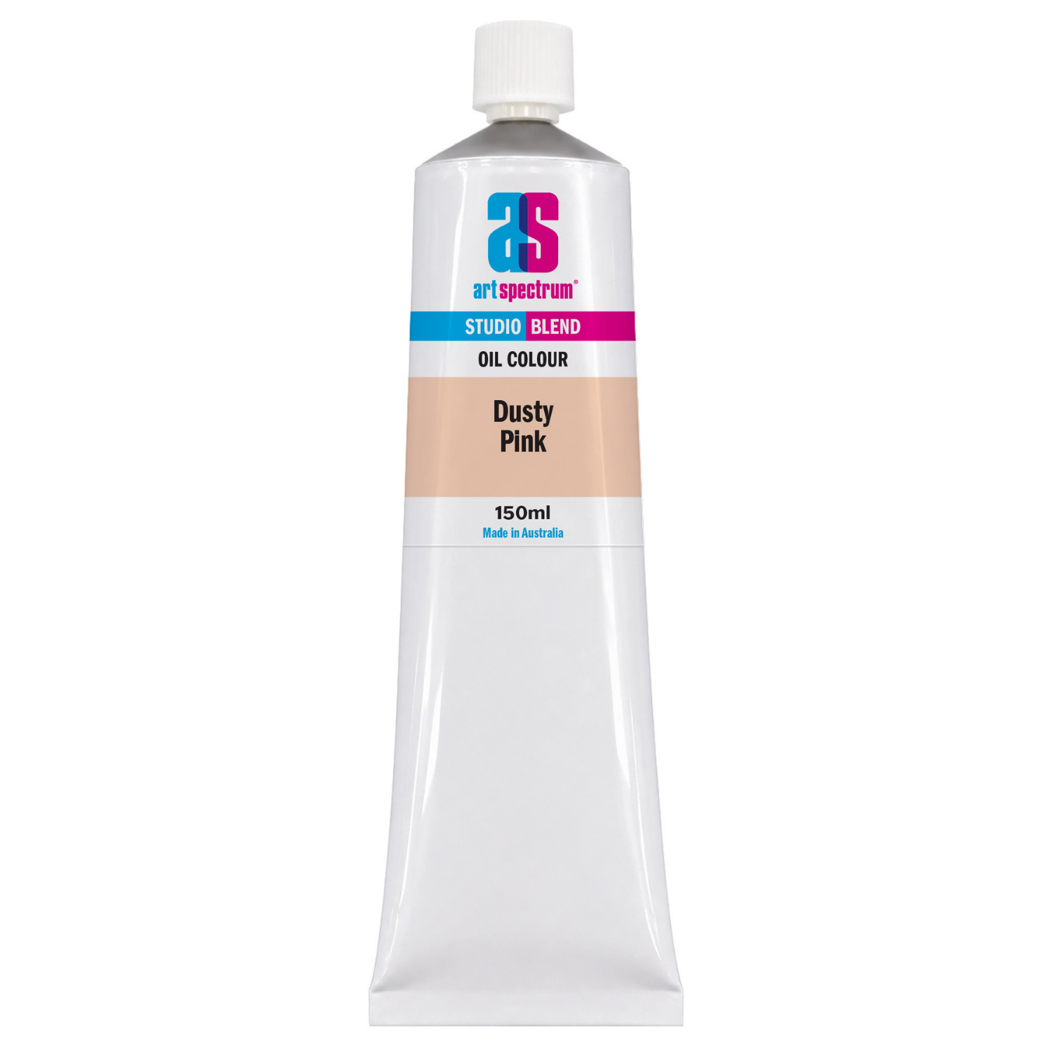
Art Spectrum Studio Blend Oil 150ml Dusty Pink
Our everyday low price
or 4 interest-free installments of $9.99 with

Own it now, pay later

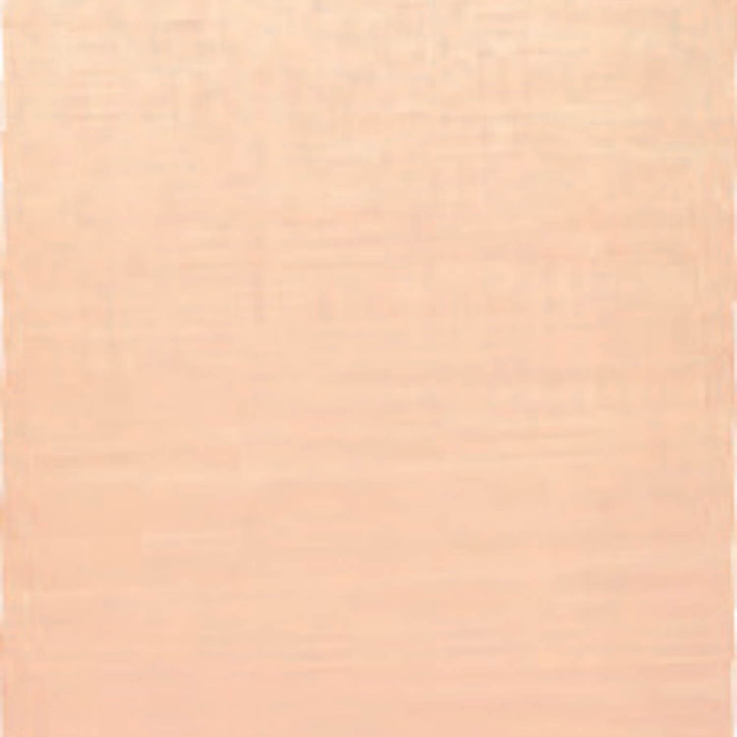
Dusty Pink is a warm, muted pink with an earthy, desaturated quality that places it squarely in the territory of natural skin and flesh tones. It is not the bright, saturated pink of a flower or a candy colour. It is quieter than that: a pinkish-beige that reads as organic and warm rather than vivid. Based on the iron oxide triad of Titanium White, Yellow Iron Oxide, and Red Iron Oxide, Art Spectrum Studio Blend Oil Dusty Pink belongs to the oldest and most stable family of pigments available in oil paint. Portrait painters, figure painters, and still life artists working with skin-toned subjects will find this colour an immediately useful and reliable starting point.
What Makes This Colour Special
The iron oxide family of pigments, of which Dusty Pink is a member, represents the oldest continuous tradition in painting. Yellow and red iron oxides have been used by human painters for tens of thousands of years, and remain among the most valued colours in contemporary oil painting precisely because of their stability, compatibility, and natural quality. Mixes made with iron oxide colours tend to stay cleaner and more harmonious than those combining highly saturated synthetic pigments, because iron oxides have a naturally muted, earthy character that keeps mixes from going garish or discordant.
Dusty Pink occupies the pale end of the iron oxide range, sitting alongside Yellow Ochre and Burnt Sienna as a pre-mixed warm-light tone suited specifically to fair and medium skin and to the warm, pinkish quality of lit flesh passages. Portrait painters who work from a limited palette of earth tones will recognise this colour as the pale, warm element that sits between white and the mid-toned siennas and ochres in a skin tone progression. It saves considerable time on the palette by providing a ready-made starting point for the lights in fair skin work.
Beyond portraiture, Dusty Pink is useful for any passage where a warm, muted, peachy-pink tone is needed. The soft coral and blush tones of certain Australian wildflowers, the warm pinkish cast of lit sandstone and pale ochre rock, the warm-grey of weathered timber in afternoon light: all of these have a character close to this colour that makes it a genuinely versatile landscape and still life tone, not only a portrait convenience.
Why Art Spectrum Studio Blend Oil Belongs on Your Palette
- Ready-to-use skin tone base. Provides the pale, warm starting point for fair and medium skin in a single tube, saving palette-mixing time in portrait sessions.
- Iron oxide stability. PW6, PY42, and PR101 are among the most permanent pigments in oil painting. This colour will not fade or shift. Reliable for portrait commissions and exhibited work.
- Mixes stay clean. Iron oxide pigments are harmonious mixers. Combining Dusty Pink with other earths (Burnt Sienna, Yellow Ochre, Raw Umber) never produces muddy or discordant results.
- Opaque covering power. Full opacity allows confident corrections and layering in portrait work. Covers darker underpaintings without requiring multiple coats.
- Australian-made since 1966. Art Spectrum has produced artists' materials from their Epping, Victoria facility for over six decades.
Getting the Most Out of This Tube
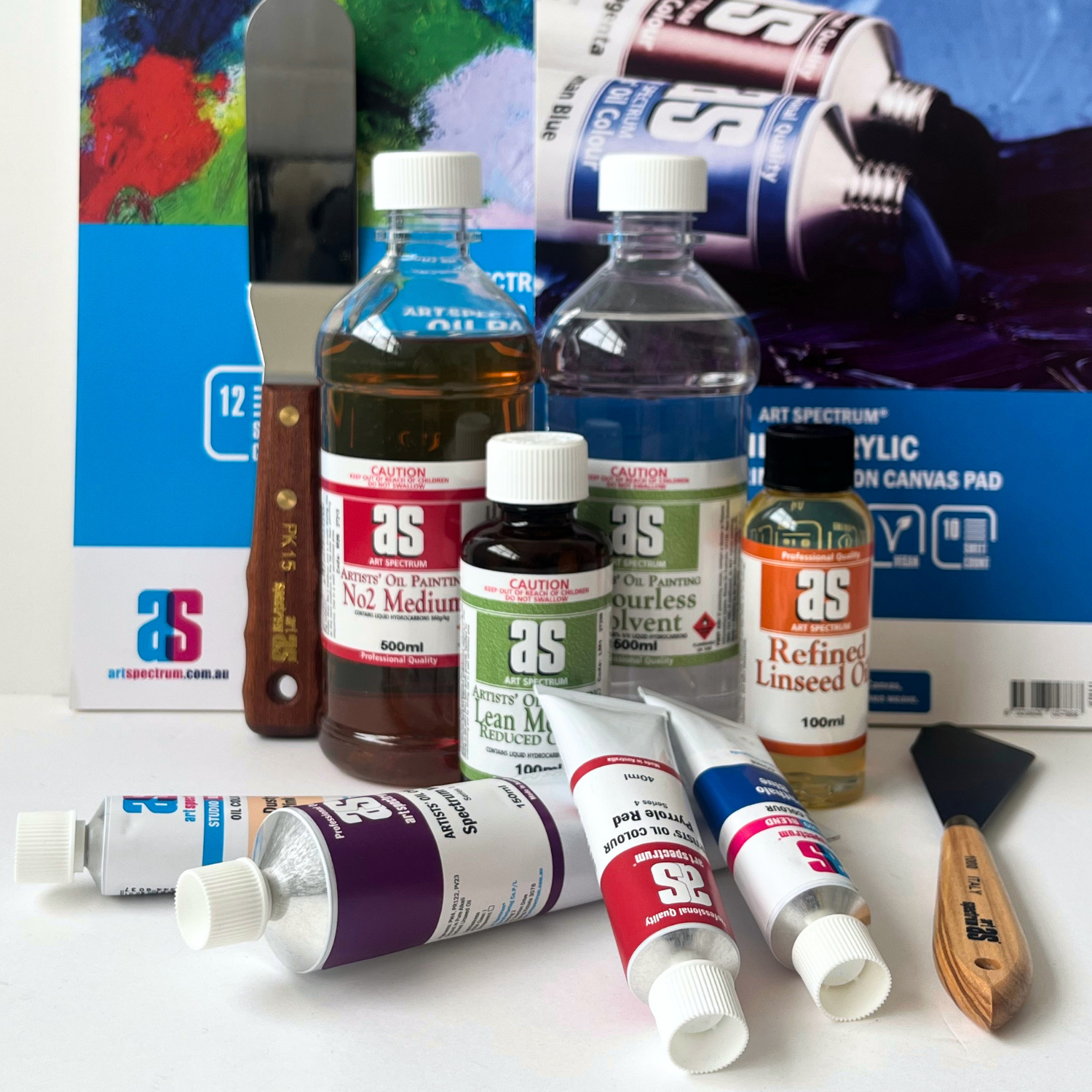
For a basic portrait palette built around Dusty Pink, pair it with Burnt Sienna (mid and shadow warmth), Yellow Ochre (golden mid-tone), Raw Umber (cool dark), Cobalt Blue Hue (cool shadow), and Titanium White (highest lights). This six-colour arrangement covers the full range of fair to olive skin tones through mixing. Dusty Pink takes the role of the pale warm base, which in older practice would have been mixed laboriously from white and small amounts of red and yellow earth pigments.
For landscape use, try Dusty Pink in the warm, sandy passages of Australian desert scenes where the ground catches low afternoon light. Mixed with Yellow Ochre it gives the warm pinkish-buff of lit red sand. Added sparingly to Titanium White it gives the faint warm blush of pale ochre rock face in late light. It is a more natural warm-light tone for these subjects than mixing from cadmiums.
For muted floral work, Dusty Pink provides the pale, desaturated pink of roses in diffuse light, the blush tones of soft-petalled native flowers, and the warm, atmospheric pinks that appear in overcast or evening light conditions. It is far more convincing in these contexts than a bright pink modified with white, which tends to look artificial and chalky by comparison.
About Art Spectrum Studio Blend Oil: Melbourne Made Since 1966
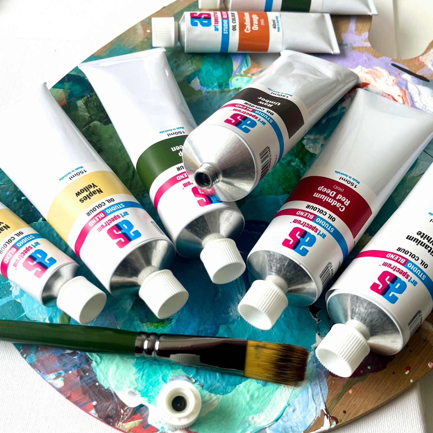
Art Spectrum has been manufacturing artists' materials in Epping, Victoria since 1966. The Studio Blend Oil range is the rebrand of the former Art Prism range, with fresh new packaging and artwork. The formula is unchanged: same pigments, same linseed oil base, same manufacturing standards. It is a studio-grade oil paint designed for working artists who want reliable, lightfast colour at a practical price. The 26-colour palette covers the complete mixing spectrum and is fully compatible with all Art Spectrum oil mediums and varnishes.
What pigments are in Art Spectrum Studio Blend Oil Dusty Pink?
Art Spectrum Studio Blend Oil Dusty Pink uses PW6 (Titanium White), PY42 (Yellow Iron Oxide), and PR101 (Red Iron Oxide). All three are iron-based pigments with ASTM I lightfastness ratings. The combination produces a warm, opaque, muted pinkish-beige with the natural, earthy quality of iron oxide pigments. This pigment group has been used by portrait painters for centuries and is among the most stable available in oil paint.
Is Dusty Pink suitable for portrait painting?
Yes. Dusty Pink is specifically designed as a portrait and figure painting colour. Its warm, muted pinkish-beige tone sits at the pale end of the skin tone range and serves as a ready-made base for lit passages on fair to medium skin. It mixes cleanly with all the other earth tones required for portrait work, including Burnt Sienna, Yellow Ochre, and Raw Umber, and can be cooled for shadow passages with a touch of Cobalt Blue Hue or Raw Umber. It is a significant time-saver compared with mixing a pale flesh tone from scratch on the palette.
What skin tones is Dusty Pink suited to?
Dusty Pink is most suited to fair to medium skin tones as a base for the lit passages. It can be extended toward darker and warmer skin tones by mixing with Burnt Sienna, Raw Sienna, or Raw Umber. For very dark skin tones, it is less useful as a base but can still appear in the specular highlight areas where the skin catches direct light. Portrait painters working across a wide range of skin tones typically combine Dusty Pink with the broader iron oxide earth palette to cover the full spectrum from very fair to very dark.
Can Dusty Pink be used for subjects other than portraits?
Yes. Dusty Pink is useful anywhere a warm, muted, pinkish-buff tone is needed. Australian landscape painters use it in desert and ochre terrain passages, particularly where warm light catches pale sandy ground or weathered stone. It suits soft floral pinks in botanical subjects, the warm blush of pale rose petals in diffuse light, and warm neutral passages in still life work involving natural fabrics or aged surfaces. Its iron oxide base gives it a natural, organic character that artificial pinks mixed from synthetic pigments typically lack.
Is Art Spectrum Studio Blend Oil the same as Art Prism?
Yes. Art Spectrum Studio Blend Oil is the direct successor to the Art Prism range with new packaging and artwork only. The formula, pigments, and linseed oil base are unchanged. If you have used Art Prism Dusty Pink previously, this product is identical in colour and performance.
Art Shed Online is an authorised Australian stockist of Art Spectrum products. All Art Spectrum Studio Blend Oil colours are sourced through official distribution channels. We ship Australia-wide.
(APFT1)
| SKU | APFT1 |
| Barcode # | 9323926000192 |
| Brand | Art Spectrum |
| Shipping Weight | 0.0168kg |
| Shipping Width | 0.055m |
| Shipping Height | 0.040m |
| Shipping Length | 0.200m |
| Shipping Cubic | 0.000440000m3 |
Others Also Bought
More From This Category