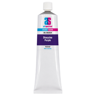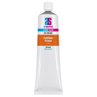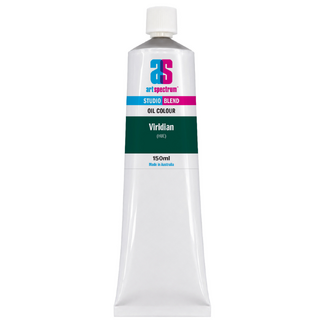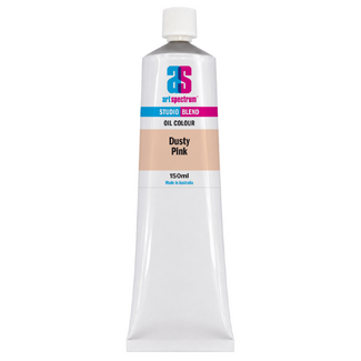



Art Spectrum Studio Blend Oil 150ml Cobalt Blue Hue
Our everyday low price
or 4 interest-free installments of $9.99 with

Own it now, pay later

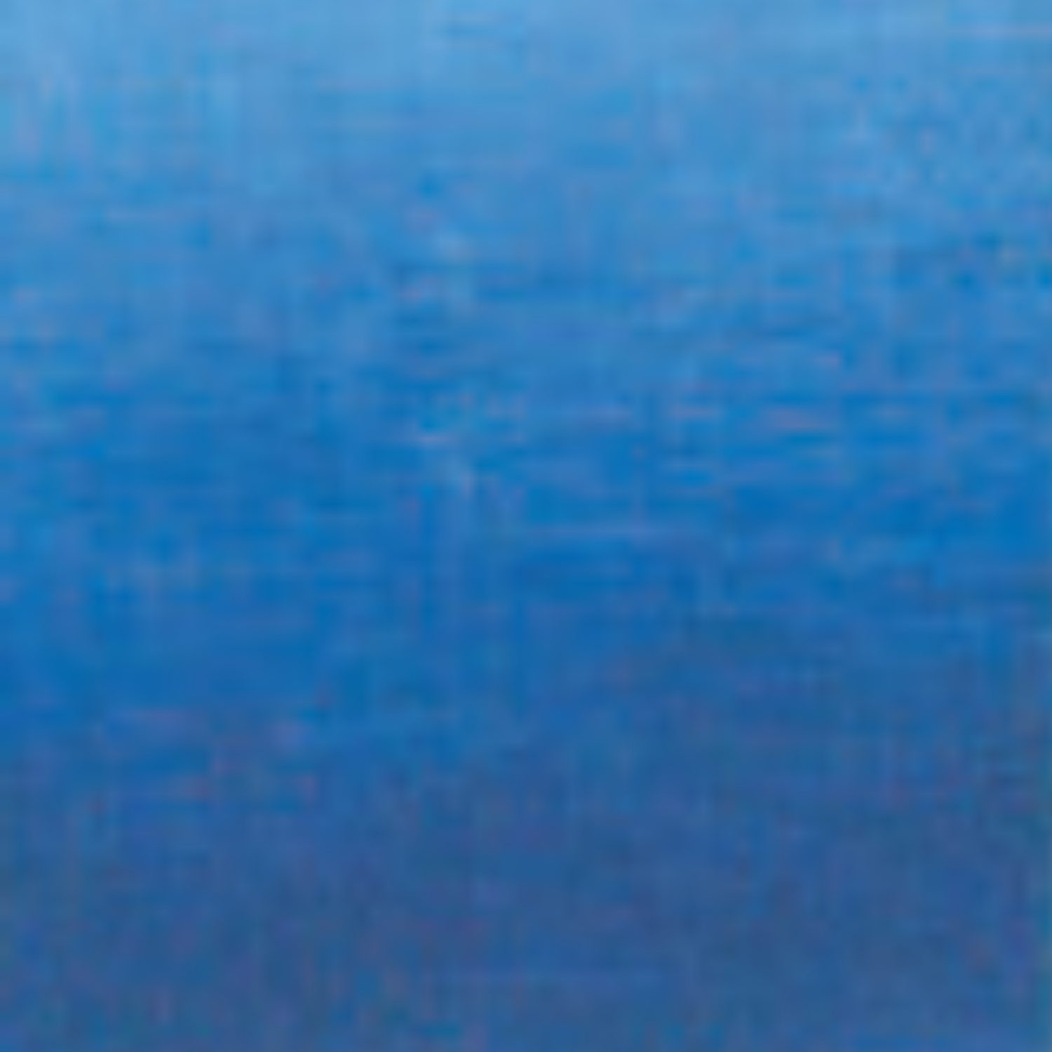
Cobalt blue occupies a unique position in oil painting: it is the pure, neutral blue that sits exactly between the warm violet bias of French Ultramarine and the cool greenish tone of Cerulean. It has no pronounced temperature lean in either direction. Painters have valued cobalt for centuries precisely because it reads as simply "blue" without pulling a mix toward purple or green. Art Spectrum Studio Blend Oil Cobalt Blue Hue reproduces this neutral, mid-range blue quality using a combination of Ultramarine, Phthalo Blue, and Titanium White, giving you the distinctive cobalt character at studio price without the cost of genuine cobalt pigment, which remains one of the most expensive in oil painting.
What Makes This Colour Special
Genuine cobalt blue (PB28) has been a primary colour on the oil painter's palette since its introduction in the early nineteenth century. Its particular value is its neutrality: unlike French Ultramarine, which carries a distinct violet bias, or Phthalo Blue, which pulls strongly toward green, cobalt sits between both extremes. Mixed with yellow it produces cleaner, more natural greens than either of those blues. Mixed with red it produces more balanced purples. Mixed with orange or sienna it gives restrained, atmospheric greys. This mixing versatility is the reason cobalt blue became so central to traditional oil painting practice and has remained there ever since.
Cobalt Blue Hue fills this same role in the Studio Blend Oil palette. It is the blue that neither warms nor cools a mix excessively. For Australian landscape painters, it is particularly useful for the mid-tones of shadows on pale surfaces in bright light, where neither the warmth of Ultramarine nor the cool intensity of Phthalo gives quite the right result. The blue-grey of dry granite boulders in direct sun, the shadow on white weatherboard, the tonal quality of eucalyptus distance: all of these benefit from a blue that does not pull in either direction.
For portrait and figurative painters, Cobalt Blue Hue provides the cool notes in skin shadow passages without the purple muddiness that Ultramarine can introduce. Mixed with small amounts of Burnt Sienna, it produces the muted, slightly cool shadows that appear on fair skin in diffuse or overcast daylight. In drapery and fabric passages where a clear, readable blue is needed, Cobalt Blue Hue gives a colour that reads unambiguously as blue without the theatrical intensity of Phthalo or the violet richness of Ultramarine.
Why Art Spectrum Studio Blend Oil Belongs on Your Palette
- The neutral blue that resolves mixes. Neither warm nor cool, Cobalt Blue Hue is the most versatile blue on the palette for mixing work. It greens without excessive intensity and purples without violet heaviness.
- ASTM I lightfastness. All three component pigments carry the highest permanence rating. A dependable colour for any work intended to last.
- Cobalt blue quality at studio price. Genuine cobalt pigment (PB28) is costly. This formulation delivers the characteristic neutral mid-blue of cobalt in a reliable, accessible studio colour.
- Triple-milled in refined linseed oil. Smooth, even consistency that blends well and spreads uniformly across both large and detailed passages. Melbourne-made to studio standards.
- Australian-made since 1966. Art Spectrum has produced artists' materials from their Epping, Victoria facility for over six decades.
Getting the Most Out of This Tube
For mixing greens, try Cobalt Blue Hue instead of French Ultramarine or Phthalo Blue. The greens it produces with yellows are less aggressive and more naturalistic than either. Starting from Cadmium Yellow Hue and adding small amounts of Cobalt Blue Hue incrementally gives a progression of greens from warm lime through mid-leaf green to a deep, slightly grey-green without any of the electric intensity that Phthalo mixes can have.
For mixing greys, pair Cobalt Blue Hue with Burnt Sienna in varying ratios. More Sienna gives warm, reddish greys. More Cobalt gives cooler, bluer greys. Equal amounts in approximately the right balance produce a neutral mid-grey that can be lightened with Titanium White to any value. This grey-mixing approach avoids the lifeless quality of black-based greys.
For portrait work, add a small touch of Cobalt Blue Hue to shadow mixes where you need to cool a passage without pushing it into purple. The amount required is small. It is most useful in the shadows of fair or mid-toned skin where reflected sky light produces a slightly blue cast in the cool passages.
About Art Spectrum Studio Blend Oil: Melbourne Made Since 1966
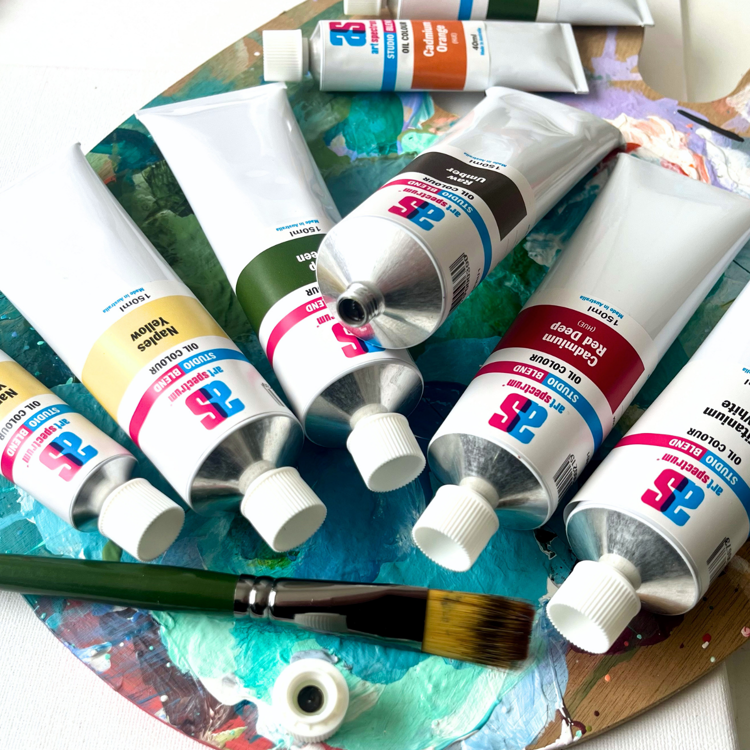
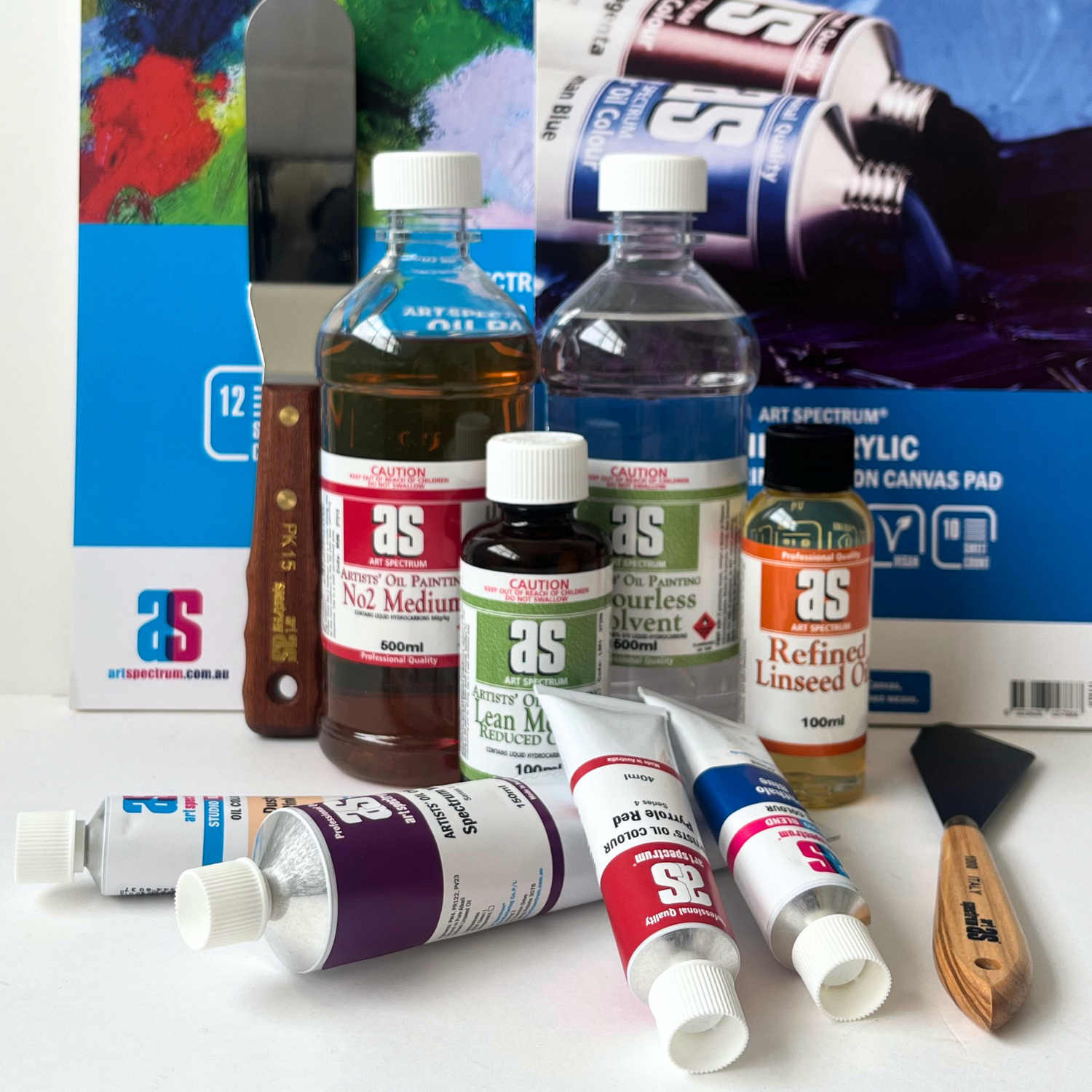
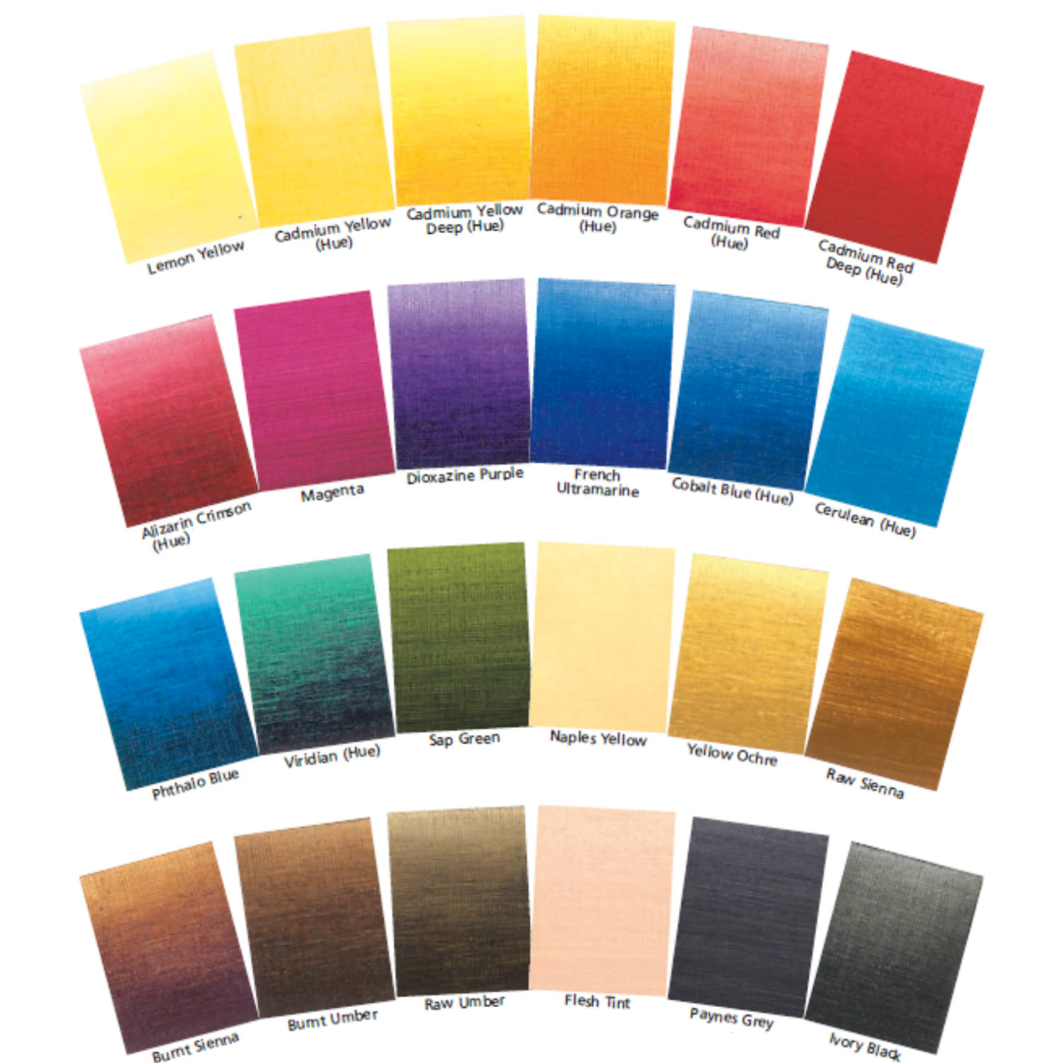
Art Spectrum has been manufacturing artists' materials in Epping, Victoria since 1966. The Studio Blend Oil range is the rebrand of the former Art Prism range, with fresh new packaging and artwork. The formula is unchanged: same pigments, same linseed oil base, same manufacturing standards. It is a studio-grade oil paint designed for working artists who want reliable, lightfast colour at a practical price. The 26-colour palette covers the complete mixing spectrum and is fully compatible with all Art Spectrum oil mediums and varnishes.
What is the difference between Cobalt Blue Hue and French Ultramarine?
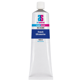
French Ultramarine has a warm violet undertone that pulls mixes toward purple and gives the deep, slightly warm quality of night sky. Cobalt Blue Hue is a neutral mid-blue with neither warm nor cool bias. In practice, Ultramarine is more dramatic and useful for deep shadow and rich blue passages, while Cobalt Blue Hue is more useful for mixing work, particularly greens and greys, where a neutral blue gives cleaner, more controllable results. Many painters keep both on their palette because they serve different purposes.
What pigments are in Art Spectrum Studio Blend Oil Cobalt Blue Hue?
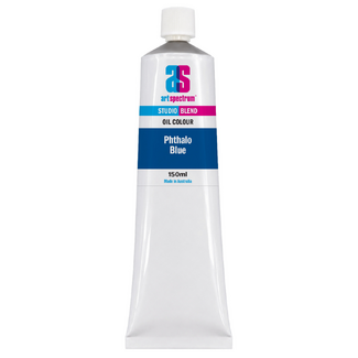
Art Spectrum Cobalt Blue Hue uses PB29 (Ultramarine Blue), PW6 (Titanium White), and PB15:3 (Phthalo Blue Green Shade). The three-pigment blend balances the warm violet bias of Ultramarine against the cool green bias of Phthalo Blue, with Titanium White adjusting the tone to the characteristic mid-blue of cobalt. All three pigments carry ASTM I lightfastness ratings.
Is Cobalt Blue Hue a good blue for mixing greens?
Yes, Cobalt Blue Hue is excellent for mixing greens, and many painters prefer it over Phthalo Blue or Ultramarine for this purpose. Phthalo Blue produces very vivid, sometimes harsh greens that can be difficult to subdue. Ultramarine mixed with yellow can give greens with a slight grey-brown quality from its violet undertone. Cobalt Blue Hue sits between both and produces clean, naturalistic greens that are less vivid than Phthalo mixes but fresher and cleaner than Ultramarine mixes.
Why does Art Spectrum make a hue version of cobalt blue instead of using the genuine pigment?
Genuine cobalt blue (PB28, cobalt aluminate) is one of the most expensive pigments used in oil paint. Using alternative pigments to reproduce its characteristic neutral blue colour allows Art Spectrum to offer this important palette position at a studio-grade price point accessible to working artists. The hue formulation uses three ASTM I lightfast pigments, so permanence is not compromised. Artists who require the exact handling properties of genuine cobalt pigment may prefer Art Spectrum's professional Finest Artists' Oils range.
Is Art Spectrum Studio Blend Oil the same as Art Prism?
Yes. Art Spectrum Studio Blend Oil is the direct successor to the Art Prism range with new packaging and artwork only. The formula, pigments, and linseed oil base are unchanged. If you have used Art Prism Cobalt Blue Hue previously, this product is identical in colour and performance.
Art Shed Online is an authorised Australian stockist of Art Spectrum products. All Art Spectrum Studio Blend Oil colours are sourced through official distribution channels. We ship Australia-wide.
(APCB1)
| SKU | APCB1 |
| Barcode # | 9323926000451 |
| Brand | Art Spectrum |
| Shipping Weight | 0.0168kg |
| Shipping Width | 0.055m |
| Shipping Height | 0.040m |
| Shipping Length | 0.200m |
| Shipping Cubic | 0.000440000m3 |
Others Also Bought
More From This Category