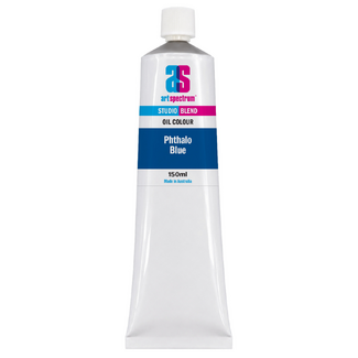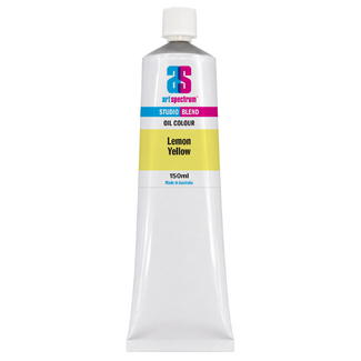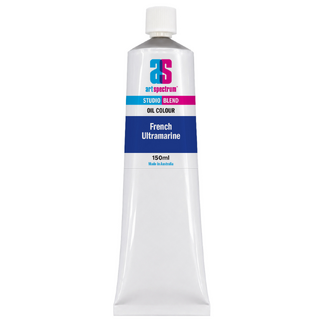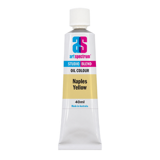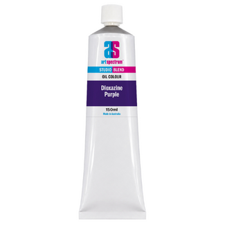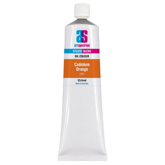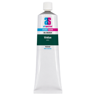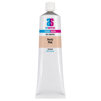


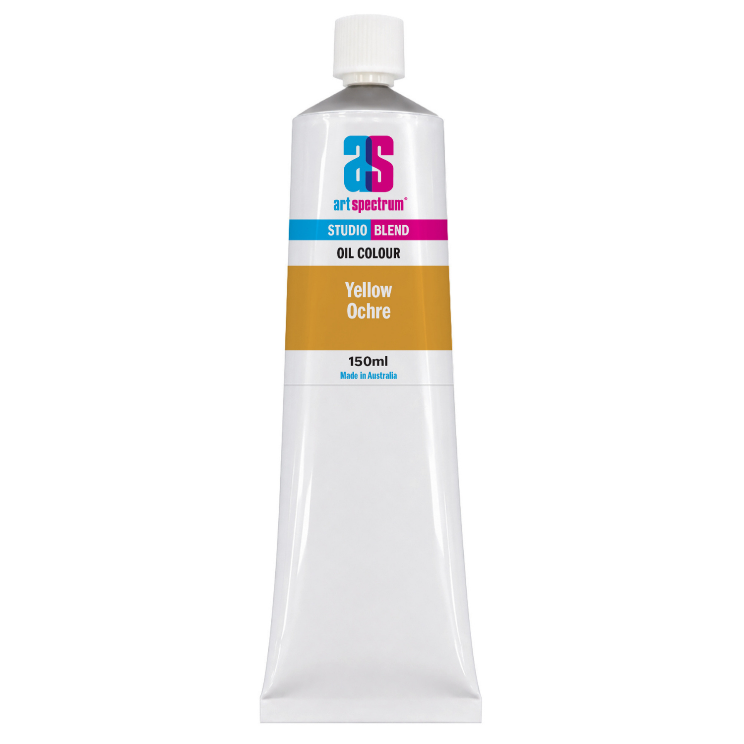
Art Spectrum Studio Blend Oil 150ml Yellow Ochre
Our everyday low price
or 4 interest-free installments of $9.99 with

Own it now, pay later

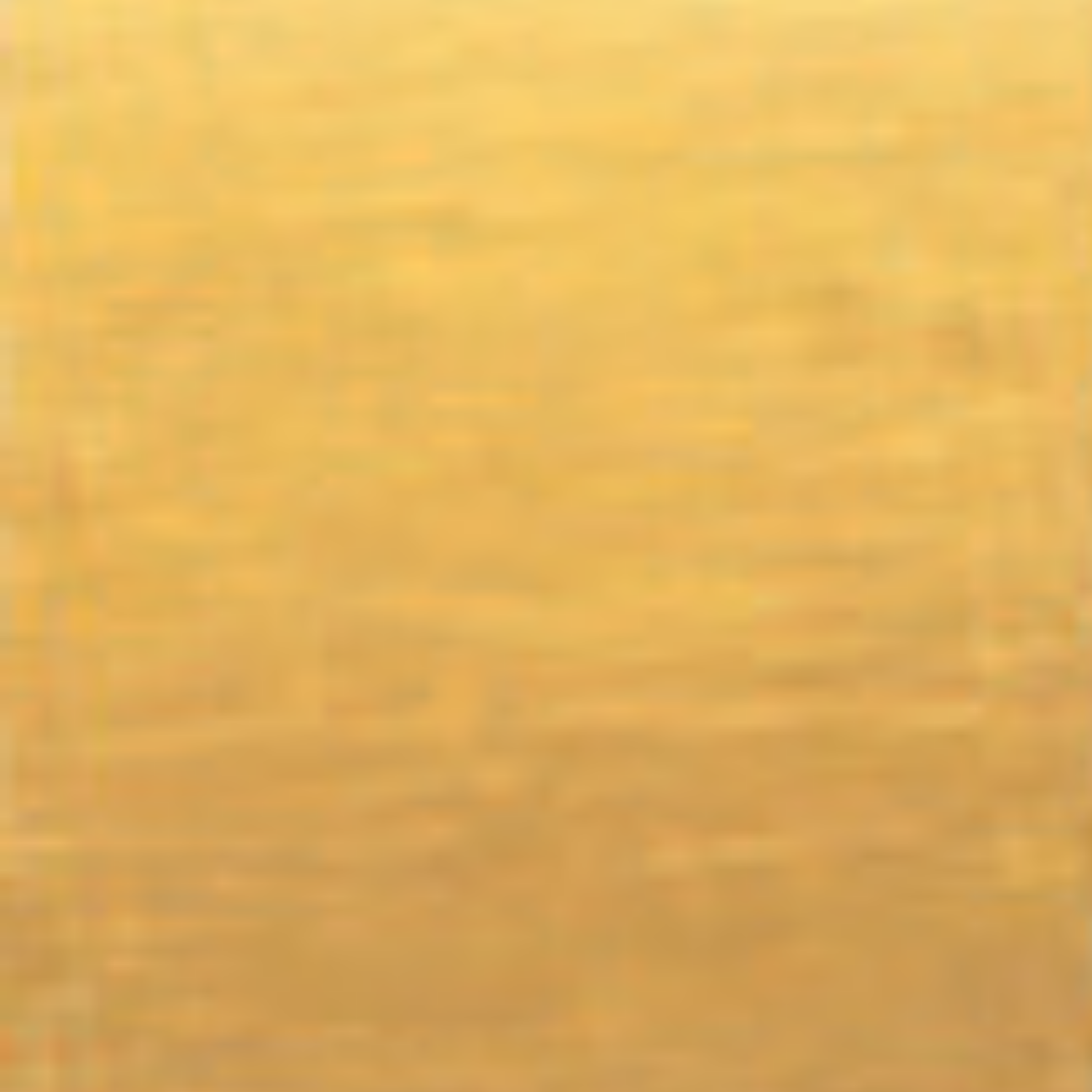
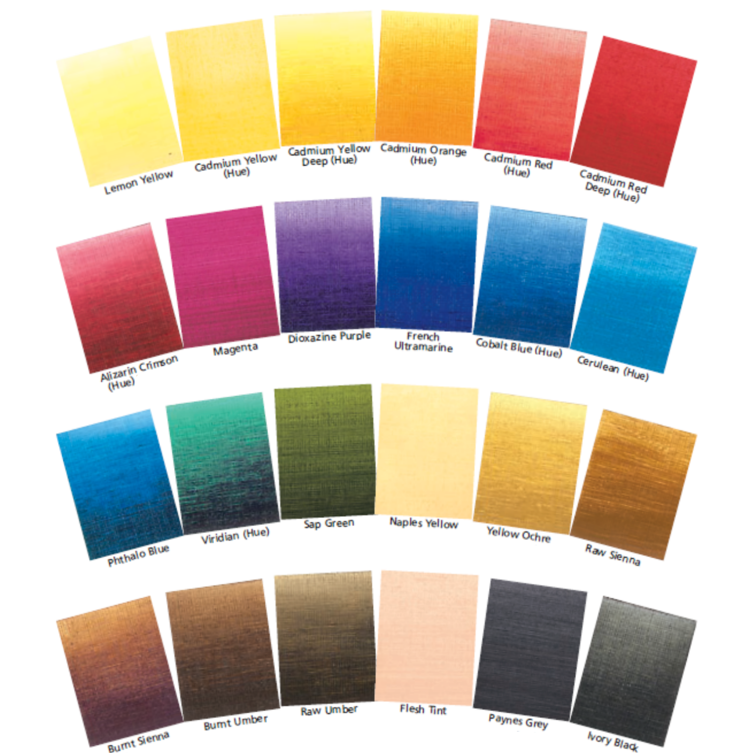
Yellow Ochre is one of the oldest pigments known to humankind and one of the most useful on the contemporary oil painting palette. A warm, orange-yellow earth colour with excellent opacity, it is the standard colour for ochre-toned terrain, warm skin mid-tones, golden grasses, and every passage that calls for a muted, warm yellow without the saturation of cadmium or the coolness of lemon yellow. Art Spectrum Studio Blend Oil Yellow Ochre uses PY42 (synthetic iron oxide, yellow grade) to deliver a clean, consistent, fully opaque paint that is compatible with every colour on the palette and forms the foundation of the warm earth palette essential for painting Australian landscapes.
What Makes This Colour Special
The central practical value of Yellow Ochre is its muted, naturalistic quality. Where cadmium yellows are saturated and vivid, Yellow Ochre is warm but restrained, with a natural, earthy character that reads as plausible in landscape and portrait work without requiring the mixing adjustments that highly chromatic yellows need. Most real-world subjects that read as yellow-brown, whether dry grass, sandy beach, aged timber, or warm skin, are closer to Yellow Ochre than to a saturated cadmium. Using Yellow Ochre as the base for these passages produces results that match observation more directly than starting from a more saturated yellow and working back.
For Australian painters, Yellow Ochre is the fundamental landscape colour. The dry, golden-yellow of summer grassland across the eastern seaboard, the ochre of coastal sand, the warm face of sandstone outcrops in Queensland and New South Wales, and the pale, bleached timber of old weatherboard buildings all fall squarely within Yellow Ochre's register. It is the colour that links the warm, sun-bleached tones of the Australian outdoor landscape into a coherent chromatic identity, and no Australian landscape palette is complete without it.
Why Art Spectrum Studio Blend Oil Belongs on Your Palette
- The fundamental Australian landscape colour. Dry grass, coastal sand, ochre rock, and sun-bleached terrain are all Yellow Ochre territory. It is the single colour most responsible for the characteristic warm, earthy quality of Australian outdoor painting.
- The portrait skin foundation. Yellow Ochre with Titanium White and Cadmium Red Hue forms the base skin tone mix for a very wide range of complexions. It is the warm-yellow component that most skin tones require.
- ASTM I lightfastness. Iron oxide pigments are permanently stable under all normal conditions. Yellow Ochre is one of the most durable pigments in painting history.
- Muted, naturalistic warmth. Unlike the vivid, high-saturation cadmium yellows, Yellow Ochre's natural, restrained quality means it reads as plausible and observed in most naturalistic painting without requiring extensive neutralising.
- Australian-made since 1966. Art Spectrum has produced artists' materials from their Epping, Victoria facility for over six decades.
Getting the Most Out of This Tube
For Australian landscape, begin a session by pre-mixing two or three Yellow Ochre tones across the warm-earth value range: Yellow Ochre with generous Titanium White for the lightest, most sun-bleached ochre tones; Yellow Ochre straight from the tube for mid-range terrain; Yellow Ochre with a touch of Burnt Sienna for the darker, more richly coloured earth passages. Having these three tones ready allows fast, confident painting of the extensive warm-earth passages that are characteristic of Australian landscape subjects.
For portrait skin tones, Yellow Ochre, Titanium White, and Cadmium Red Hue form the three-colour mixing system that covers the mid-light range of most skin tones. The proportion of Yellow Ochre determines how golden or warm the tone reads. Increasing the Red adds warmth; increasing the White moves toward highlights. Adding small amounts of Burnt Sienna moves toward deeper, warmer mid-tones. Adding a trace of Paynes Grey or Raw Umber creates the cooler, slightly greyish shadow tones that complement the warmer lit-face passages.
Yellow Ochre also serves well as a warm toning wash for the canvas or board before painting. Applied thinly over a white ground and allowed to dry, a Yellow Ochre imprimatura establishes a warm middle tone that prevents the cold, stark white of the ground from being visible in any thin passages and immediately moves the overall colour temperature of the painting toward the warm, outdoor register of most Australian landscape subjects.
About Art Spectrum Studio Blend Oil: Melbourne Made Since 1966
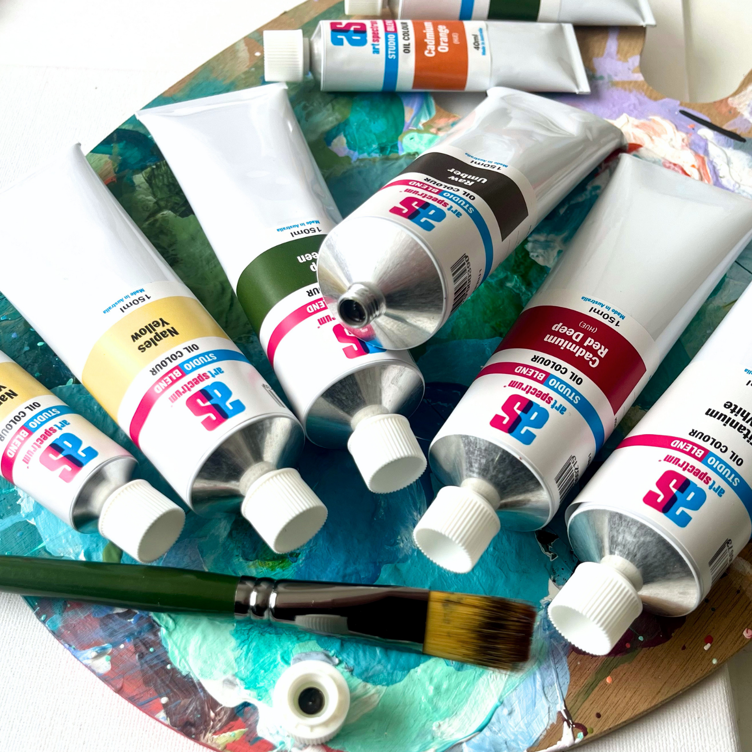
Art Spectrum has been manufacturing artists' materials in Epping, Victoria since 1966. The Studio Blend Oil range is the rebrand of the former Art Prism range, with fresh new packaging and artwork. The formula is unchanged: same pigments, same linseed oil base, same manufacturing standards. It is a studio-grade oil paint designed for working artists who want reliable, lightfast colour at a practical price. The 26-colour palette covers the complete mixing spectrum and is fully compatible with all Art Spectrum oil mediums and varnishes.
What is Yellow Ochre used for in oil painting?
Yellow Ochre is used in three main areas: landscape terrain (dry grass, sandy soil, ochre rock, sun-bleached surfaces), portrait skin tones (as the warm yellow component in virtually all skin tone mixing), and general palette use as a warm, muted yellow that neutralises easily and mixes predictably with all other colours. It is one of the most used colours on most landscape and portrait palettes because of its naturalistic, earthy quality that matches many real-world subjects more directly than the more saturated cadmium yellows.
What is the difference between Yellow Ochre and Raw Sienna?
Yellow Ochre (PY42) is fully opaque and slightly more orange-yellow in tone. Raw Sienna (PBr7) is semi-transparent and more golden-amber in colour. The critical practical difference is transparency: Raw Sienna glazes over other paint and is used for warm, luminous transparent layers; Yellow Ochre is opaque and used for direct coverage of terrain, skin, and architectural passages. They are complementary colours with different applications, and most landscape palettes use both: Yellow Ochre for direct painting and Raw Sienna for glazing and warm-toning washes.
How do I use Yellow Ochre for portrait skin tones?
The classic three-colour portrait skin mix uses Yellow Ochre, Titanium White, and a red (Cadmium Red Hue or Venetian Red are common choices). Begin with Titanium White as the base, add Yellow Ochre to establish the warm-yellow character, then add the red incrementally until the tone reads as the desired skin colour in the lit area. For shadow tones, replace some of the white with Paynes Grey or Raw Umber to cool and darken. For deeper complexions, increase the Yellow Ochre and Red proportions and reduce the white. The mix is straightforward to adjust once the three-colour relationship is understood, and Yellow Ochre is the anchor of the system.
Is Yellow Ochre good for Australian landscape painting?
Yes, it is essential. The dry, sun-bleached warm-yellow tones that characterise Australian summer landscape across most of the continent are closely matched by Yellow Ochre. Dry summer grass, sandy beaches, coastal dune scrub, pale ochre sandstone, dirt roads, and sun-bleached paddock soil all fall within Yellow Ochre's register. No other single colour addresses this range as directly. Paired with the other earth colours (Burnt Sienna, Raw Sienna, Burnt Umber), Sap Green for the khaki-olive of dry bush, and Paynes Grey for distance, Yellow Ochre forms the foundation of a complete Australian landscape palette.
Is Art Spectrum Studio Blend Oil the same as Art Prism?
Yes. Art Spectrum Studio Blend Oil is the direct successor to the Art Prism range with new packaging and artwork only. The formula, pigments, and linseed oil base are unchanged. If you have used Art Prism Yellow Ochre previously, this product is identical in colour and performance.
Art Shed Online is an authorised Australian stockist of Art Spectrum products. All Art Spectrum Studio Blend Oil colours are sourced through official distribution channels. We ship Australia-wide.
(APYO1)
| SKU | APYO1 |
| Barcode # | 9323926000499 |
| Brand | Art Spectrum |
| Shipping Weight | 0.0168kg |
| Shipping Width | 0.055m |
| Shipping Height | 0.040m |
| Shipping Length | 0.200m |
| Shipping Cubic | 0.000440000m3 |
More From This Category