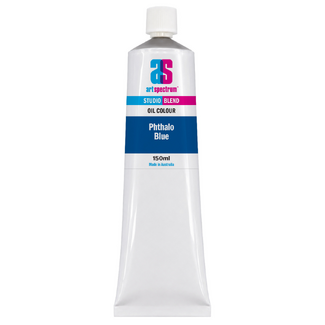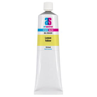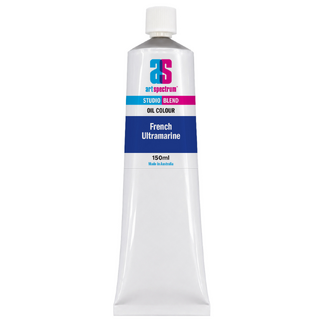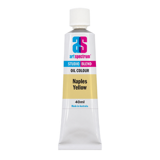


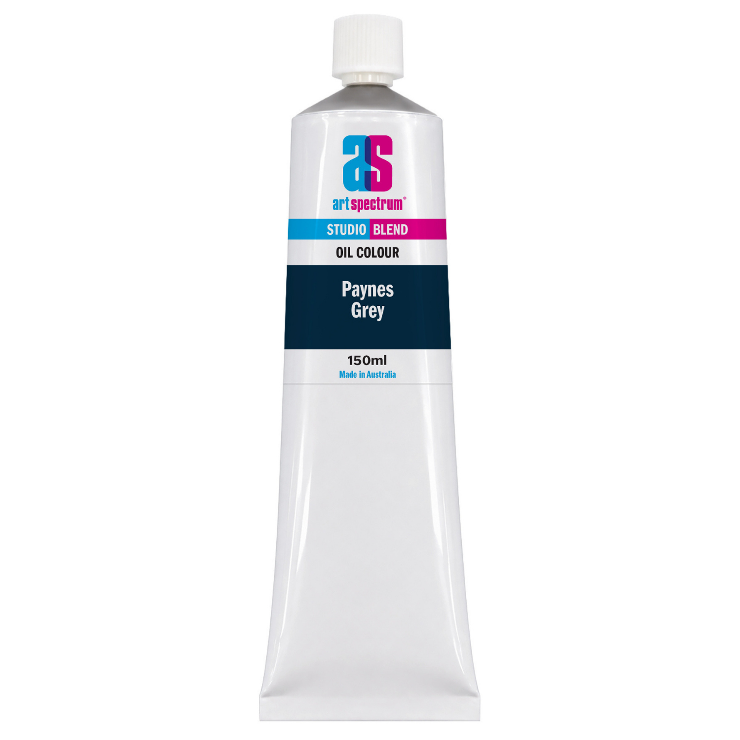
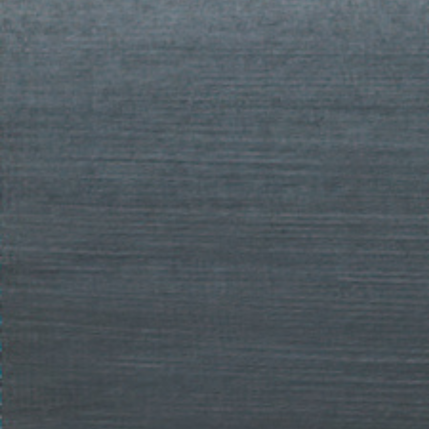
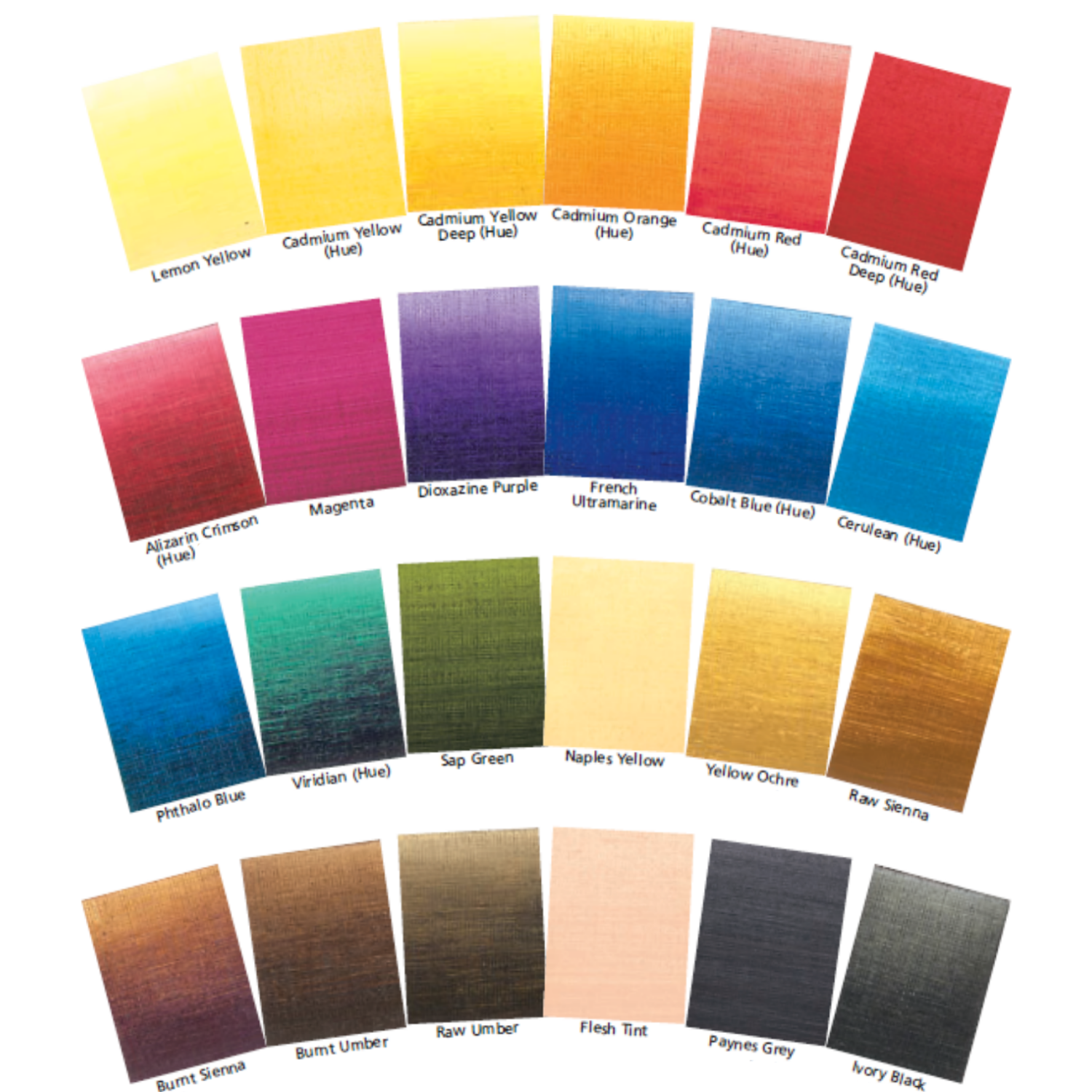
Art Spectrum Studio Blend Oil 150ml Paynes Grey
Our everyday low price
or 4 interest-free installments of $9.99 with

Own it now, pay later

Paynes Grey occupies the space between black, blue, and grey in a way no other colour can. It is a dark, slightly cool neutral with genuine blue-violet character: darker than most greys but with far more colour complexity than pure black. Named after the English watercolourist William Payne, who formulated it in the eighteenth century, it has remained one of the most used studio colours across mediums ever since. Art Spectrum Studio Blend Oil Paynes Grey uses PB29 (Ultramarine Blue), PW6 (Titanium White), and PBk7 (Carbon Black) to deliver a semi-transparent dark neutral that deepens mixes without deadening them, ideal for shadows, atmospheric work, dark skies, and the cool half-tones of almost any subject.
What Makes This Colour Special
The practical advantage of Paynes Grey over black for shadow mixing comes from its colour temperature and residual hue. Shadows in nature are rarely neutral: they tend to be cool (reflecting the blue of the sky) or slightly coloured by reflected light from surrounding objects. Pure black adds no colour character to a mix; it simply reduces value. Paynes Grey adds value reduction plus a cool, slightly blue quality that matches the way real shadows typically read. The result is shadows that feel atmospheric and three-dimensional rather than flat and inert.
For Australian landscape painters, Paynes Grey is indispensable for the particular colour of distance. The blue-grey haze of the Blue Mountains seen from a distance, the purple-grey of ranges receding toward the horizon in inland landscapes, and the deep blue-grey of storm clouds over the coast are all closely matched by Paynes Grey. The aerial perspective effect, where distant objects appear lighter, bluer, and less saturated than foreground objects, is immediately and reliably reproduced by adding Paynes Grey to a colour mixture and adding Titanium White to further reduce the value and chroma.
In portrait work, Paynes Grey is the standard choice for the coolest shadows on the face: the deep shadows under the brow, the corners of the eyes, and the shaded side of the head away from a warm light source. Mixed with warm skin tones it pulls the mix toward a cool, naturalistic shadow tone rather than the muddy result of adding black. The blue-grey character of Paynes Grey creates a colour-temperature contrast with warm lit areas that reads as three-dimensional form.
Why Art Spectrum Studio Blend Oil Belongs on Your Palette
- A dark that keeps colour alive. Unlike pure black, Paynes Grey maintains chromatic interest in dark passages. Shadows mixed with Paynes Grey feel atmospheric and spatial; shadows mixed with black feel flat and dead.
- The standard atmospheric perspective colour. Adding Paynes Grey plus Titanium White to any colour immediately reads as distance and aerial haze. The fastest way to push an element to the background in a landscape painting.
- ASTM I lightfastness. All three component pigments are individually ASTM I rated. Fully permanent for all studio and exhibition applications.
- Works across every subject. Landscape, portrait, still life, marine, architectural painting: in every genre, shadow passages call for a colour that darkens without flattening. Paynes Grey is the single most versatile dark on the palette.
- Australian-made since 1966. Art Spectrum has produced artists' materials from their Epping, Victoria facility for over six decades.
Getting the Most Out of This Tube
For shadow mixing, add Paynes Grey to the local colour of the lit area in small amounts. The shadow should share the hue of the lit area but be darker, cooler, and slightly less saturated. Paynes Grey achieves all three of these adjustments in a single addition: it darkens (value), cools (colour temperature), and slightly neutralises (chroma). Compare the result with adding black to the same base colour and the advantage is immediately clear.
For atmospheric perspective in landscape, create a small separate Paynes Grey and Titanium White mix to use as a toning agent for distant elements. The further an element is from the picture plane, the more of this cool grey mix should replace the actual local colour. A distant mountain range that is locally green appears as a muted blue-grey in practice; painting it with local green is a common and readily visible error. Systematic application of the Paynes Grey atmospheric tone resolves this problem immediately.
As a direct painting colour, Paynes Grey mixed with Titanium White gives the complete range of cool greys needed for overcast skies, still water reflecting an overcast sky, and the grey-blue of galvanised metal and weathered timber. These are all common Australian painting subjects, and Paynes Grey addresses them more accurately than mixing greys from black and white, which gives neutral rather than cool greys.
About Art Spectrum Studio Blend Oil: Melbourne Made Since 1966
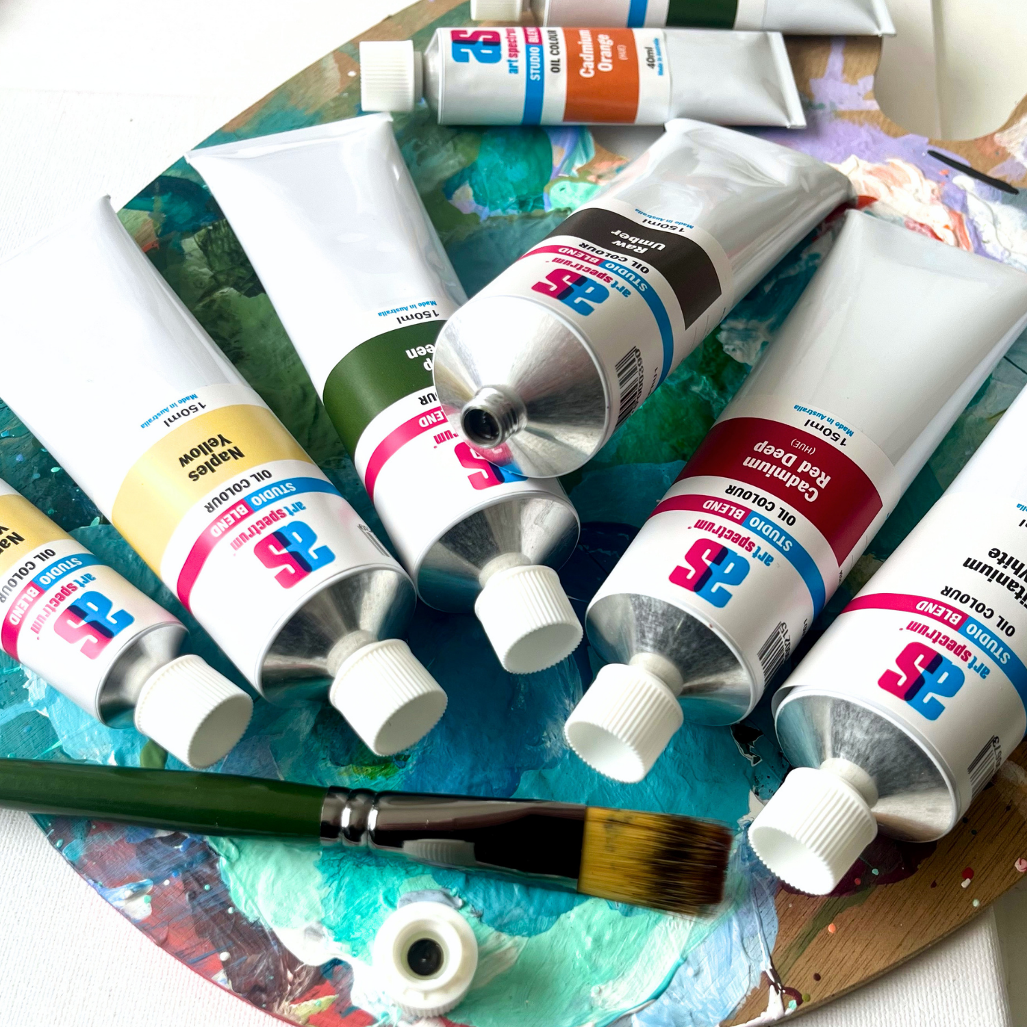
Art Spectrum has been manufacturing artists' materials in Epping, Victoria since 1966. The Studio Blend Oil range is the rebrand of the former Art Prism range, with fresh new packaging and artwork. The formula is unchanged: same pigments, same linseed oil base, same manufacturing standards. It is a studio-grade oil paint designed for working artists who want reliable, lightfast colour at a practical price. The 26-colour palette covers the complete mixing spectrum and is fully compatible with all Art Spectrum oil mediums and varnishes.
Should I use Paynes Grey instead of black in oil painting?
For most mixing purposes, yes. Paynes Grey produces richer, more atmospheric darks than pure black because it carries genuine colour character (the blue-violet of Ultramarine) into the mix. Black adds only value reduction; Paynes Grey adds value reduction plus cool colour temperature plus a slight chromatic interest. The practical result is that shadows mixed with Paynes Grey look more like real shadows, which are almost always cool and slightly coloured, than shadows mixed with black, which tend to look flat and deadened. Black remains useful for its own reasons (the specific character of a very neutral dark) but for general shadow mixing, Paynes Grey is the better choice.
What pigments are in Art Spectrum Paynes Grey oil paint?
Art Spectrum Studio Blend Oil Paynes Grey uses PB29 (French Ultramarine), PW6 (Titanium White), and PBk7 (Carbon Black). The Ultramarine provides the characteristic blue-violet colour bias; the Carbon Black provides depth and value; the Titanium White tunes the overall mid-dark tone. All three pigments are ASTM I lightfast, making this a fully permanent colour.
How do I use Paynes Grey for atmospheric perspective in landscape painting?
Mix a small amount of Paynes Grey with Titanium White on the palette to create a cool mid-grey toning mix. For distant elements in a landscape, replace an increasing proportion of the actual local colour with this grey mix as elements recede toward the horizon. Very distant ranges may be almost entirely this cool grey with only a trace of local colour. Elements in the middle distance should retain most of their local colour but with a slight grey influence. Foreground elements should be painted with full local colour and no added grey. This systematic approach produces convincing atmospheric depth regardless of the subject.
Is Paynes Grey good for portrait shadow tones?
Yes. In portrait painting under a warm light source, the shadows on the face will be cool relative to the lit areas. Adding a small amount of Paynes Grey to a warm skin tone mix cools it, darkens it, and slightly neutralises the chroma, producing a shadow tone that reads as the same face seen in reduced, cooler light. Adding black to the same mix darkens it but often makes it look dirty or grey without the specific cool-but-coloured quality of real shadows. Paynes Grey is the standard choice for portrait shadows in most teaching contexts precisely because it gives this result reliably.
Is Art Spectrum Studio Blend Oil the same as Art Prism?
Yes. Art Spectrum Studio Blend Oil is the direct successor to the Art Prism range with new packaging and artwork only. The formula, pigments, and linseed oil base are unchanged. If you have used Art Prism Paynes Grey previously, this product is identical in colour and performance.
Art Shed Online is an authorised Australian stockist of Art Spectrum products. All Art Spectrum Studio Blend Oil colours are sourced through official distribution channels. We ship Australia-wide.
(APPG1)
| SKU | APPG1 |
| Barcode # | 9323926000338 |
| Brand | Art Spectrum |
| Shipping Weight | 0.0168kg |
| Shipping Width | 0.055m |
| Shipping Height | 0.040m |
| Shipping Length | 0.200m |
| Shipping Cubic | 0.000440000m3 |
More From This Category