

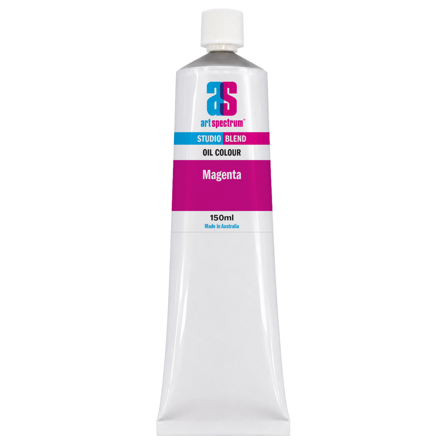
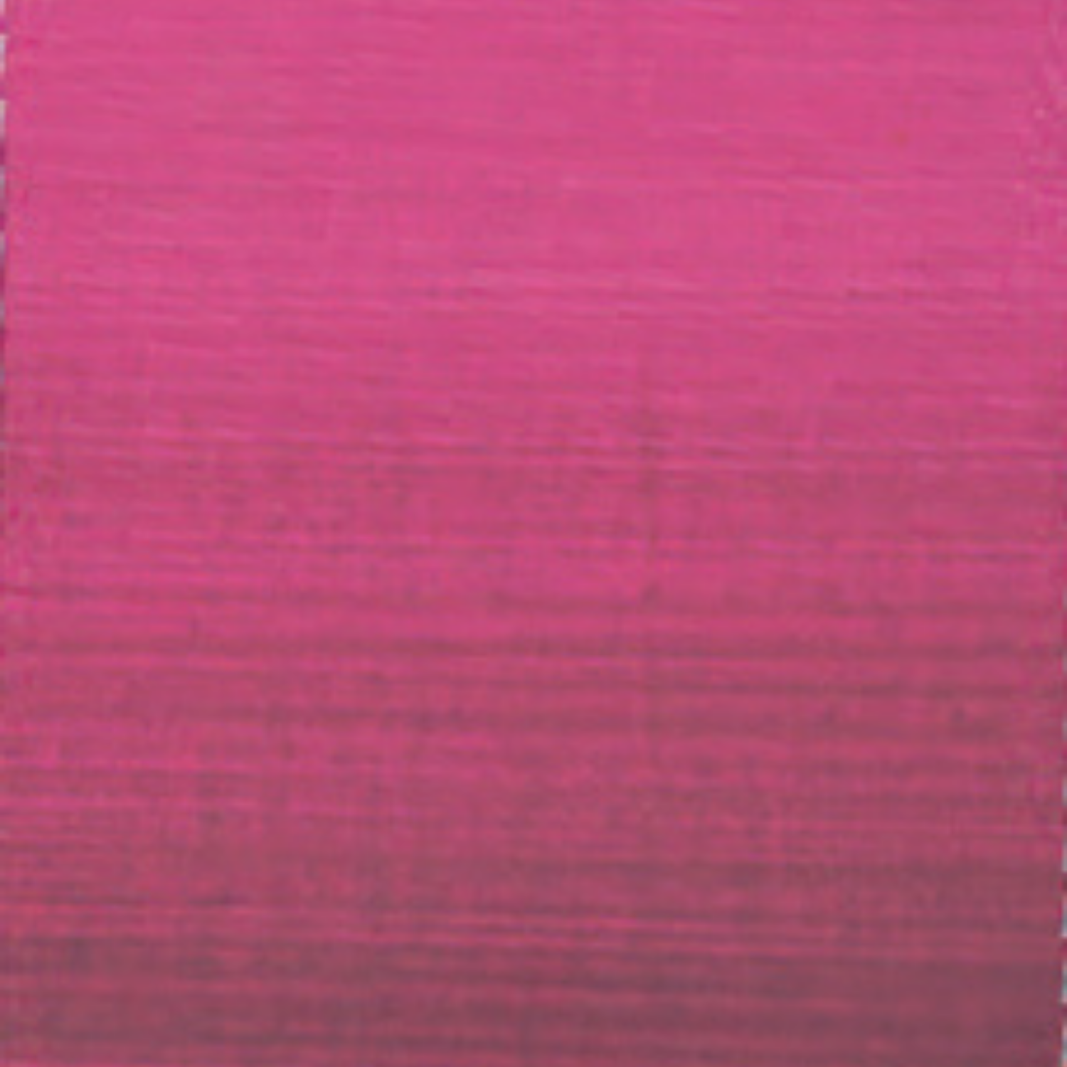
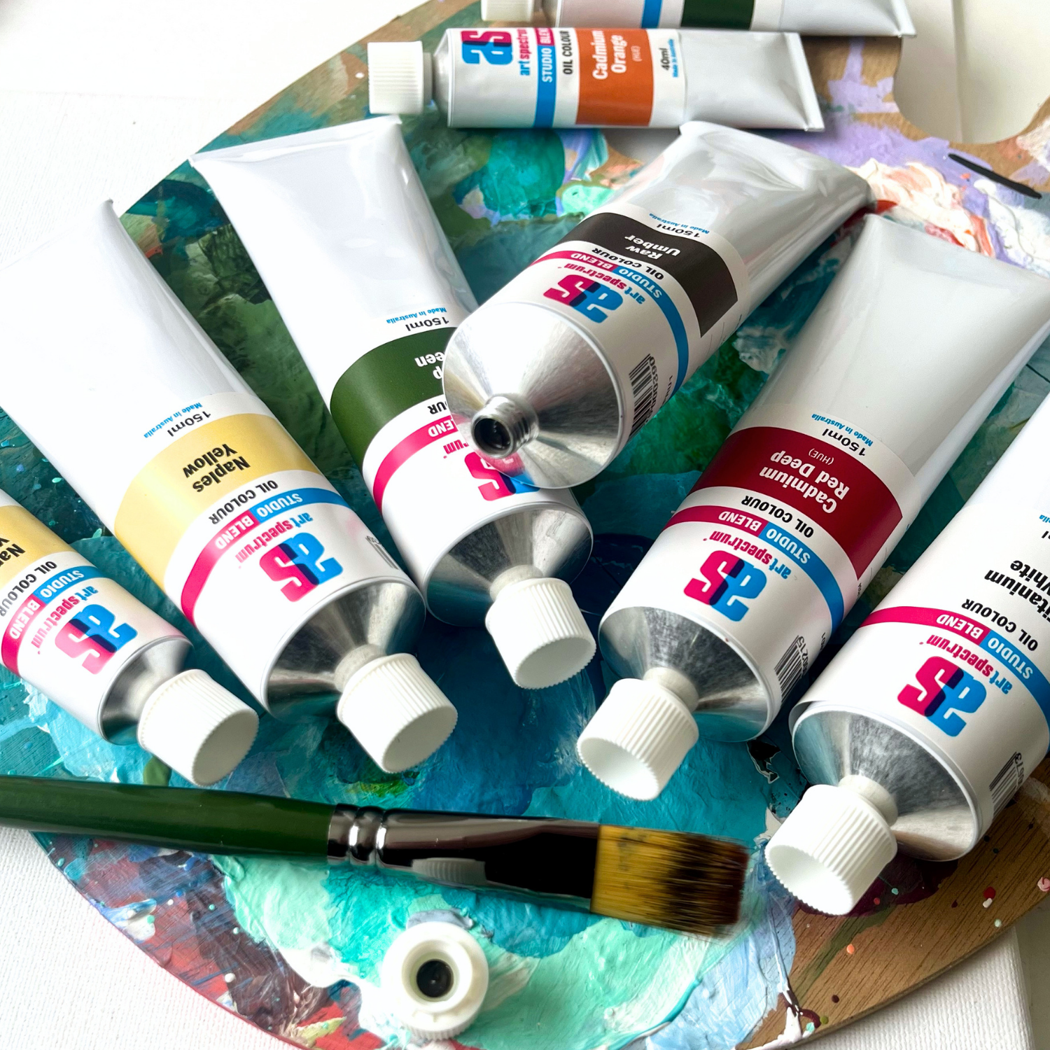
Art Spectrum Studio Blend Oil 150ml Magenta
Our everyday low price
or 4 interest-free installments of $9.99 with

Own it now, pay later

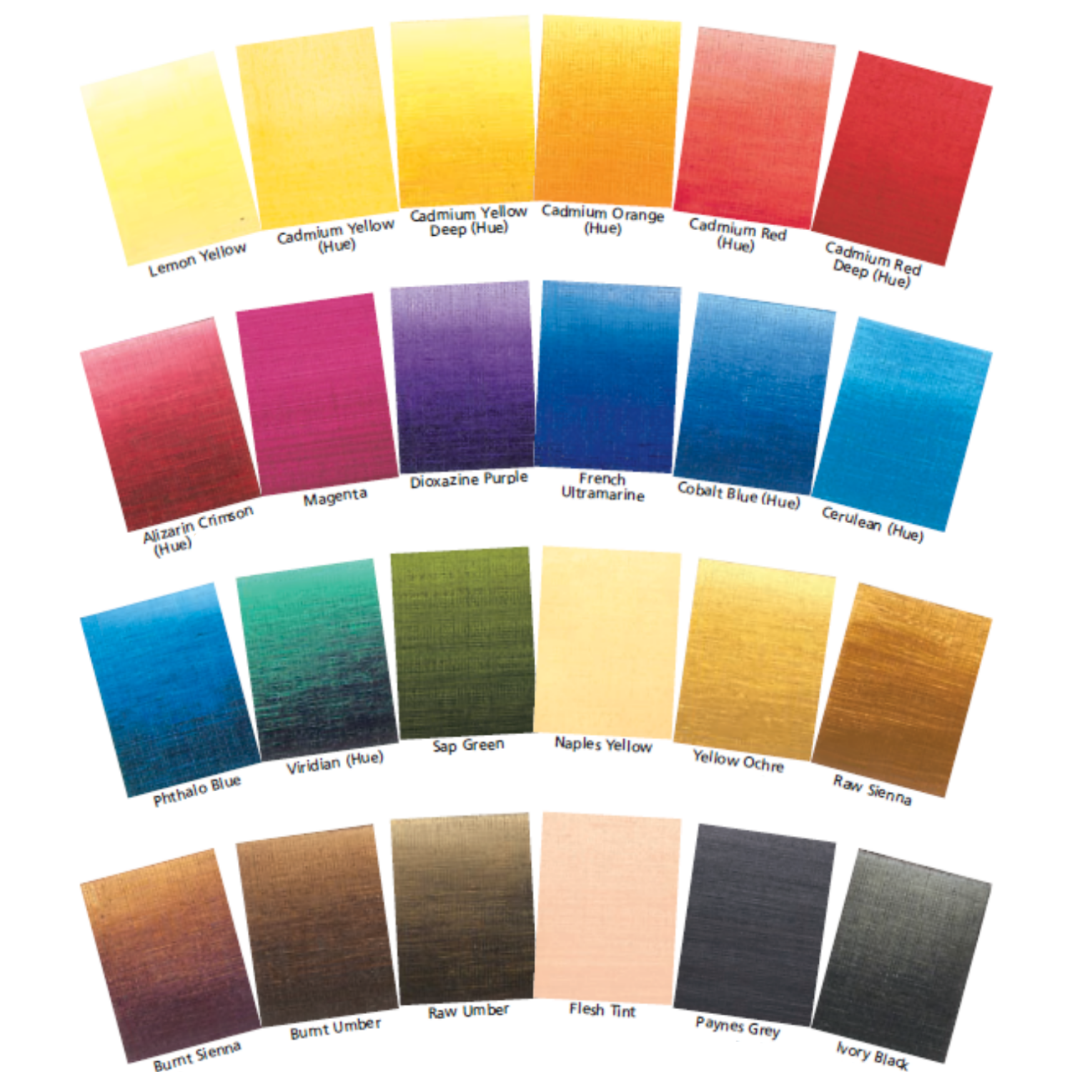
Magenta sits precisely at the threshold between red and violet, a vivid, cool pink-red that no other colour on the palette can replicate or reliably mix. It is the primary mixing colour for the entire violet-purple-pink spectrum: mixed with blue it produces clean violets and purples; mixed with white it gives luminous, saturated pinks. Art Spectrum Studio Blend Oil Magenta uses a combination of PV19 (Quinacridone) and PV23 (Dioxazine) to deliver a transparent, intensely chromatic magenta rated ASTM I for lightfastness, ideal for florals, glazing, and any passage that calls for the bright, cool-pink warmth that reds alone cannot reach.
What Makes This Colour Special
The case for keeping Magenta on the palette alongside Alizarin Crimson (or Cadmium Red) comes down to mixing range. Alizarin Crimson is a warm, brownish red: it contains enough yellow-orange to produce reasonable orange-reds, but when mixed with blue it produces dull, slightly muddy purples. The brown component in Alizarin works against the blue. Magenta has no such opposing warmth. It is a cool red, positioned closer to violet on the spectrum, which means it mixes with blue freely: the result is a clean, vivid violet or purple, not a grey-brown.
This distinction becomes immediately obvious when both colours are tested on the palette. A Magenta-and-Ultramarine mix produces a bright, clean purple. An Alizarin Crimson-and-Ultramarine mix, using the same proportions, produces a noticeably duller, more neutral result. For any painting with vibrant purple or violet passages, including shadows, florals, fabric, or Australian twilight skies, Magenta gives access to a chromatic range that warmer reds cannot reach.
Magenta's full transparency makes it an exceptional glazing colour. Applied thinly in successive layers over a dry lighter passage, it builds a deep, jewel-like quality that direct application cannot replicate. The technique is particularly effective for Australian floral subjects: bougainvillea bracts, waratah heads, and the deep magenta-red of certain native orchids all benefit from glazed Magenta over a warmer pink or red underpainting. The colour appears to glow from within in a way that opaque application never achieves.
Why Art Spectrum Studio Blend Oil Belongs on Your Palette
- The clean purple mixer. Magenta is the only red on the palette that mixes vivid, chromatic purples and violets with blue. Warm reds produce dull, neutralised purples. This single quality justifies its place on any palette where violets or purples appear.
- Superior glazing transparency. Fully transparent PV19 glazes produce luminous, jewel-like colour layers impossible to achieve with opaque application. For florals and deep shadow glazing, this transparency is a major technical advantage.
- ASTM I lightfastness. Quinacridone pigments were developed specifically to replace fugitive pinks and reds. ASTM I means this colour holds permanently, unlike many historical magenta and rose pigments.
- Vibrant, clean pinks with white. Mixed with Titanium White, Magenta produces a range of bright, saturated pinks unavailable from warm reds. Essential for any subject involving cool-pink floral tones or skin highlight passages.
- Australian-made since 1966. Art Spectrum has produced artists' materials from their Epping, Victoria facility for over six decades.
Getting the Most Out of This Tube
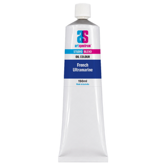
For purple mixing, begin with French Ultramarine as the base and add Magenta in small amounts. The ratio determines the hue: a small amount of Magenta gives blue-violet; equal parts give a mid-purple; more Magenta than Ultramarine gives a warm red-violet. Work systematically across the palette to see the full range before committing to your painting. The transparency of Magenta means the mixes remain clean at all ratios, without the greyness that appears when warm reds meet blue.
For glazing florals, establish the form first in a lighter, more opaque version of the flower's general colour. Allow to dry fully. Then glaze thinly with Magenta, using a medium such as linseed or Liquin, applying the glaze in the shadow areas and middle tones. The transparency of PV19 allows the lighter underpainting to show through and creates depth and luminosity in the petal forms that direct opaque application cannot replicate.
For Australian floral subjects including waratahs, native fuchsias, and some banksias, Magenta mixed with Cadmium Red Hue gives the full range of warm-to-cool reds that these subjects display. The deep, cool crimson-red of a waratah head benefits from glazed Magenta in the darker recesses, with Cadmium Red in the fully lit areas. The colour temperature shift between lit and shadowed areas reads as convincingly three-dimensional.
About Art Spectrum Studio Blend Oil: Melbourne Made Since 1966
Art Spectrum has been manufacturing artists' materials in Epping, Victoria since 1966. The Studio Blend Oil range is the rebrand of the former Art Prism range, with fresh new packaging and artwork. The formula is unchanged: same pigments, same linseed oil base, same manufacturing standards. It is a studio-grade oil paint designed for working artists who want reliable, lightfast colour at a practical price. The 26-colour palette covers the complete mixing spectrum and is fully compatible with all Art Spectrum oil mediums and varnishes.
What is the difference between Magenta and Alizarin Crimson in oil painting?
Magenta (PV19+PV23) is a cool, transparent pink-red that sits between red and violet on the colour wheel. Alizarin Crimson Hue is a warmer, slightly brownish dark red. The critical practical difference is in purple mixing: Magenta with blue gives a clean, vivid violet or purple because both colours are cool-biased and their hues align. Alizarin Crimson with blue gives a much duller, more neutralised result because Alizarin's warm brown component partially cancels out the blue. Magenta is not a substitute for Alizarin Crimson in all applications (it is less useful for warm, dark reds), but for any painting that requires pure, bright purples or pinks, Magenta is the better choice.
Why is transparency important in a Magenta oil paint?
Transparent pigments allow light to pass through the paint film, reflect from the ground below, and return through the colour again. This double pass of light through the pigment creates a depth and luminosity that opaque colours cannot replicate. For florals, this transparency is especially valuable: glazing a transparent Magenta over a dry lighter passage produces petal tones with an inner glow that describes the translucency of actual flower petals far better than opaque direct application. In purple mixing, transparency also keeps the mixes cleaner, since opaque particles in a mix scatter light and reduce saturation.
Is Magenta a lightfast colour in oil paint?
Yes. Art Spectrum Studio Blend Oil Magenta uses PV19 (Quinacridone) and PV23 (Dioxazine) pigments, both rated ASTM I for lightfastness. This is the highest available rating and indicates excellent permanence under prolonged exposure to light. Quinacridone pigments were developed in the mid-twentieth century specifically to address the poor lightfastness of many historical red and pink pigments. Modern quinacridone-based magentas and roses are considered among the most permanent of all organic pigments available to artists.
Can I mix a full range of purples from Magenta alone?
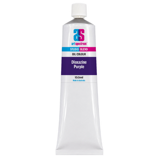
Yes, when combined with blue. Magenta alone gives a vivid cool pink-red, but mixed with French Ultramarine it produces the full purple and violet range: warm red-violet at one end, through mid-purple, to deep blue-violet at the other. Adding white to any of these mixed purples gives a further range of lavenders and mauves. For the deepest, darkest purples and violet-blacks, combining Magenta with Dioxazine Purple extends the range further still. One tube of Magenta, combined with one blue and white, gives more usable purple tones than most pre-mixed purple paints offer.
Is Art Spectrum Studio Blend Oil the same as Art Prism?
Yes. Art Spectrum Studio Blend Oil is the direct successor to the Art Prism range with new packaging and artwork only. The formula, pigments, and linseed oil base are unchanged. If you have used Art Prism Magenta previously, this product is identical in colour and performance.
Art Shed Online is an authorised Australian stockist of Art Spectrum products. All Art Spectrum Studio Blend Oil colours are sourced through official distribution channels. We ship Australia-wide.
(APM1)
| SKU | APM1 |
| Barcode # | 9323926000475 |
| Brand | Art Spectrum |
| Shipping Weight | 0.0168kg |
| Shipping Width | 0.055m |
| Shipping Height | 0.040m |
| Shipping Length | 0.200m |
| Shipping Cubic | 0.000440000m3 |
Others Also Bought
More From This Category