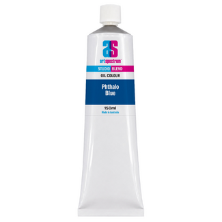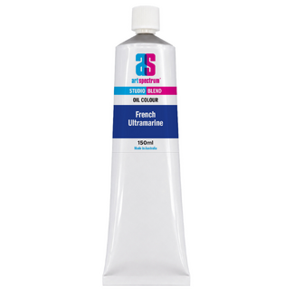


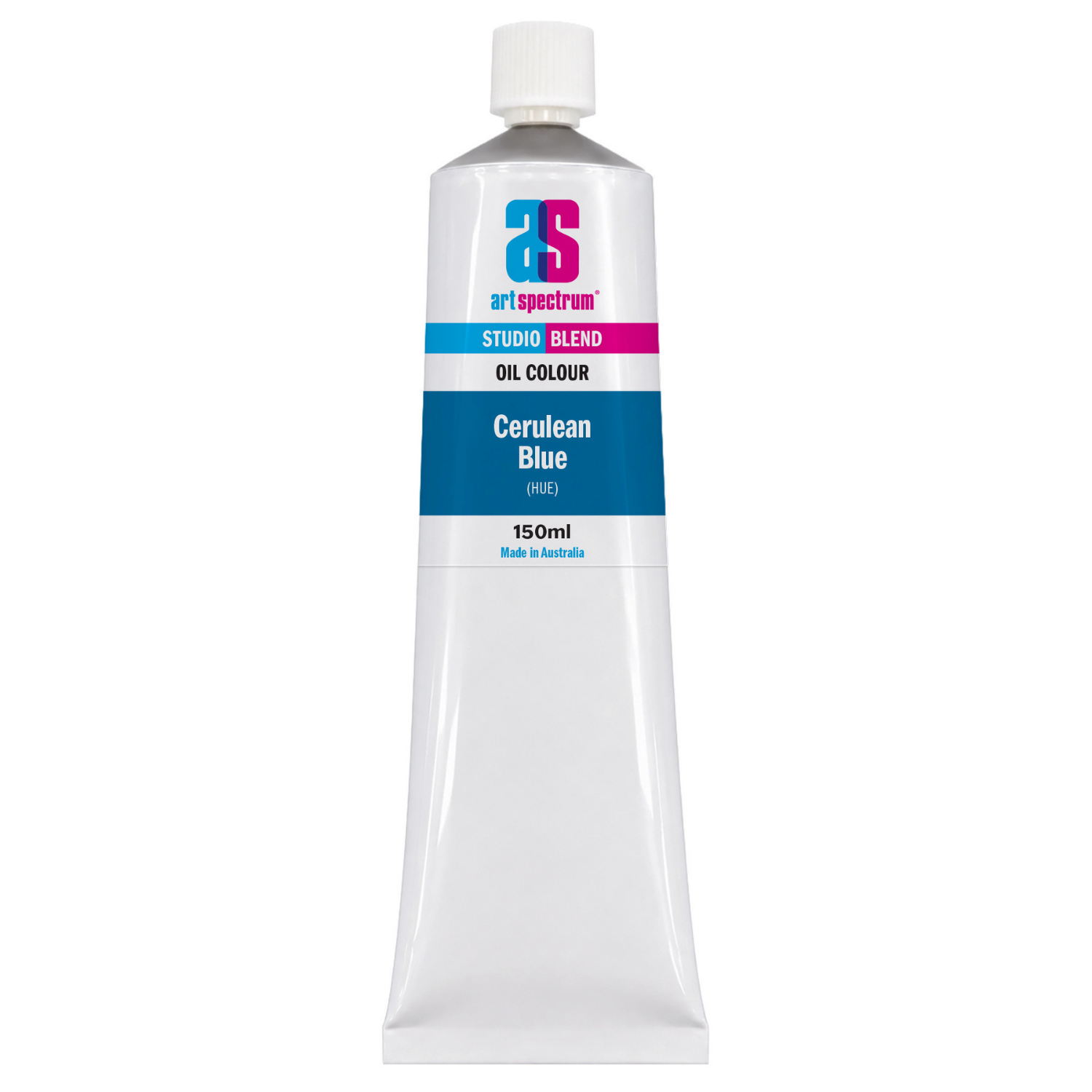
Art Spectrum Studio Blend Oil 150ml Cerulean Blue Hue
Our everyday low price
or 4 interest-free installments of $9.99 with

Own it now, pay later

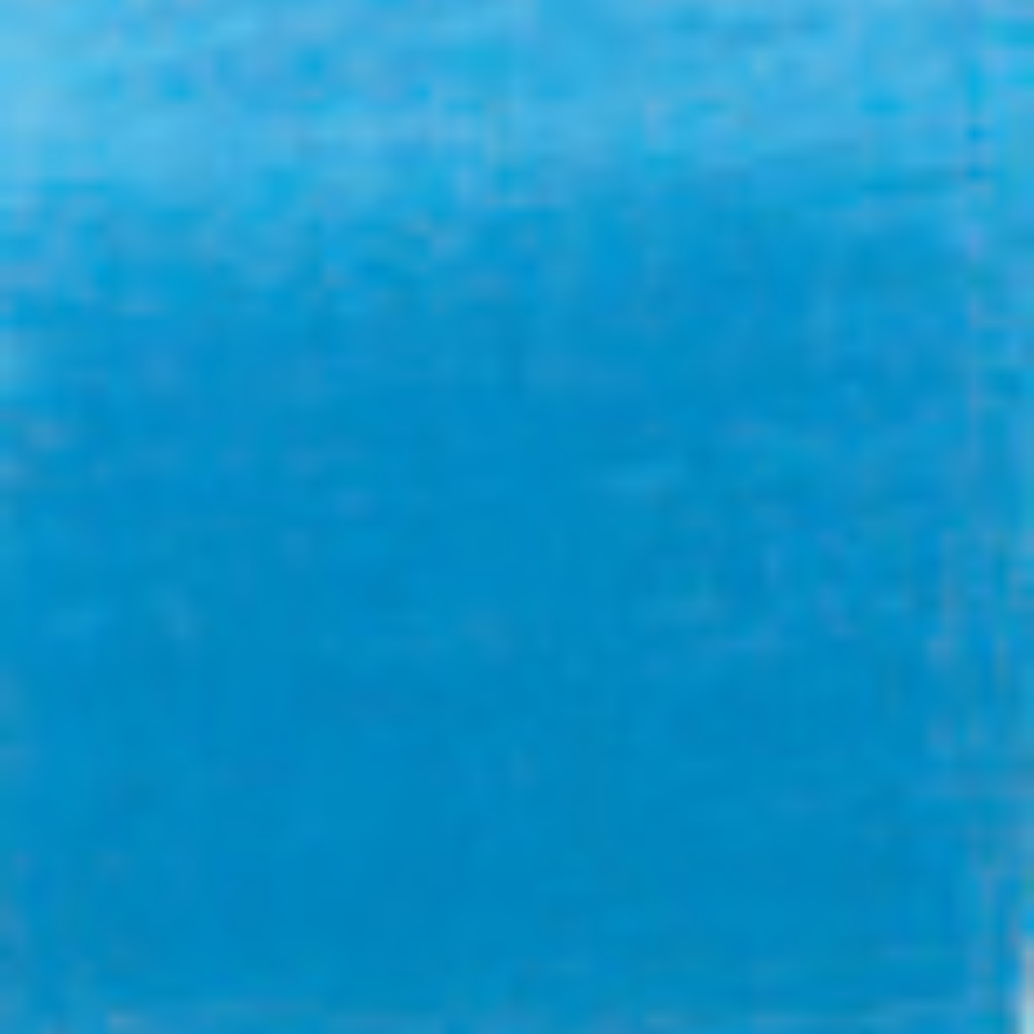
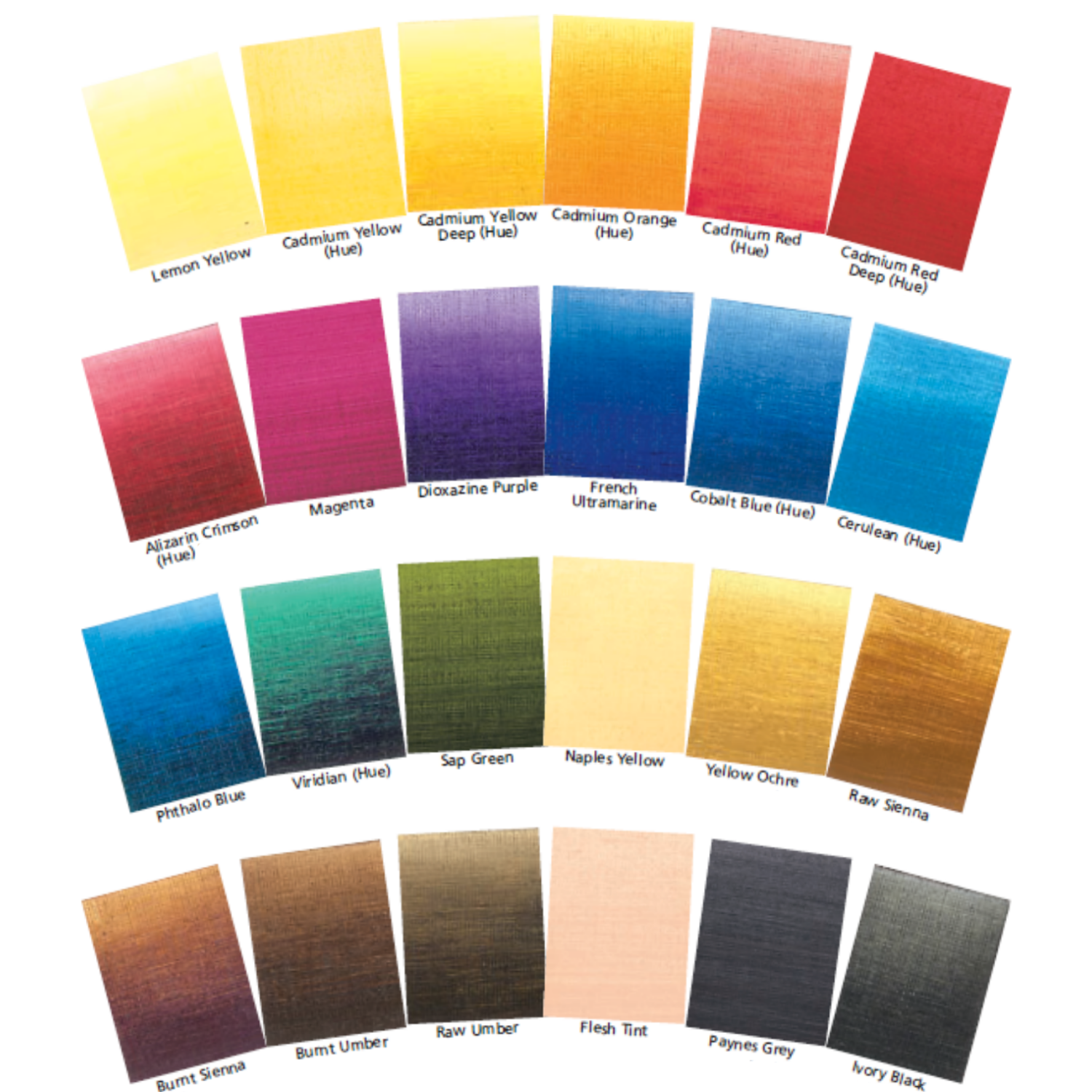
Cerulean blue is the sky blue of oil painting: a clear, slightly greenish pale blue that captures the colour of an open sky at midday better than any other pigment on the palette. It is not the deep, saturated blue of French Ultramarine nor the vivid intensity of Phthalo Blue. It is lighter, airier, and inherently luminous. Art Spectrum Studio Blend Oil Cerulean Blue Hue achieves this pale sky quality using a Phthalo Blue and Zinc White combination, producing a colour that is immediately recognisable as sky blue and that mixes the airy, light-filled atmospheric tones that landscape and plein air painters rely on constantly.
What Makes This Colour Special
Cerulean Blue has a specific and irreplaceable role in landscape and plein air painting. Its pale, slightly greenish sky-blue character cannot be accurately replicated by mixing French Ultramarine with white, which produces a lavender-tinted result rather than the cool, clear tone of actual sky blue. The slight green shift in Cerulean Blue Hue comes from the Phthalo Blue Green Shade component, which reads as the cooler, greener quality of light sky compared to the warmer, more violet overtones of deeper blues.
For Australian landscape painters, this colour fills three specific needs: the clear mid-sky on blue-sky days, the pale horizon tone in open landscapes, and the reflected sky light in water, wet sand, and shadow passages in direct sunlight. Australian summer sky at midday on a cloudless day is very close to this colour straight from the tube. The capacity to paint directly from the tube for large sky areas without laborious mixing is one of the practical advantages of having Cerulean Blue Hue on the palette.
In figurative and studio work, Cerulean Blue Hue provides the cool, reflected sky tones that appear in the shadow side of outdoor figures and objects in bright daylight. Cool shadows in sunlit outdoor work typically have a slight blue character from reflected sky, and Cerulean Blue Hue mixed sparingly into shadow mixes is what produces that distinctive plein air quality that separates outdoor painting from interior studio work.
Why Art Spectrum Studio Blend Oil Belongs on Your Palette
- Ready-to-use sky blue. Produces the correct pale, slightly greenish sky blue straight from the tube. No mixing needed for clear sky passages, saving time and palette space.
- ASTM I lightfastness. Outstanding permanence. Both component pigments are among the most stable in oil painting. Reliable for any application intended to last.
- Fills the sky-blue gap that mixing cannot. French Ultramarine plus white produces lavender, not cerulean. This colour gives you the actual sky tone without the violet shift.
- Triple-milled in refined linseed oil. Smooth, blendable consistency ideal for large sky areas and soft atmospheric gradations. Melbourne-made to studio standards.
- Australian-made since 1966. Art Spectrum has produced artists' materials from their Epping, Victoria facility for over six decades.
Getting the Most Out of This Tube
For a sky gradation from horizon to zenith, place Cerulean Blue Hue near the horizon and French Ultramarine toward the top of the sky. Blend the boundary between the two colours wet-into-wet with a wide, clean brush. If the horizon has a warm haze, add a small amount of Titanium White and a trace of Naples Yellow or Yellow Ochre to the Cerulean near the very horizon. Work quickly: oil paint blends best when both areas are still wet.
For cool shadow tones in outdoor figurative work, add a small amount of Cerulean Blue Hue to your shadow mixes wherever there is strong reflected sky light. The amount needed is small: too much will make shadows look artificially blue. A little goes a long way, shifting shadows toward a slightly cooler, more atmospheric tone without overtly reading as blue.
For ocean and coastal water painting, Cerulean Blue Hue is the right starting point for clear, shallow tropical water. Mix it with Viridian Hue for bright green-blue water, or with French Ultramarine for deeper, darker ocean tones. Adding Titanium White produces the pale, light-catching surface of calm water at mid-range distance.
About Art Spectrum Studio Blend Oil: Melbourne Made Since 1966
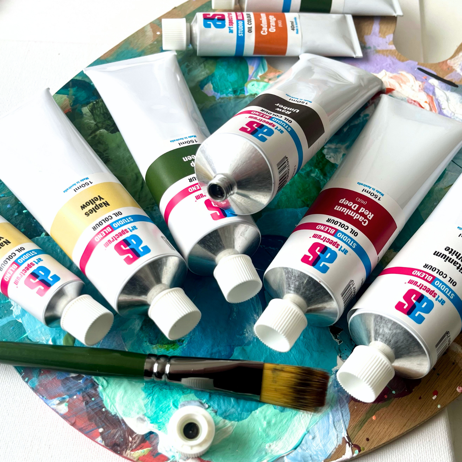
Art Spectrum has been manufacturing artists' materials in Epping, Victoria since 1966. The Studio Blend Oil range is the rebrand of the former Art Prism range, with fresh new packaging and artwork. The formula is unchanged: same pigments, same linseed oil base, same manufacturing standards. It is a studio-grade oil paint designed for working artists who want reliable, lightfast colour at a practical price. The 26-colour palette covers the complete mixing spectrum and is fully compatible with all Art Spectrum oil mediums and varnishes.
Why can't I just mix French Ultramarine and Titanium White to get cerulean?
French Ultramarine has a violet undertone that becomes apparent when mixed with white, producing a lavender-blue rather than the clear, slightly greenish sky blue of cerulean. Cerulean Blue Hue uses Phthalo Blue Green Shade as its base, which has a cooler, greener character that reads as true sky blue when lightened. The difference is subtle in a colour swatch but becomes significant when painting large sky areas where the correct temperature and hue of sky blue is critical to a convincing result.
What pigments are in Art Spectrum Studio Blend Oil Cerulean Blue Hue?
Art Spectrum Cerulean Blue Hue uses PW4 (Zinc White) and PB15:3 (Phthalo Blue Green Shade). The Zinc White pre-lightens the highly saturated Phthalo Blue to the pale, clear sky blue of cerulean. Both pigments are rated ASTM I for lightfastness, making this a very stable colour. PB15:3 is one of the most lightfast pigments available in oil paint.
Is Cerulean Blue Hue good for painting Australian skies?
Yes. The clear, pale blue of Cerulean Blue Hue closely matches the mid-sky colour of a clear Australian blue-sky day, particularly in the middle and lower portions of the sky dome. The characteristic brightness and lack of violet in Australian sky blue is well captured by this colour. Paired with French Ultramarine for the upper sky, Cerulean Blue Hue gives a convincing sky gradation from horizon to zenith that is extremely difficult to achieve with mixing alone.
Can I use Cerulean Blue Hue for ocean painting?
Yes. Cerulean Blue Hue is well suited to painting clear tropical and coastal water. For bright, shallow reef or beach water, mix it with Viridian Hue. For deeper, cooler ocean passages, combine it with French Ultramarine. For the pale, light-reflecting surface of calm water at middle distance, add Titanium White. Its slightly greenish blue character is more accurate for tropical Australian coastal water than the violet bias of Ultramarine.
Is Art Spectrum Studio Blend Oil the same as Art Prism?
Yes. Art Spectrum Studio Blend Oil is the direct successor to the Art Prism range with new packaging and artwork only. The formula, pigments, and linseed oil base are unchanged. If you have used Art Prism Cerulean Blue Hue previously, this product is identical in colour and performance.
Art Shed Online is an authorised Australian stockist of Art Spectrum products. All Art Spectrum Studio Blend Oil colours are sourced through official distribution channels. We ship Australia-wide.
(APCE1)
| SKU | APCE1 |
| Barcode # | 9323926000291 |
| Brand | Art Spectrum |
| Shipping Weight | 0.0168kg |
| Shipping Width | 0.055m |
| Shipping Height | 0.040m |
| Shipping Length | 0.200m |
| Shipping Cubic | 0.000440000m3 |
More From This Category