









Red is not one colour. It's a spread that runs from an orange-leaning scarlet all the way through to a blue-leaning crimson and magenta, and where a red sits on that spread matters more than most painters realise. Grab the wrong one and a mixed purple turns muddy before you've even worked out why.
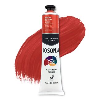
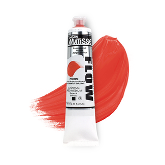
Our red acrylic paint range covers that whole spread: cadmium red, pyrrole red, naphthol red, alizarin and quinacridone crimson, across Matisse, Atelier, Liquitex and Mont Marte, in both heavy body and fluid consistencies. Between them, these pigment families also carry one of the stranger histories in the whole paint aisle, ground earth and crushed insects on one end, a laboratory pigment invented in the 1980s to replace lead-based automotive paint on the other. Everything ships fast, Australia wide, and is priced below standard retail.
Warm and Cool Reds, and What Each One Mixes Into
What's the difference between a warm red and a cool red?
It comes down to which way the red leans. Warm reds like cadmium red and scarlet lean towards orange, cool reds like alizarin crimson and quinacridone magenta lean towards blue. Neither is more "red" than the other, they just sit on opposite ends of red's own spectrum.
What happens when I mix a warm red with yellow or blue?
A warm red mixes a clean, vivid orange with yellow, but a dull, brownish violet with blue. A cool red does the opposite, clean violets and pinks with blue, but a muted, brownish orange with yellow. This is why most working palettes carry one of each rather than expecting a single red to do both jobs.
Cadmium red or alizarin crimson, which should I reach for?
It depends what the mix needs to do. Cadmium red is warm, opaque and high in tinting strength, built for solid, punchy colour. Alizarin crimson is cool, transparent and made for glazing and deep shadow work. Most painters end up needing both rather than picking one as a permanent favourite.
How do I judge a red's temperature before I buy it?
Don't judge it in isolation. Hold the tube's swatch up against a red you already know is warm and one you know is cool, temperature is relative, and a red that looks neutral on its own often reveals a clear lean once it's sitting next to something else.
Pigment Codes, Opacity and Lightfastness on the Tube
How do I read the pigment code on a tube of red paint?
Paint names are useful, but once you start comparing artist-quality ranges, the tiny pigment information on the back of the tube becomes even more helpful.
Two paints can both be called "Crimson" and behave completely differently.
The pigment code tells you what's actually creating the colour.
Look for a code beginning with PR, which stands for Pigment Red, followed by a number.
Some common examples include:
- PR108: commonly associated with genuine cadmium reds
- PR254: pyrrole red
- PR83: traditional alizarin crimson
- PR122: quinacridone magenta
- PR112 and PR170: examples from the broader naphthol red family
Once you get used to recognising a few codes, shopping for colour becomes much easier.
Instead of relying entirely on names like "Permanent Red Deep", "Brilliant Crimson" or "Primary Red", you can turn the tube around and see whether two brands are actually using a similar pigment underneath.
Does the same pigment code mean two paints will look identical?
Not necessarily.
Think of the pigment code as the ingredient, not the complete recipe.
Two manufacturers can use the same pigment but formulate it with different pigment loads, binders, particle dispersions and consistencies. One PR254 may feel dense, opaque and extremely powerful while another feels slightly more transparent or fluid.
That's why we love pigment codes for understanding colour, but we'd still recommend looking at the actual manufacturer's swatch where possible.
Why do single-pigment reds mix cleaner than multi-pigment ones?
Every extra pigment in a mix adds its own bias, and those biases compound. A single-pigment red gives you one clean variable to work with when you mix it into something else, while a red blended from two or three pigments can dull or shift unexpectedly once combined with a second colour.
★ Art Shed Tip
If a mixture keeps turning muddy and you can't work out why, flip both tubes over and count the pigments. You might think you're mixing two colours when you're actually mixing five.
Why does my red paint look see-through on the canvas?
Many organic reds, alizarin crimson and quinacridone included, are inherently transparent rather than faulty. That transparency is exactly what makes them useful for glazing, but it means a single coat won't give full coverage. Check the opacity symbol on the tube, usually a filled, half-filled or hollow square, before relying on a red for solid coverage.
Is cadmium red toxic?
Genuine cadmium colours require more thoughtful handling than many modern alternatives.
Artist paint manufacturers provide specific safety information for each formulation, so always follow the label and Safety Data Sheet supplied with the paint you're using.
Avoid eating or drinking while painting, don't put brushes in your mouth, wash your hands afterwards and be particularly cautious about techniques that can create airborne paint particles, such as spraying or sanding.
If you'd prefer not to work with genuine cadmium pigment at all, there are excellent cadmium-free and cadmium-hue reds designed to give artists a similar warm, opaque colour character using alternative pigments.
★ Art Shed Tip
Red has one of the stranger timelines of any pigment family. Cadmium metal was discovered in 1817, but cadmium red itself wasn't manufactured until 1907, a 90 year gap. Alizarin crimson traces back to madder root used in ancient Egypt, and became the first natural pigment ever successfully recreated synthetically, in a German lab in 1868. Pyrrole red is the newest of the lot, developed in the 1980s to replace lead-based automotive paint, only later finding its way onto an artist's palette. If working from raw colour rather than a tube appeals to you, our pigment powder range carries several of these same reds in loose form.
Mixing Deeper Reds, Shadows and Skin Tones
How do I darken red without killing its vibrancy?
Skip the black. Adding black to red kills its chroma and drags it towards brown rather than a true deep red. Burnt umber gives an earthy deep red instead, dioxazine purple builds a rich, cool maroon, and a touch of phthalo green, red's complement, produces the deepest crimson shadow that still reads as red rather than brown.
How do I mix realistic skin tones with red?
Start with a cool red or quinacridone mixed with yellow ochre and titanium white as your base. Add burnt sienna for warmth through the cheeks and ears, then glaze a thin layer of cool crimson over flushed areas and lips rather than mixing it in solid, glazing keeps those areas looking like colour under the skin rather than colour sitting on top of it.
Why does my red dry darker and duller than it looked wet?
Acrylic reds dry marginally darker and less glossy than they appear on the palette, it's a property of the medium rather than a fault in the paint. Judge a mix on a dried test swatch rather than while it's still wet, and if you want the depth back on a finished piece, a gloss varnish restores much of what the drying process took away.
Red Acrylic Paint Questions, Answered
Which single red should I buy first if I only want one in my palette?
A mid-temperature red like naphthol red or pyrrole red is the most forgiving single choice, warm enough to mix a reasonable orange, cool enough not to turn violets into mud. If you can stretch to two, add a true cool red like alizarin crimson or quinacridone alongside it, or start from one of our ready-made acrylic sets.
What is the difference between hue, permanent and genuine on a red paint label?
"Genuine" means the original pigment, such as true alizarin crimson made from PR83. "Hue" means a modern, more lightfast pigment blended to match that original colour without using it. "Permanent" usually signals the manufacturer's own lightfast reformulation of a historically fugitive colour, check the lightfastness rating regardless of which word is on the label.
Which red acrylics are safe for children to paint with?
Cadmium-free reds and naphthol or pyrrole-based reds are non-toxic and safe for supervised children's use. Genuine cadmium reds carry adult handling advice due to the raw pigment's toxicity in powder form, though the dried paint film itself is not a hazard once it's on the page.
Do I need to varnish red paintings to stop them fading in a sunny room?
Varnish protects the paint film generally, but it won't fully stop fading if a genuinely fugitive pigment is hung in direct, constant sunlight. Choosing a lightfast red to begin with, most modern cadmiums, pyrroles and quinacridones qualify, matters more than any varnish applied afterward.
Is cadmium red toxic?
The raw pigment is toxic in powder form and shouldn't be inhaled or ingested, which is why tubes carry handling advice. Once dry on canvas, the paint film itself is considered safe. Cadmium-free hues are available if you'd rather sidestep the handling precautions altogether.
Ready to find your reds? Browse the full range below from Liquitex, Atelier and Mont Marte, or head to our acrylic mediums and varnish ranges to extend or protect your reds once they're on canvas. Every order ships fast, Australia wide, direct from our Melbourne warehouse.