


Oil painters develop strange loyalties to colour. Certain blues become sacred. Particular earth reds start appearing in every second painting like recurring characters in a long-running fantasy series. Entire afternoons disappear while comparing undertones under studio lighting that suddenly feels as serious as an archaeological examination.
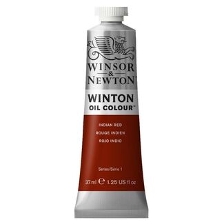
Art Shed’s Oil Paints by Colour collection exists for artists building palettes with intention. Organised by colour family, the range makes it easier to hunt down specific pigments, glazing colours, Australian earth tones, and professional favourites from brands like Art Spectrum, Winsor & Newton, and Matisse without tearing apart twelve different oil sets in the process.
Build Your Signature Palette with Individual Oil Tubes
Most experienced oil painters eventually abandon the “random assortment starter set” phase and begin assembling palettes with the precision of a wizard preparing potion ingredients before battle.
Every colour starts serving a purpose. Portrait painters gravitate toward earthy reds, ochres, and subtle flesh tones. Landscape artists chase atmospheric greens and moody sky blues. Abstract painters often collect pigments intense enough to start a small revolution the second they hit the canvas.
Shopping by colour also reveals how differently pigments behave across brands. Some ultramarines glaze softly across the surface; others arrive thick and commanding.
Certain colours dry faster, some overpower mixtures instantly, and a few exist purely to humble artists who thought they understood colour mixing five minutes earlier. Building a custom palette means learning which pigments actually belong in your creative arsenal instead of settling for whatever happens to come bundled in a box.
Understanding Pigment Characteristics and Colour Families
Every pigment family carries its own strange personality onto the canvas. Earth colours feel grounded and dependable in mixtures, creating natural shadows and warmth that sit beautifully inside portraiture and landscape work. Quinacridones glow through transparent glazes like stained glass under sunlight, while Phthalos arrive with enough tinting strength to dominate an entire mixture after the tiniest tap of their natural-hair brush imaginable.
Opacity changes the game entirely, too. Opaque colours create strong coverage and bold structure, while transparent pigments allow light to pass through layered glazes and create depth gradually over time. It’s part chemistry, part instinct, and part standing two metres back from the easel, squinting dramatically at your painting like a Renaissance master trying to decode a prophecy.
FAQs
Can I buy individual oil paint colours, or do they only come in sets?
Absolutely. Art Shed stocks individual oil paint tubes across a huge range of colours, pigment families, and professional brands.
What are the "must-have" basic oil colours for a beginner’s palette?
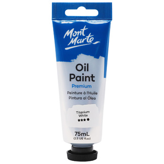
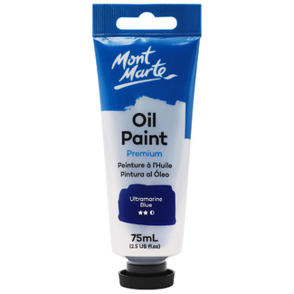
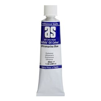
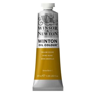
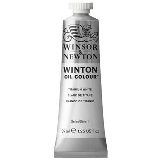
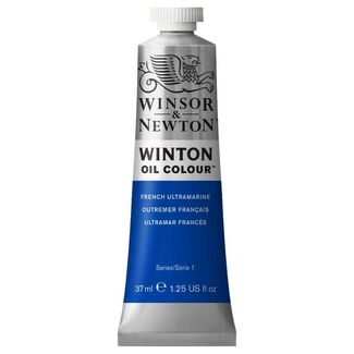
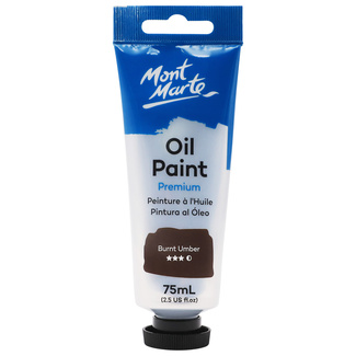
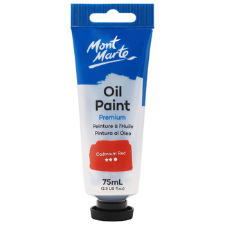
Many artists begin with Titanium White, Ultramarine Blue, Cadmium Red, Yellow Ochre, and Burnt Umber for a flexible foundational palette.
Why do some oil colours cost more than others? (Explain series pricing based on pigment rarity).
Certain pigments are rarer, more difficult to manufacture, or naturally more expensive, which affects the paint’s series pricing.
Which oil colours are most transparent for glazing techniques?
Transparent pigments like Quinacridones, Alizarin Crimson, and Phthalo colours are popular for glazing techniques and layered luminosity.
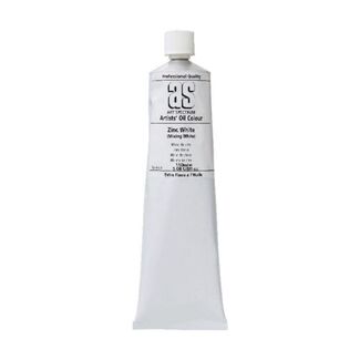
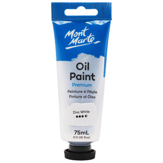
How do I choose between different whites, like Titanium White and Zinc White?
Titanium White offers strong opacity and coverage, while Zinc White is softer and more transparent for subtle mixing and delicate glazing work.