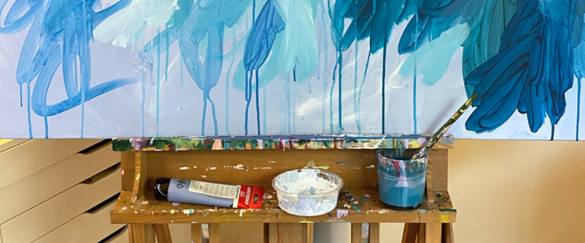


How to Paint Your Own Large Statement Canvas
Author: The Art Shed Team Date Posted:20 July 2026
Walk into just about any homewares store, gallery or design space at the moment and you'll notice something pretty quickly: bigger artworks are everywhere. Instead of filling a wall with lots of smaller pieces, more people are choosing one large painting that becomes the focal point of the room. And honestly, we can see why.
For artists, that's exciting news. Whether you're painting for your own home, taking commissions, selling at markets or building a gallery portfolio, learning to paint on a larger canvas is a skill that's well worth having.
That said, making the jump from an A3 canvas to something a metre wide can feel a little intimidating. It's rarely because you don't know how to paint. It's usually because you're wondering where to start, how much paint you'll need, or whether you'll accidentally end up with a giant muddy mess. (We've all been there.)
The good news is that painting big isn't about completely changing the way you paint. It's about using the right materials, thinking a little differently about composition, and picking up a few techniques that make working on a larger canvas much easier. In this guide, we'll walk you through everything you need to know, from choosing the best paints and brushes to practical tips that help you paint with confidence on large canvases.
Jump To Section
• Why are large canvases trending? Maximalism, TikTok and the death of the gallery wall • Why oversized art is the defining home trend of 2026 • What makes painting big different to painting small? • What size canvas should you use? • The best paints for large-scale canvas work • 2026 colour palettes for oversized abstract art • Step-by-step: paint a large abstract canvas (beginner method) • Hang it and step back • Large canvas painting FAQs
Where this trend actually came from: maximalism, TikTok and the death of the gallery wall
Minimalism had a good run. For the best part of a decade, home interiors leaned on restraint: one accent wall, a few muted cushions, and a gallery wall spaced with the precision of a spirit level.
Now, colour, texture and personality are creeping back in. Pinterest trend forecasts and social platforms have helped push maximalist interiors into the spotlight, but rather than filling every available surface, many people are choosing one oversized artwork to do the heavy lifting.
It makes sense. Modern homes often have large, open living spaces and equally large blank walls. A collection of smaller pieces can sometimes look lost above a long sofa, dining table or bed, while one big canvas anchors the furniture, creates a focal point and brings colour into the room without adding more visual clutter. Maximum impact, minimum dusting.
Large abstract paintings work especially well because they add movement, texture and mood without needing to match the room too literally. They also photograph neatly on platforms like TikTok, Instagram and Pinterest, where one bold focal point tends to read more clearly than nine frames, nine reflections and one suspiciously crooked print.
That doesn’t mean small artworks or gallery walls are over. It simply means more people are looking for one confident statement piece that can finish an entire room and for artists, that makes learning to work on a larger canvas a skill worth having.
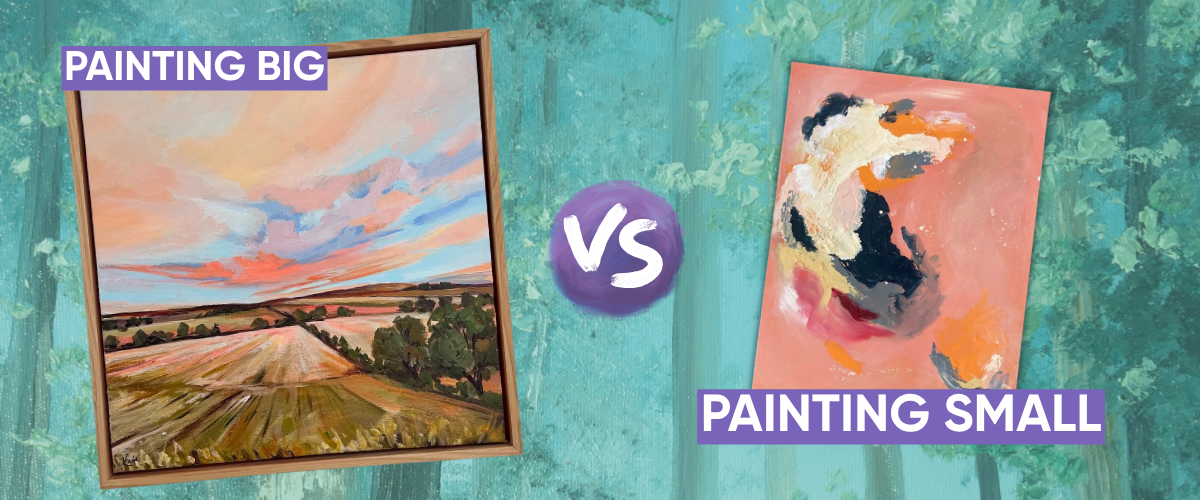
What makes painting big different to painting small?
The biggest misconception about large-scale painting is that it demands more skill. It doesn't. It demands different tools and slightly different thinking, and once that clicks, it works in your favour.
1. Your brushes need to scale up too
A small detail brush that behaves beautifully on an A4 sketch will fight you across a metre of canvas. You'll be reloading it every few seconds, and the strokes will look thin and nervous against all that empty space, a bit like turning up to paint a house with a set of nail art brushes.
This is where a set like the 3pc Abstract Expression Taklon Paint Brush set earns its name. They're built for exactly this kind of loose, gestural mark-making, and they're also sold individually if you'd rather build your own kit one size at a time. For covering large flat areas, the Mont Marte Taklon Flat Wide 50mm brush does most of the work on its own, and a large roller is worth having on hand for blocking in big background sections before you get into any detail at all. If you want to go a level up in quality, our Neef range covers an enormous span of sizes and bristle types, from soft synthetics to stiff hog bristle, so there's a Neef brush for almost any large-scale technique you land on. A palette knife or two rounds out the kit nicely for texture and any sharper accent marks.
2. You're working in zones, not details
Large abstract and gestural work is built around blocking in the big shapes first, then refining, rather than working one small area to completion before moving on.
Tip from the Shed: Photograph your canvas on your phone as you go. Shrinking a large piece down to a small screen instantly shows you whether the composition is balanced, because your eye reads a photo all at once, the same way it reads a small canvas, rather than getting lost in one corner up close. |
3. Composition mistakes get amplified at scale
A wonky line that's invisible on a small canvas becomes very visible at a metre and a half. A couple of ways to catch this before it becomes a problem:
Try the grid method. Divide your reference (or your canvas) into a simple grid, then work one square at a time, checking shapes and placement against the corresponding square in your reference. It sounds fussy for something meant to look loose and abstract, but it's really just a scaffold, one you take down once the composition's locked in.
Or just squint. Squinting blurs out the fine detail and leaves you with the main shapes and value blocks, which is genuinely all you need to map out at this stage. Think of it like a paint by numbers: block in the big shapes first, worry about detail later.
Tip from Teal, the Shed Team: Your painting should honestly look a bit ugly for most of the process, and that's fine. Unless you're painting like it's going on the ceiling of the Sistine Chapel, most paintings aren't actually as “detailed” as they look. Nobody paints every individual glint of light in something sparkly. Your eye fills in the gaps on its own, so loose blocking and loose detail reads as far more finished than it feels while you're doing it. |
More contrast beats not enough, almost every time. If you're not sure your values are working, take a photo of your painting and your reference, switch both to black and white, and compare them side by side. Colour can trick your eye, but a black and white photo won't lie to you about whether your darks are actually dark enough.
And if scaling up a smaller sketch is the part that's stopping you, an Artograph LED Tracer will project your drawing straight onto the canvas at whatever size you need, so you're tracing rather than eyeballing proportions from scratch.
4. Priming properly is non-negotiable
Skipping gesso, or only applying one thin coat, is one of the most common and most avoidable mistakes on a large canvas. An under-primed surface absorbs paint unevenly, which shows up later as patchy, dull sections exactly where you don't want them on a piece meant to be the room's focal point.
Common mistakes to watch for
Trying to blend the whole canvas in one sitting. Acrylic starts setting up within minutes, and a large surface takes far longer to cover than you'd expect, so working section by section keeps your base layer even rather than patchy.
Underestimating how much paint you need. Large flat areas eat paint fast, and running out mid-blend on a big wash is an annoying way to find out.
Not stepping back often enough. Working up close the whole time is the fastest way to lose the overall composition, literally.
Using paint that's too thin for the effect you're after. Bold, maximalist work relies on confident, opaque colour, which a thick, high-pigment acrylic delivers far more easily than a runnier student-grade paint.
Judging the piece before it's dry. Acrylic darkens and flattens slightly as it cures, so a colour that looks a touch too intense while wet often settles beautifully once fully dry.
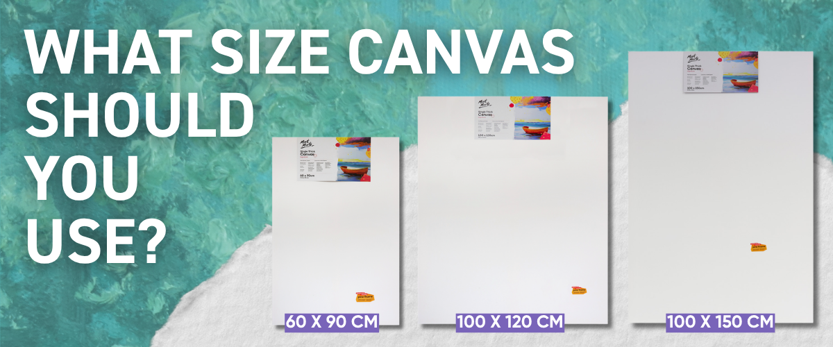
What size canvas should you use?
The two-thirds rule is the easiest way to avoid a canvas that looks lost, or one that swallows the room whole. Measure your sofa's width and aim for roughly two-thirds of that as your canvas width. It's not a strict law, more a starting point for when you're staring at a wall trying to picture what "big" actually means in centimetres.
Here's a quick canvas size chart for the most common large canvas sizes and where they suit:
Canvas Size Chart
| Size | Best for |
|---|---|
| 60 x 90cm | A smaller wall, a narrower hallway, or a first attempt at painting large without fully committing |
| 90 x 120cm | The sweet spot for most standard living rooms, roomy enough to practise working in zones |
| 100 x 150cm+ | A genuine statement piece for longer walls, staircases, or high ceilings, the size that gets photographed for a room tour |
So which canvas should you actually go for?
If you're just testing an idea, or seeing whether you even enjoy painting at this scale before spending more, we'd point you toward Mont Marte Discovery Canvas. It's our most affordable, pre-primed option, and a generally sensible low-stakes way in.
|
Tip from the Shed: Give it an additional coat or two of gesso before you start. The priming on budget canvases is great for most things, but a metre of canvas is exactly where that extra coat is really worth it. |
If this one's going up in your own living room and you want something solid and dependable, Mont Marte's Signature range is where we'd point you. Signature Single Thick has an 18mm frame and is the everyday standard, reliable, well-primed, and available in enough sizes to cover almost any wall.
But it's the Signature Double Thick that's our most sought-after canvas, and for good reason. That deeper 38mm frame gives it real presence off the wall, skips framing altogether, and holds its tension noticeably better over time than a slimmer canvas does, which matters more than people expect once a large piece has been sitting on a wall through a few Australian summers. It's the one our customers come back for again and again, and it's usually our first recommendation for anyone painting a large piece for their home.
And if this piece is headed for a client, an exhibition, or your own gallery stock, we'd steer you toward the top end of our Mont Marte canvases instead: Professional or Artiste Linen. Professional steps up to a heavier 380gsm cotton over kiln-dried timber frames, giving you superior tension and a surface that holds up to serious studio work without the tension sagging over time. Artiste Linen goes further again, 450gsm natural Indian linen, diamond-braced frames and gallery-folded corners, the kind of surface usually reserved for exhibiting oil painters. Both are still firmly in Mont Marte's affordable-but-serious territory rather than boutique fine art pricing, but it shows the moment someone's paying good money for the finished piece.
Stretched vs deep-edge vs canvas boards:
in plain terms: a standard stretched canvas is the most affordable option and suits most abstract work fine. A deep-edge canvas has stretcher bars thick enough to paint around the sides, so it's ready to hang, or sell, the moment it's finished, no framing needed. And canvas boards are the low-commitment way to try an idea before you commit to a bigger stretched canvas.
If you want to see the full picture before deciding, our canvas size guide breaks the whole range down by size, and our stretched canvases and canvas boards are both worth a browse too. But honestly, whatever you land on, it's a lot harder to get wrong than it feels standing in the canvas aisle.
The best paints for large-scale canvas work
At normal painting size, the difference between a $2 tube and a $30 tube is mostly a philosophical debate. At large scale, it's a real budget decision, because you're covering a genuinely bigger surface, and paint doesn't stretch any further just because you asked nicely.
So here's the shortcut.
If you're painting for practice or underpainting, reach for Mont Marte Signature or Liquitex Basics.
If you want a serious, professional-grade paint without a serious price tag, Mont Marte Dimension is your best friend.
If this piece is going to be sold, exhibited, or generally judged by someone other than your dog, Matisse Structure, Golden Heavy Body, Golden Open or Atelier Interactive are where the quality genuinely shows.
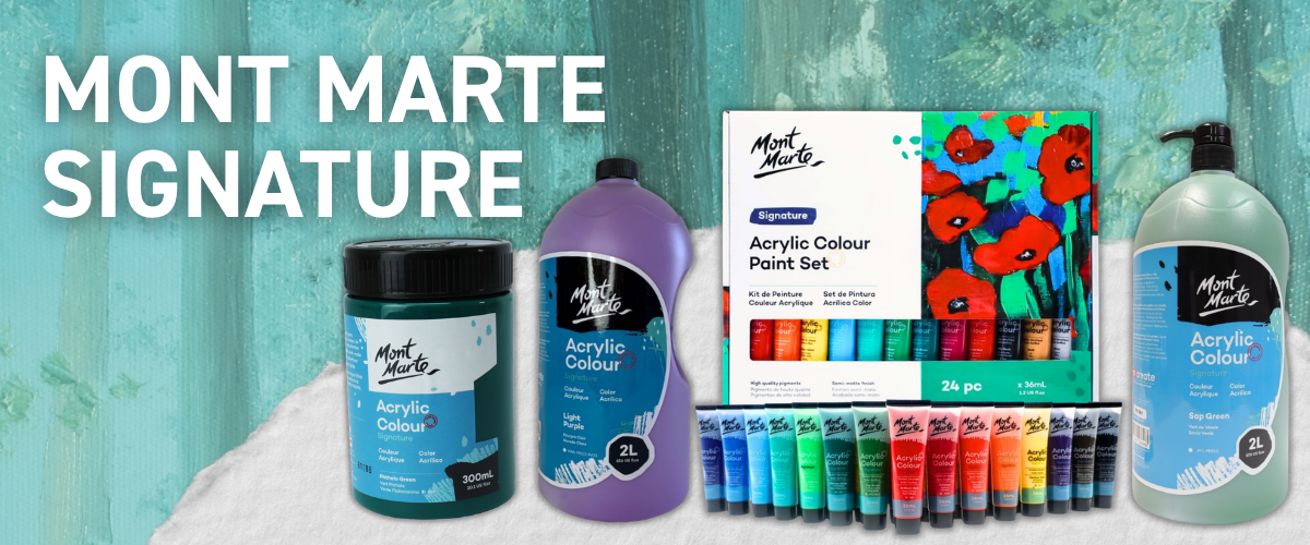
Mont Marte Signature
Mont Marte Signature is about as affordable as good acrylic paint gets, with small tubes priced at around $2.50 and larger one-litre options available for approximately $21.95. When you are staring down a large blank canvas, that affordability can make a genuine difference, particularly during the early stages when you need plenty of paint simply to establish the composition.
As a student range, it carries less pigment straight from the tube than a professional acrylic, but that can be exactly what you want for a base layer no one will ever see once the painting is complete. It lets you mass out the background, test colour placement and build the first few layers without spending your entire paint budget before you reach the areas that actually need premium colour.
The larger sizes are particularly useful for colours you know you will use repeatedly, such as a dominant background shade, neutral mixing colour or the main tone running throughout the artwork. Instead of carefully rationing every brushful, you can work more freely and make larger, more confident marks.
For the strongest result, treat Mont Marte Signature as the practical foundation of the painting rather than expecting it to do every job. Use it generously for underpainting and broad coverage, then layer a more highly pigmented paint over the top for focal points, final highlights and areas where you need richer colour or better opacity. It is a smart way to balance cost and quality without compromising the parts of the painting viewers will notice most.
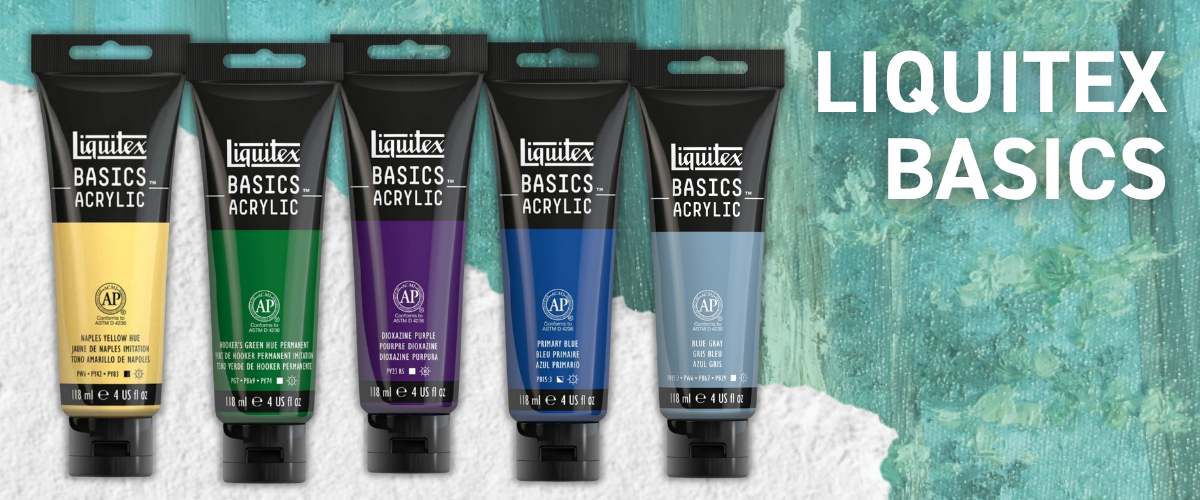
Liquitex Basics
Liquitex Basics earns its spot here for many of the same reasons large-canvas painters regularly reach for student-grade acrylics: generous tube sizes, an extensive colour range and a relatively accessible price for the amount of surface you can cover.
It also tends to move a little more freely than some thicker student-range paints, which makes it a natural fit for underpainting large areas quickly. You can use it to establish the composition, map out major colour zones and cover the white of the canvas without wasting a premium paint on layers that will eventually be hidden.
The smoother consistency is also helpful when working with larger brushes, as it spreads across the surface without needing as much water or medium to loosen it. This can make the early stages of a large painting feel faster and less physically demanding, particularly when you are working across broad backgrounds or repeating colours throughout the piece.
While it may not have the same concentration, opacity or texture retention as a professional heavy-body range, that does not make it the wrong choice. It simply makes it better suited to a different stage of the painting. Use it for underlayers, colour blocking and general coverage, then introduce a more pigment-rich or textured paint where you need stronger opacity, depth or visual impact.
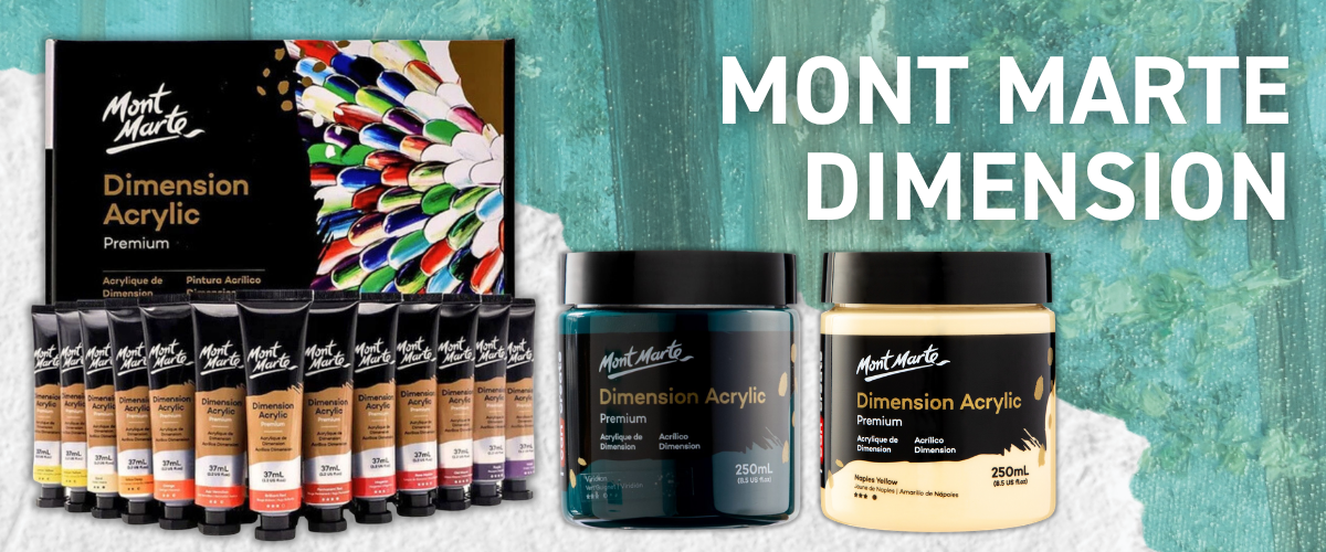
Mont Marte Dimension
Mont Marte Dimension is the standout in this tier, and arguably the best value paint on this entire list.
At around $6.95 for a 75ml tube, it's a genuinely high-viscosity, premium acrylic, thick enough to hold a palette knife mark and pigmented enough to look considered rather than cheap. This is exactly why it's such a popular choice among commission and working artists for large pieces: block in the bulk of a big canvas with Dimension, then bring in a pricier paint for the top layers or fine detail where the extra cost actually shows. Nobody examining the finished piece is going to know (or care) which paint did the heavy blocking underneath.
Dimension also has a history as a finishing layer, not just a base one, plenty of artists paint an entire large piece in it and it holds up well. One thing worth a quick check first: like most ranges, individual pigments vary slightly in lightfastness even within the same line, and each tube carries its own star rating for exactly this reason. Here's a quick guide on reading that rating before you buy.
mixing paint tiers within a single piece is completely normal, using something more affordable for 80% of a large canvas and a premium paint for the last 20% isn't cutting corners, it's how a lot of working artists manage a large piece.
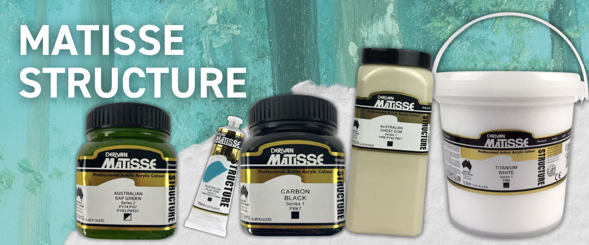
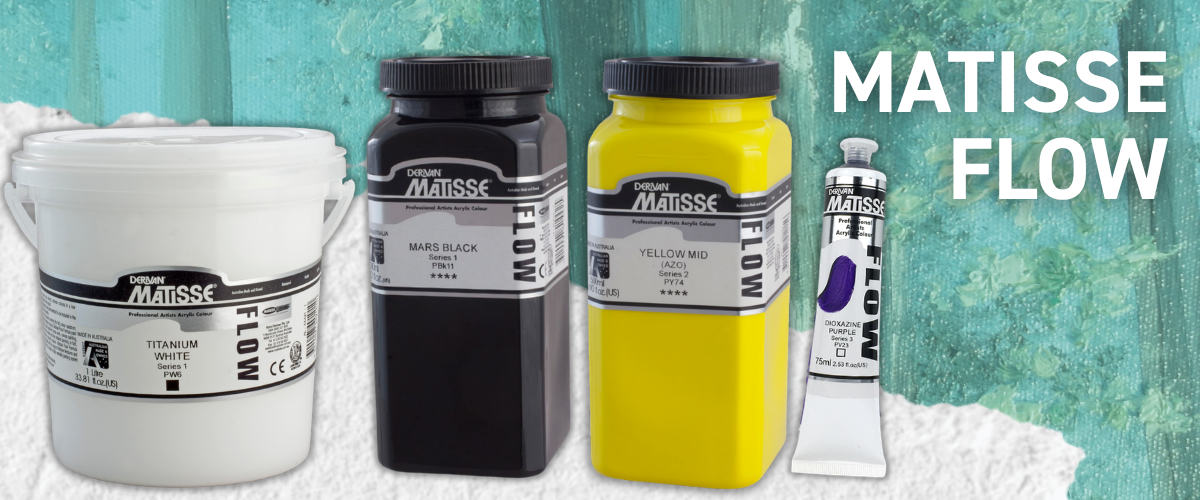
Matisse Structure & Matisse Flow
Matisse Structure and Matisse Flow are both made by Derivan here in Australia, and between the two of them they cover almost everything you could want from an acrylic painting range. They share the same professional-quality approach to colour, but their very different consistencies make them useful for completely different parts of a large painting.
Matisse Structure is the thick, buttery, impasto option, designed for palette knife work, sculptural texture and bold brush marks that hold their shape. On a large canvas, that body helps visible strokes retain their impact from across the room rather than flattening into the surface. It is ideal for textured focal points, expressive mark-making and anywhere you want the physical movement of the paint to become part of the finished artwork.
Matisse Flow is thinner and more free-flowing, making it better suited to smooth blending, fine detail, glazing or broad areas where you want the colour to glide rather than sit in raised ridges. It moves easily across the canvas and can help you cover larger sections without constantly fighting against a stiff paint.
The real advantage is that the two ranges can be used together. Flow can handle backgrounds, washes and smoother passages, while Structure adds weight, texture and definition over the top. That combination gives you the flexibility to create contrast across a large canvas without having to force one paint consistency to do every job.
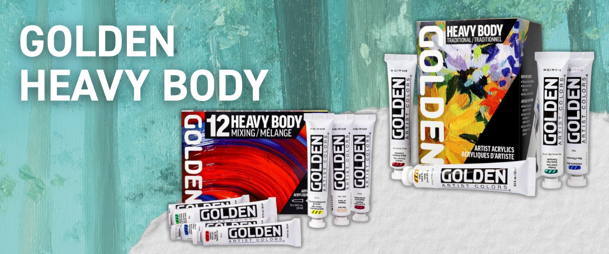
Golden Heavy Body
Golden Heavy Body is the American answer to Matisse Structure: thick, buttery and famously free of fillers or opacifiers, so what you’re paying for is genuinely pigment-rich colour. It holds peaks, ridges and palette knife marks beautifully, making it an excellent choice for large canvases where texture needs to remain visible from across the room.
The dense consistency also gives you plenty of control. You can build bold impasto passages, create defined brushwork or spread it across the surface without the paint immediately flattening out. Despite its weight, the colour remains rich and clean rather than looking artificially bulked out, which is especially valuable when working at scale and using large areas of a single colour.
It is a premium option, but a little can go a long way when used strategically. Many artists reserve Golden Heavy Body for textured focal points, visible brushwork and high-impact sections, then pair it with a more fluid or affordable paint for backgrounds and broader coverage.
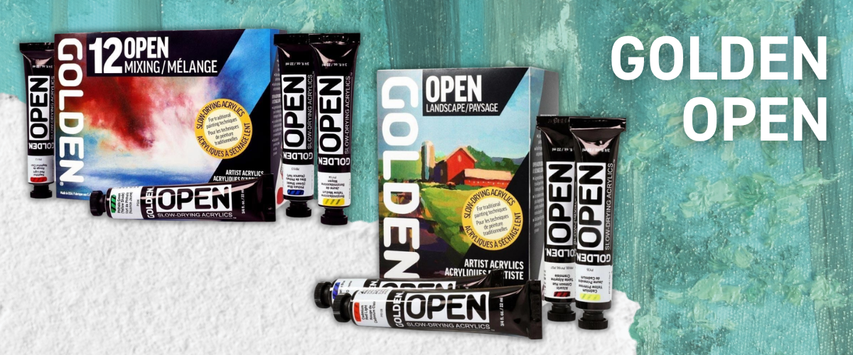
Golden Open
Golden Open solves a different problem entirely. It is formulated to stay workable for far longer than a standard acrylic, sometimes hours rather than minutes, which opens up the kind of soft blending, gradual transitions and wet-on-wet techniques that acrylic paint can normally make difficult.
That extra working time can be especially helpful on a large canvas, where you may need longer to blend across a wide sky, soften the edges of a portrait or create a smooth transition before one side begins drying ahead of the other. Rather than rushing to beat the paint, you have more time to step back, adjust the composition and work the colour until it feels right.
The trade-off is that it may not deliver the same immediate opacity and heavy pigment feel as a traditional heavy-body acrylic, so many artists use it selectively rather than across the entire painting. You might block in the composition with a faster-drying, more affordable paint, then bring in Golden Open for the sections that genuinely need extra blending time. It is less about covering the whole canvas and more about giving you control exactly where standard acrylic would usually dry too quickly.
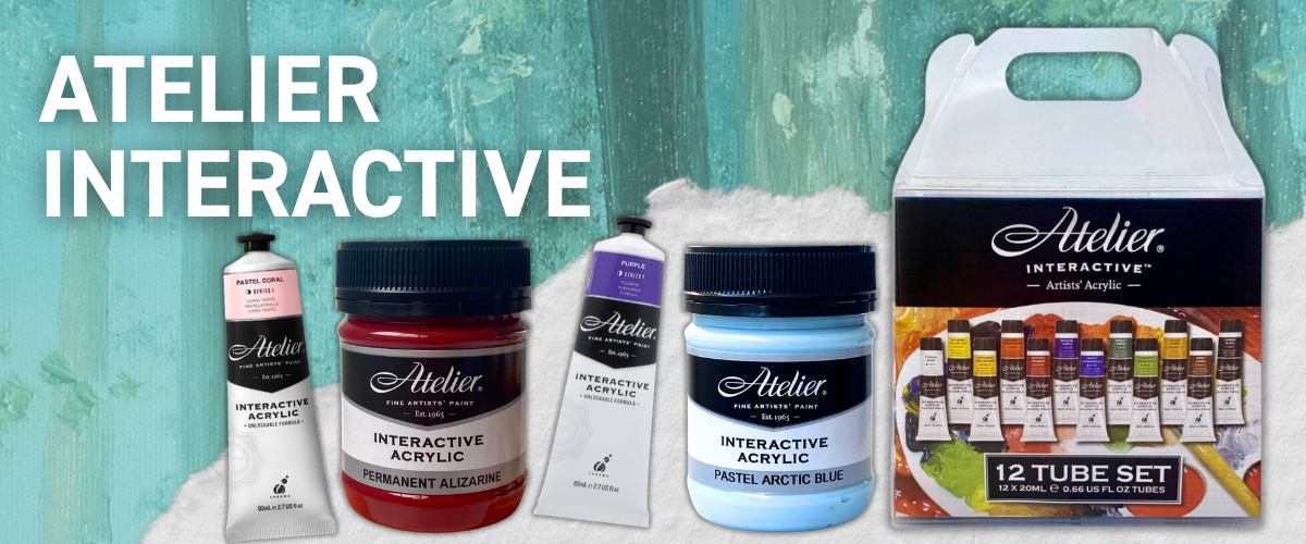
Atelier Interactive
Atelier Interactive does something similar, and arguably suits a large canvas even better. It's widely considered one of the acrylics that behaves closest to oil paint, and unlike Golden Open's slow-drying approach, it stays rewettable with water even after it's touch-dry, so you can reopen and rework a section well after the fact rather than racing a drying clock from the start. On a canvas this size, that reworkable window matters enormously.
|
“I found working with acrylic on a large painting a lot harder than I expected. It's such a big space that trying to blend and layer it all at once just isn't realistic, so working in smaller sections helped me enormously. Getting a solid, even base layer down was honestly the hardest part.” — Sarsha, Art Shed Team |
It's a completely normal hurdle, and one paints like Atelier Interactive and golden open is genuinely built to solve. Their unique formula means you're not racing the clock the way you would with a fast-drying student acrylic, and working section by section, exactly as Sarsha did, is the easiest way to keep a large base layer even.
Quick Comparison Table
| Paint | Consistency | Best used for |
|---|---|---|
| Mont Marte Signature | Thin, light pigment | Underpainting, practice, base layers |
| Liquitex Basics | Medium, fluid, huge colour range | Underpainting, covering large areas affordably |
| Mont Marte Dimension | Thick, high pigment | Bold blocking, base layers, or the whole piece |
| Matisse Flow | Thin, free-flowing, highly pigmented | Blending, fine detail, smooth application |
| Matisse Structure | Thick, buttery, impasto | Texture, palette knife work, exhibition pieces |
| Golden Heavy Body | Thick, pure pigment, no fillers | Maximum texture, professional finish |
| Golden Open | Soft, very slow drying | Extended blending, oil-like technique |
| Atelier Interactive | Medium-thick, rewettable | Large-scale blending, oil-like depth |
Don't forget the supporting cast either, gesso to prime properly, a medium if you want to adjust flow or texture, and a varnish to seal the piece once it's fully cured.
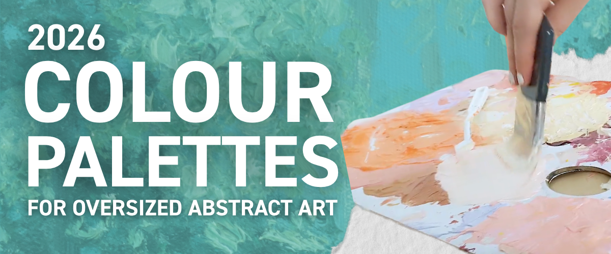
2026 colour palettes for oversized abstract art
Picking a palette before you start, rather than deciding colour by colour as you go, is one of the simplest things you can do to make a large piece feel finished rather than experimental. Three palettes to work from, each suited to a different room or a different buyer.
Earthy neutral. Warm terracotta, soft sage green, warm cream and a touch of burnt sienna. This is the safest, most liveable option, the kind of palette that suits almost any room and almost any client who wants "something big and beautiful" without much more direction than that.
Dopamine brights. Teal, mustard yellow and coral. Bolder, more maximalist, and a strong choice if this piece is meant to be the obvious focal point rather than a backdrop. If you're building a recognisable style to sell under, this palette tends to be the one people remember.
Quiet luxury. Off-white, charcoal and a soft metallic gold accent. Understated, a little chic, and especially effective on a deep-edge canvas with no frame competing for attention. This is the palette that photographs beautifully for a gallery listing or a styled interiors shot.
Within Dimension, Structure, Flow, or whichever range you've landed on, look for these hues by name and don't be afraid to mix your own in-between shades. Three or four colours per piece is usually the ceiling before a large abstract starts feeling muddy rather than considered, more isn't always more, no matter what the maximalists say. (Our artist used about 15 colours on her 30x30cm test piece and can personally confirm this rule exists for a reason…)
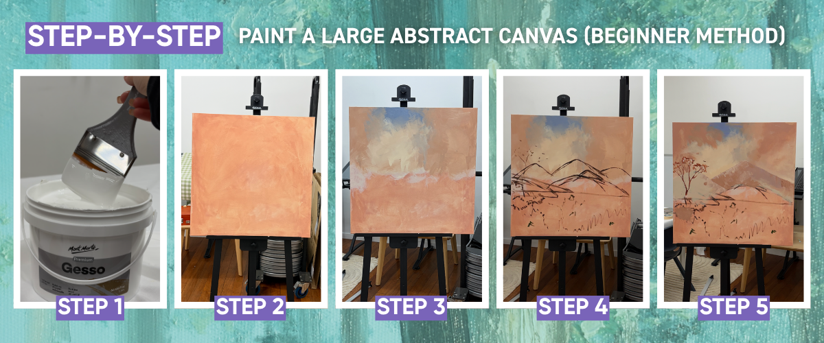
Step-by-step: paint a large abstract canvas (beginner method)
We didn't want to just tell you this method works, we wanted to actually test it. So our artist, who describes herself as a decent A4 sketcher and nothing more, picked up a 30 x 30cm canvas and painted an abstract Australian landscape from scratch to see whether the technique, and the paint choices, held up for someone with no real large-scale experience. Here's exactly what she did.
Prime and tone the canvas. Start with a coat of Mont Marte gesso, fully dried. Then, instead of starting on stark white, tint the whole canvas with watered-down Atelier Interactive in Burnt Sienna. This is a proper technique, not a shortcut, painters have used a toned ground for centuries because it gives you a warm, mid-tone base to work from rather than fighting bright white the entire time.
Mix one base colour, then build a family from it. Rather than mixing every colour from scratch, Sarsha mixed a single warm beige first, white, burnt sienna, a touch of purple and yellow ochre, then used that beige as the starting point for everything else. Adding blue to the beige gave a soft, dusty sky colour. Adding more burnt sienna and a touch of red gave a warm orange. Because every colour shares that same beige base, they all sit together naturally instead of fighting each other, which is a genuinely useful trick for keeping a large, loose piece feeling cohesive.
Rag on the sky. Using a rag rather than a brush, work the blue and orange into the sky in loose, dabbed patches to build up a soft cloud texture. This is where things got genuinely tricky. Blending a sky-sized area smoothly, without it turning muddy or patchy, was the hardest part of the entire painting, which tracks with everything we said earlier about working in sections rather than trying to blend a large area all in one go.
Block in your main shapes. Rough in the background mountains and a single tree shape using your base colours, just simple silhouettes at this stage, nothing detailed.
Add light and shadow to the mountains. Mix a purple for the shadowed side and a coral-peach for the lit side, echoing the way distant mountains actually look under an Australian sunrise, cooler and hazier on one side, warmer where the light catches. Apply both loosely with a palette knife, scraping rather than smoothing, so the texture stays a little rough and atmospheric rather than airbrushed.
Build the fields. Mix a few greens and olive tones, plus brighter accents in pink, yellow and red, and apply them loosely with a large expression brush in a fluffing, dabbing motion rather than long strokes. This is what gives a field texture and life instead of reading as a flat green block.
Finish the tree. Paint the tree itself in your base beige, add the peach for shadow, then switch to a small palette knife loaded with green and dab it on to suggest individual clusters of leaves without painting each one.
Paint choice, in practice: Dimension and Atelier Interactive were used together throughout, Dimension for its body and texture, Atelier for its rewettability whenever an area needed reworking. Mixing the two ranges on the same canvas worked well.
.png)
A few practical things worth stealing from this test run:
Mix more paint than you think you need. Running out mid-blend on a large area is genuinely frustrating, and it's far easier to have too much than not enough.
Don't waste the leftovers. Scrape any extra paint onto a stay-wet palette rather than binning it, it'll still be usable next session.
Use a flow medium for thinner areas. Mont Marte Flow Medium is worth having on hand for any section where you want the paint to move more freely without thinning out the colour itself.
Keep a misting spray bottle nearby. A light mist keeps paint workable on the palette for longer, which matters a lot once you're mixing colour families rather than single tubes.
Our Artists honest verdict: decently happy with the final piece, though she'd turn the lights on next time, working it out in dim lighting made some colour decisions harder to judge than they needed to be.
The other genuine challenge was scaling up itself. Being comfortable sketching at A4 didn't translate automatically to composing confidently at a larger size, which is exactly why the grid method and the Artograph LED Tracer mentioned earlier exist, they're not just for people who "can't draw," they're for anyone whose hand and eye are calibrated to a sketchbook rather than a canvas standing on the floor.
Want to watch someone actually paint one of these?
Reading the steps is one thing, watching the layers actually go on is another. Tom, one of our in-house artists, put together this walkthrough of painting an abstract landscape that follows the same spirit as the method above, toned ground, loose colour blocking, building light and shadow with a palette knife, so you can see the technique in motion rather than just picture it.
Hang it and step back
Once your canvas has cured, hang it somewhere it can actually breathe. A large piece needs enough clear wall space around it to read as the room's focal point, not just a big thing squeezed between the bookshelf and the doorframe. A picture hook rated for the canvas's weight is all you need, and if you went with a deep-edge canvas, you can skip framing altogether.
And if a full canvas still feels like a bigger first step than you're ready for, our Paint by Numbers range is a gentler way in
Ready to start? Shop large canvases, Mont Marte Dimension, Satin and Atelier Interactive acrylics, and everything else on this list SHOP NOW. Whatever you paint, it'll almost certainly look better on your wall than a print ever could, if only because you'll actually know what's underneath it.
Large canvas painting FAQs
Is it hard to paint a large canvas?
No. If anything, it's more forgiving than small-scale work. Bigger brushes and broad blocks of colour hide small imperfections, and the main skill is learning to work in sections and step back often.
What size canvas should I paint for above my sofa?
Aim for roughly two-thirds the width of your sofa. For a standard three-seater, that's typically 90cm to 120cm wide.
What kind of paint is best for a large canvas?
A thick, heavy-body acrylic like Mont Marte Dimension for texture, bold blocking and cost-effective base layers, or Atelier Interactive where you need longer working time to blend and a more oil-like finish.
How much paint do I need for a large canvas?
As a rough guide, budget one 250ml pot per colour for a canvas around 100 x 150cm with two to three colours, more if you're building heavy texture with a palette knife.
Do I need to prime a canvas before painting?
Yes. Two to three thin coats of gesso, left to dry between coats, gives you an even surface and better paint coverage, especially at large scale.
What's the easiest style to paint on a big canvas?
A simple colour-field composition, two or three flat blocks of colour with one textured accent, is the most forgiving starting point for a first large canvas.
How do I scale up a small sketch onto a large canvas?
Use the grid method (divide both your reference and canvas into matching squares and map shapes across one at a time), or use a projector-style tool like the Artograph LED Tracer to project your sketch straight onto the canvas at the size you need.
How long does it take to paint a large canvas?
Longer than a small one, unsurprisingly, but a simple colour-field composition is genuinely achievable in an afternoon. More detailed or heavily blended pieces can take several sessions, largely because large areas take longer to cover and longer to dry between layers.
Is it cheaper to paint my own large art than buy a print?
Generally, yes. A large stretched canvas plus a few tubes of artist-grade acrylic typically costs less than a printed piece of the same size, and you end up with an original.
Is a large abstract canvas a good piece to sell as a commission?
Yes. Large abstract statement pieces are one of the most in-demand formats for commission and gallery buyers right now, since they suit modern open-plan interiors and let an artist charge a higher price point for roughly the same working time as several smaller pieces.
Keep reading
Mont Marte Canvas: Signature vs Premium, Single vs Double Thick
We covered the basics above, but if you want the full breakdown before you commit to a size and range, this is the one to read next.
What's the difference between different brands of acrylic paint?
A deeper dive into Dimension, Satin, Matisse, Golden, Liquitex and more, useful if you're still deciding what to reach for beyond this project.
How to fix a warped canvas
Large canvases warp more easily than small ones, more surface for humidity and tension to work against. Good to know before it happens, not after.