How to Avoid Muddy Colours in Your Acrylic Pour
How to Avoid Muddy Colours in Your Acrylic Pour
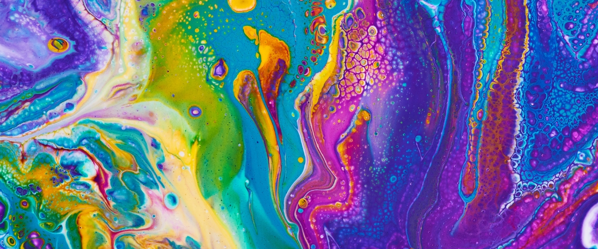
Acrylic pouring has become such a popular technique in the art world in recent years and you can achieve truly stunning results.
To learn all about how to make your own, visit our how-to blog ‘Create Fluid Art and Make Your Own Pouring Medium’ after you read our short guide below to achieve your best results.
Some fundamental guidelines to follow when it comes to the colours in your pours.
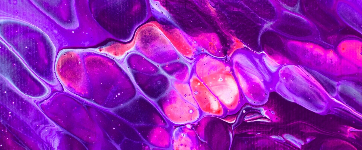
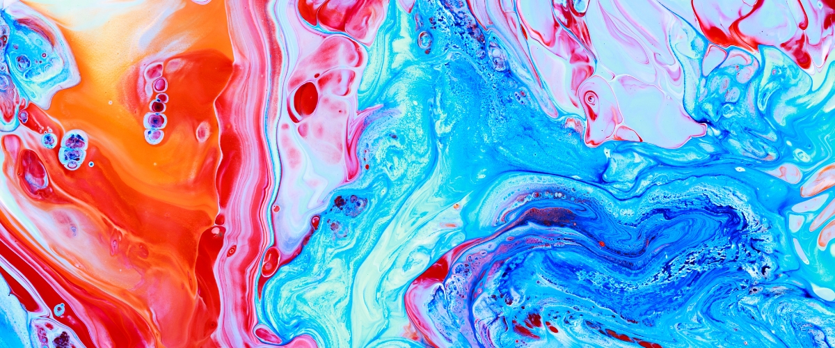
Acrylic pouring can produce beautiful bright, colourful works and magnificent marbled effects but there is a fine line when it comes to colour mixing and sometimes the waters (in the case of the paints) get muddied.
Understanding the form and colour of paint is so important particularly when mixing and blending.
Mixing paint is a perfect science that when done incorrectly, can produce less-than-perfect results.
We’ve come up with a 3-step guide to ensure your pours are picture-perfect every time and your colours are as vibrant as desired.
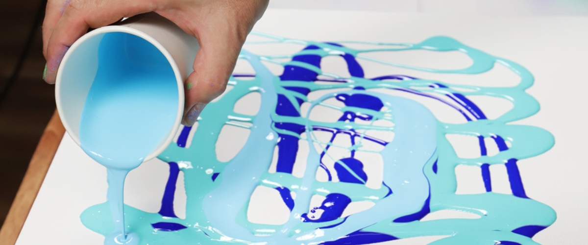
Paint Density
Preparing a pour is evaluating the density of your paints and determining your layers.
This beginning step is a very important one and often one that’s overlooked.
Did you know Paint and water share a similar rule?
Let us explain, think about water, if you drop a stone in water it will sink to the bottom, and the same goes for paint.
If you pour heavy-based paint on top of lighter-weight colours, it will drop like a lead balloon to the bottom and will in turn cause your other colours to become murky and mixed.
Generally speaking, metal-based pigments such as titanium, cadmium or cobalt have a heavier viscosity so should be your base layers.
Some brands do a range of low-viscosity paints such as Jo Sonja.
The Jo Sonja Acrylic Background Paint range is ultra-fluid across the entire colour range with no metal-based pigments; ideal for pouring techniques.
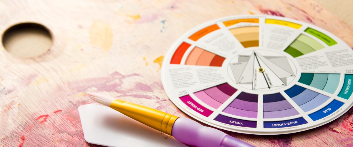
Colour Choice
This is probably the most fundamental step to avoid a muddy pour with one of the simplest solutions.
We’re going back to basics our old friend from school's art class, the colour wheel.
If you don’t own one of these bad boys I strongly urge you to grab yourself one because the powers of this nifty tool are not to be underestimated.
Mont Marte has a fantastic colour chart that rotates to show which colours mix well together and exactly what colour you can achieve, without breaking the budget. If your looking for a larger chart check out our range of charts.
Using a colour chart gives a description guide to explain how primary, secondary and tertiary colours are made.
Though the name may suggest, complimentary colours do not mix and will leave you with a muddy brown pool of paint.
This book takes the guesswork out and is a great reference and a solid investment.
Another thing to consider when it comes to coloured paints is your choice of brand.
All brands have unique formulas that contain ingredients and pigments that others may not so colours can differ.
To ensure your colours mix well, we recommend sticking to one brand.
Art Shed carries a range of great brands that have a specific paint range just for this Artwork, Mont Marte, Jo Sonja,
Matisse Flow Acrylic Paints or Matisse Fluid Acrylic Paints make for easy, colourful pours.
Paint Fluidity and Consistency
The fluidity of paint, also referred to as viscosity, is a big factor in unwanted colour mixing.
When adding your extender or medium try to aim for the consistency of pouring cream.
If it is too thick or too thin you may find it difficult to get a good fluid pour and flow of colours.
This comes down to not only your paint choice but your choice of medium as well.
A good combination with the aforementioned Matisse Acrylic Paints is the Matisse Self-Levelling Medium.
Another extender that achieves amazing results is Floetrol Acrylic Paint Conditioner.
Floetrol is a water-based paint conditioner that improves the flow and workability without sacrificing the integrity, colour or hold of the paint.
Even with the correct materials, producing the right consistency for you comes down to the old ‘practice makes perfect’.
It may take a bit of trial and error to get the perfect consistency for your canvas, materials and environment but as they say:
‘If at first, you don’t succeed, try, try again’ and have some fun doing it!
.jpg)
Now that you’re equipped with the fundamentals of pouring you’re ready to get started without fear of muddying your colours.
So, you may now scroll back up to the top and give the tutorial link a click.
As always, art is about enjoyment so get experimenting and have some fun.
If you create anything from our blog tutorials please share your work with us, we love to see our customer's creations!
If you have any topics you’d like to learn more about drop us a line with some blog suggestions.
Plus, don’t forget you can watch video tutorials on our YouTube channel https://www.youtube.com/user/artshedonline.
Happy creating!
F | @artshedonline I | @artshedonline