





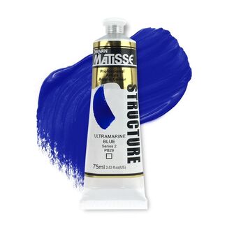
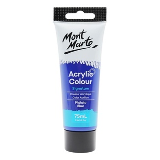
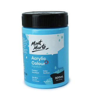
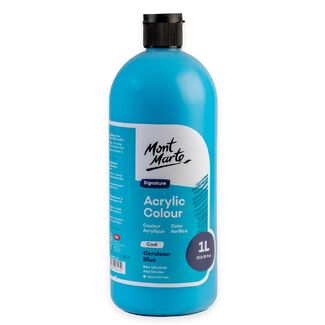
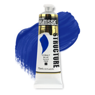
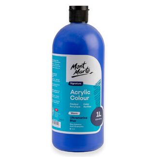
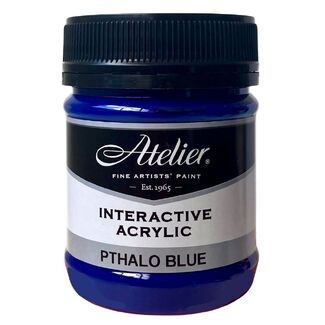
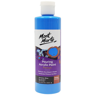

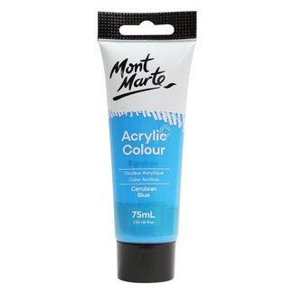
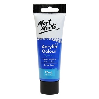
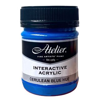
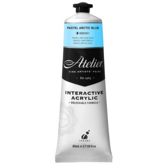
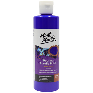
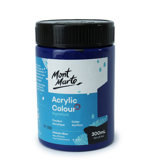
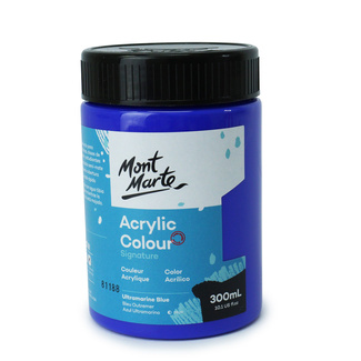
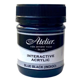
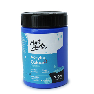
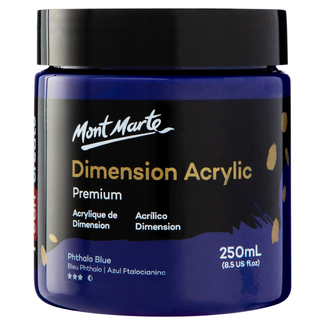
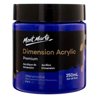
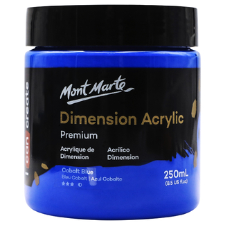
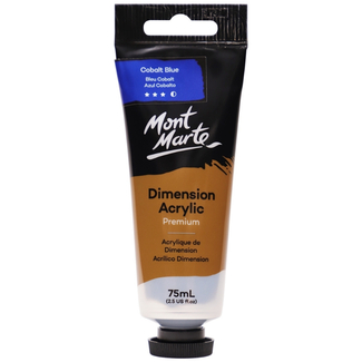
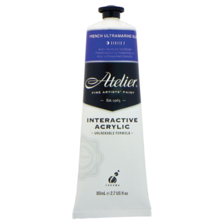
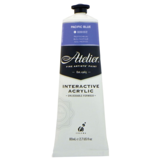
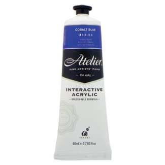
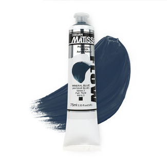
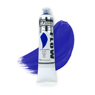
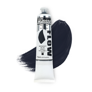
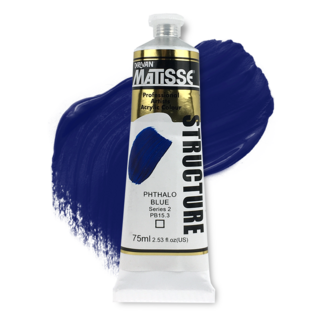
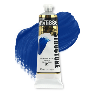
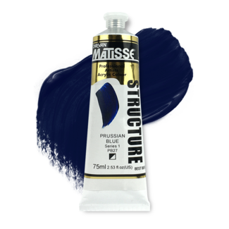
Not all blues behave the same way on canvas, and the difference isn't really about brand, it's about pigment. Four blues cover most of what artists reach for: ultramarine, phthalo, cerulean, and cobalt, and each one mixes, layers, and reads differently once it's down. Art Shed stocks 159 blue acrylic products across these pigment families, so the useful starting point isn't "which brand" but "which blue."
What's the difference between ultramarine, phthalo, cerulean and cobalt blue?
Ultramarine is a warm, reddish blue with excellent lightfastness and good transparency, but comparatively modest tinting strength, it takes more of it to shift a mix, which actually makes it easier to control when you're mixing purples or muted greens. Phthalo blue sits at the other end: a cool, green-leaning blue with very high tinting strength and strong transparency, meaning a small amount goes a long way and it's easy to accidentally overpower a mix with it. Cerulean blue is softer and more opaque, with a natural granulating quality that suits atmospheric, hazy effects rather than flat, saturated colour. Cobalt blue sits between ultramarine and cerulean in character, a true, mid-value blue, semi-opaque, often described as the closest single-pigment match to a clear sky.
None of these is the "correct" blue. They're different tools, and most painters who work seriously with colour end up keeping at least two on the palette, commonly ultramarine and phthalo, precisely because their opposite mixing behaviour covers more ground together than either does alone.
Which blue works best for skies and water?
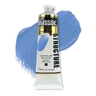
Cerulean and cobalt are the traditional choices for sky and open water, largely because their softer, more opaque character avoids the intensity that phthalo brings to a mix. Ultramarine mixed with white produces a workable sky blue too, though it leans warmer and more violet than a true cerulean. Phthalo blue is powerful in seascapes for deep, saturated water, but because of its strength, a little goes further than most beginners expect, a common mistake we see in-store is customers assuming they need to press hard or load the brush heavily with phthalo, when a small amount thinned into the mix usually gets there faster.
Mixing blue into other colours
Blue is one of the more useful colours on the palette precisely because of how differently each pigment behaves in a mix. Ultramarine plus a warm red produces confident purples; phthalo plus a warm yellow produces clean, natural greens that lean more vivid than ultramarine-based greens. Adding white to any of the four produces a different tint character, cerulean and cobalt lighten cleanly, while ultramarine's warmth becomes more apparent once diluted with white.
Frequently asked questions
Which blue acrylic paint should I buy if I only want one?
Ultramarine is the most commonly recommended single blue, since its warm undertone mixes well toward both purples and greens, and its lower tinting strength makes it more forgiving to control than phthalo.
Can blue acrylic paint be mixed to create other colours?
Yes. Blue is one of the primary mixing colours on the palette, producing greens with yellow, purples with red, and a wide range of greys and neutrals when mixed with its complementary orange.
Is acrylic paint suitable for beginners?
Yes. Acrylic dries faster than oil and cleans up with water rather than solvents, which makes it more forgiving for anyone learning colour mixing and brush handling for the first time.
What surfaces can blue acrylic paint be used on?
Acrylic paint works on canvas, wood, paper (at a suitably heavy weight), and most primed surfaces. It adheres less reliably to glossy or non-porous materials without a compatible primer.
Not sure which blue will get you the sky or seascape you're picturing? Send our team a photo of a reference image or a work in progress, and we can point you toward the pigment that'll get you there faster.