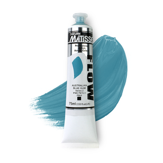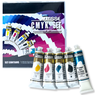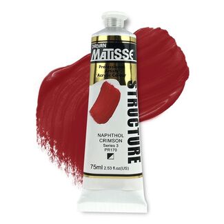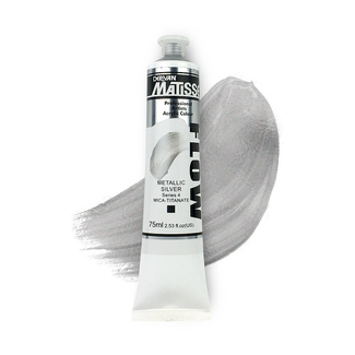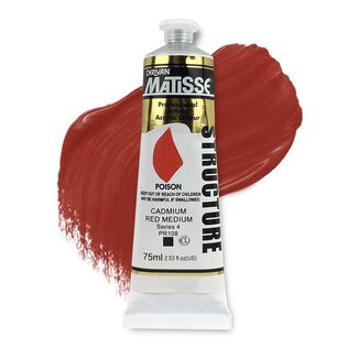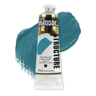


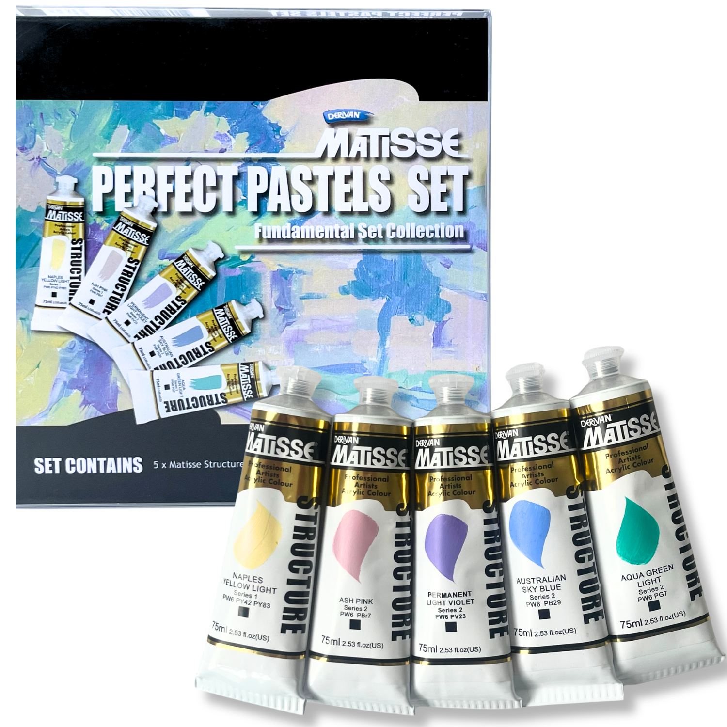
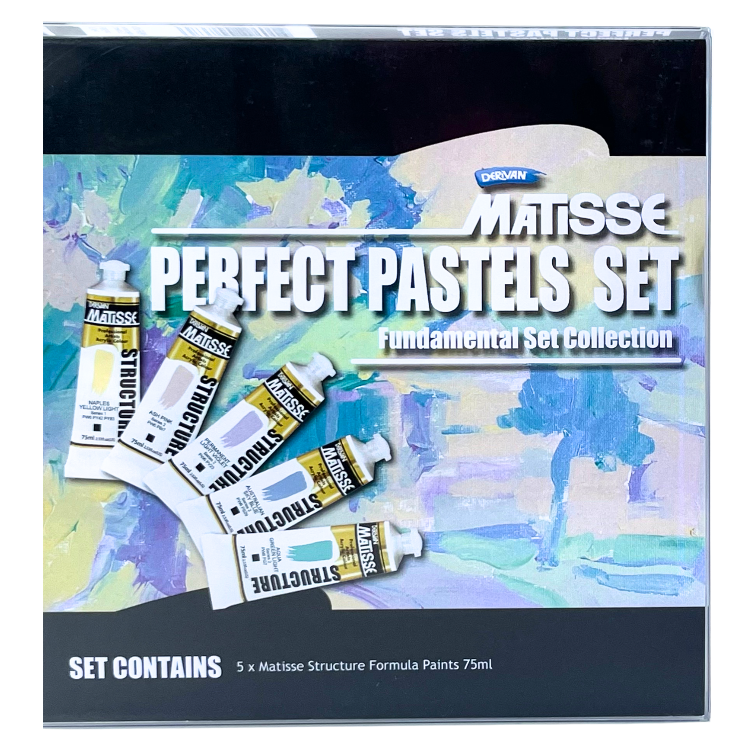
Matisse Structure Perfect Pastels Fundamental Set 5x75ml
Our everyday low price
or 4 interest-free installments of $16.24 with

Own it now, pay later

Matisse Structure Perfect Pastels Fundamental Set 5x75ml
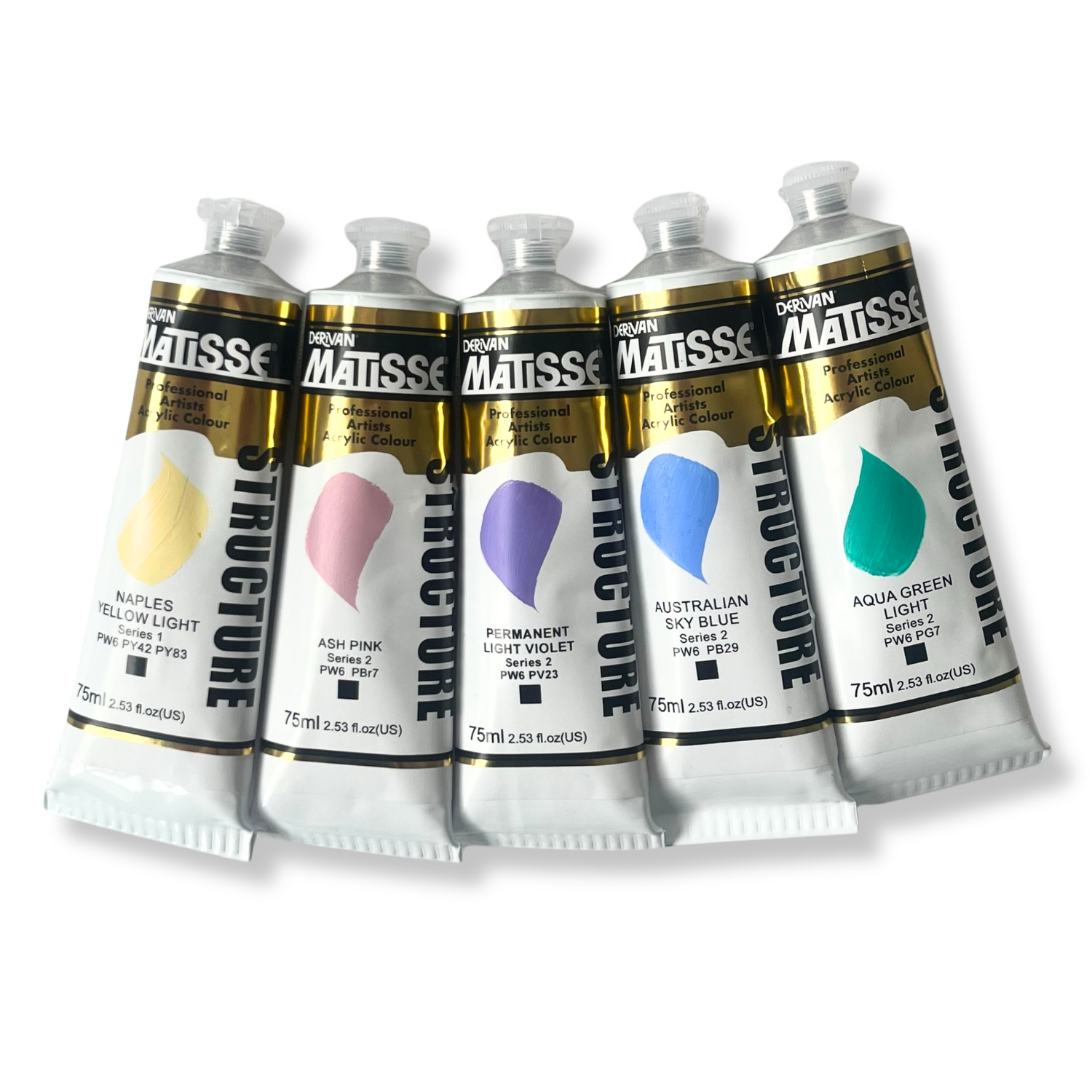
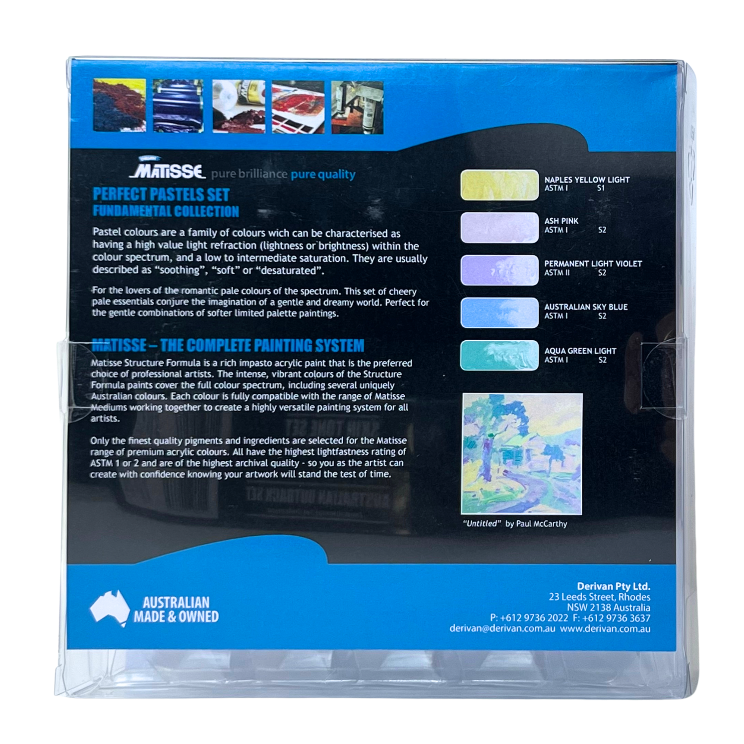
Pastels have a reputation for being gentle. They are, but they are not weak. Turner built his most atmospheric skies almost entirely from pale violets and muted yellows. Monet's water lily series is grounded in soft, close-toned tints. The pale end of the spectrum is where tonal painting lives, where light is rendered, and where most painters find they run out of the right colours at exactly the wrong moment. The Matisse Structure Perfect Pastels Fundamental Set provides five pre-mixed pastel tints that span the full colour wheel, from warm cream-yellow through muted pink, soft violet, sky blue, and aqua green. These are not novelty colours. They are considered studio colours that serve working artists in portraiture, landscape, still life, and abstraction alike.
Each colour in this set is a pre-tinted version of a pigment or pigment blend, formulated to the opaque, heavy-body consistency of Matisse Structure. Naples Yellow Light combines titanium white with iron oxide and diarylide yellow to produce the creamy, warm pale yellow that has been prized by portrait and figure painters since the Renaissance. Ash Pink blends titanium white with a warm red oxide, producing the muted, earthy rose of dried plaster and sun-faded walls. Permanent Light Violet is a soft pastel version of the dioxazine violet pigment, ideal for atmospheric skies, florals, and the luminous pale mauve of distant ranges. Australian Sky Blue brings the same clean, soft blue found across the Australian Colours range in a mid-light, horizon-ready tone. Aqua Green Light is a beautifully balanced pale turquoise built from titanium white and phthalocyanine green, as joyful and versatile as the colour of a rock pool in summer.
| Colour | Series | Pigments / Notes |
|---|---|---|
| Naples Yellow Light | S1 | PW6, PY42, PY83 · Opaque warm cream-yellow · ASTM I · prized for lightening warm palettes |
| Ash Pink | S2 | PW6, PBr7 · Muted earthy rose-pink · ASTM I · ideal for skin tones, dusky pinks, soft mauve mixes |
| Permanent Light Violet | S2 | PW6, PV23 · Soft pastel violet/lavender · ASTM II · Turner-esque atmospheric skies, florals |
| Australian Sky Blue | S2 | ASTM I · Clean, mid-light Australian sky tone · landscape, seascape, and aerial perspective |
| Aqua Green Light | S2 | PW6, PG7 · Soft pale turquoise · ASTM I · rock pools, summer water, textile-bright accents |
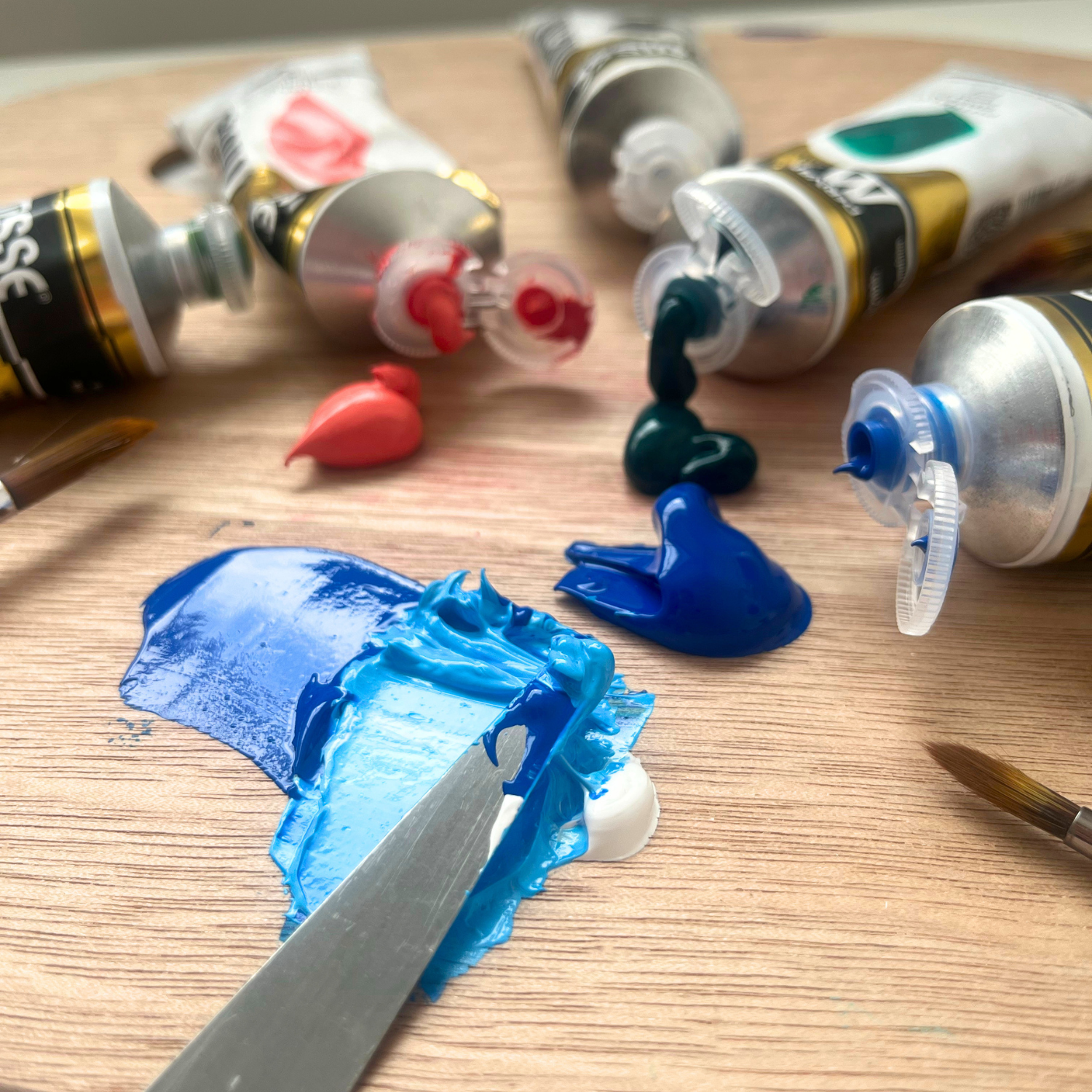
The challenge of painting in a pale, close-toned key is usually not concept but materials. Most studio palettes are assembled around saturated working colours and a single white for lightening. The problem is that mixing pure white into any saturated colour simultaneously lightens it and shifts its temperature: white cools warm colours and can make reds turn pink in ways that read as chalky or washed-out rather than luminous. Pre-mixed pastel tints solve this because each colour has already been formulated with white in the right ratio, with the right temperature bias, and with the right pigment to keep the hue clean. Naples Yellow Light stays warm. Ash Pink stays earthy. Aqua Green Light stays cool and clean. These characteristics are not accidents; they reflect deliberate formulation by Derivan's colour chemists to keep each tint behaving as it should across every mixing combination.
These two colours mix beautifully into the warm peach and salmon tones that are foundational for skin, sunlit walls, sunset clouds, and coral. Adjust the ratio to push between buttery cream and dusty rose. This is one of the most useful mixes in portrait and figurative painting.
Combining the earthy rose of Ash Pink with Permanent Light Violet produces a range of dusty mauves and soft lavenders. These are the colours of dried lavender, old roses, and the distant hills on a hazy day. A deeply versatile mix for floral, landscape, and decorative painting.
This mix captures the blue-violet of an overcast Australian sky or the colour of shadows in a snowy landscape. It is an atmospheric tone that recedes convincingly in landscape backgrounds and gives aerial perspective in distant passages of a painting.
These two cool pastels blend into the pale turquoise of shallow reef water and the blue-green of a sunlit bay. The resulting tones sit between sky blue and aqua, exactly the range needed for coastal water, swimming pools, and the shallows where sand shows through the tide.
Adding Naples Yellow Light to Aqua Green Light pushes the cool turquoise toward soft mint and pale sage-green. This is a surprisingly delicate and versatile tone for foliage in high light, glazed ceramic-style colour, and decorative botanical work.
- Pre-formulated tints are more consistent and cleaner than mixing saturated colour with white, and maintain the correct hue temperature in every mix
- Opaque, heavy-body consistency provides full coverage even in pale tones, without the transparency that can result from heavily diluted paint
- ASTM I lightfastness on four of the five colours; Permanent Light Violet is rated ASTM II, appropriate for indoor display and general studio use
- Versatile in all directions — these colours work equally as the dominant palette for a pastel-key painting, or as tinting additions to a more saturated palette
- Made in Australia by Derivan, Chipping Norton NSW, since the 1960s
Matisse Structure Formula is Australia's definitive heavy-body acrylic paint, produced by Derivan at their Sydney facility in Chipping Norton. Derivan has been manufacturing professional artist colours in Australia since the 1960s, making them the country's longest-running domestic art paint producer. The Structure Formula range spans over 100 colours across a full tonal range, including both full-chroma studio colours and the pre-tinted specialty colours found in the Australian Colours, Design, and pastel-toned segments of the range. Matisse Structure is used in art schools, universities, and professional studios across Australia and internationally.
What is a pastel colour in acrylic paint and how is it different from a regular colour?
In acrylic paint, a pastel colour is one that has been pre-mixed with white pigment during manufacture so that the final colour sits at the pale, high-key end of its hue. Unlike a saturated colour that has been diluted with water (which produces a transparent, washy result) or mixed with pure white on the palette (which can produce a chalky or temperature-shifted result), a pre-formulated pastel retains opacity, consistent coverage, and a clean hue temperature across every application. The five colours in the Perfect Pastels set are all formulated this way: each contains titanium white (PW6) as a core ingredient, blended with the appropriate chromatic pigments to achieve the correct pale tone. They behave like standard heavy-body acrylic paint in every other respect, with the same consistency, compatibility, and application properties as the rest of the Matisse Structure range.
Can I use these colours to make my own custom pastel tints from other colours in my palette?
Yes, and this is one of the most practical uses of the set. Rather than reaching for Titanium White every time you want to lighten a colour, adding one of these pre-tinted pastels will lighten the mix while simultaneously adding a specific hue direction. For example, adding Naples Yellow Light to a yellow ochre or burnt sienna lifts and warms it without the cooling effect pure white can introduce. Adding Ash Pink to a red or orange mix softens it into the earthy coral range while keeping the warm character of the hue. Aqua Green Light added to a phthalo or teal produces a clean, pale turquoise without the greenish muddying that can occur when mixing dark cool colours with white. These techniques are particularly useful when building light passages, highlights, and atmospheric passages in landscapes, where maintaining hue temperature across tonal changes is critical to the final reading of light in the painting.
Why is Permanent Light Violet rated ASTM II instead of ASTM I?
The ASTM II lightfastness rating on Permanent Light Violet reflects the properties of the dioxazine violet pigment (PV23) it contains. Dioxazine violet in its full-strength, saturated form is rated ASTM I; however, when diluted or tinted with white as it is in Permanent Light Violet, the violet pigment is present in lower concentration and the resulting tint is more susceptible to fading over long periods of direct light exposure. This is a characteristic of many violet and transparent pigments when used in tints. ASTM II is still considered a very good permanency rating and is appropriate for paintings displayed indoors and away from direct, prolonged sunlight. For work intended for outdoor display, conservation-grade storage, or very long archival life, it is worth noting this distinction. The other four colours in the set are rated ASTM I.
Do I need Titanium White alongside this set?
For a pure pastel-key limited-palette painting, you can work with these five colours alone without adding Titanium White. The colours are already tinted and will mix in the pale, close-toned range without requiring additional white. However, if you want to extend the tonal range below what the pastels provide, or if you want to push any colour toward its very lightest possible tint, adding Titanium White separately is recommended. Titanium White is available individually in Matisse Structure 75ml and larger sizes. The Perfect Pastels set pairs particularly well with a small amount of Titanium White for the very lightest highlights, and with one or two deep colours such as Dioxazine Violet or Phthalo Green for dramatic value contrast within a pale-key composition.
What painting styles work best with a pastel palette like this?
Pastel-key palettes suit any painting style that prioritises atmospheric light, tonal subtlety, or a soft, romantic mood. The Romantic and Impressionist traditions used pale tonal ranges extensively, with artists such as Turner, Monet, Renoir, and Boucher all working in high-key palettes for their most celebrated works. In contemporary practice, pastel palettes are widely used in portraiture (especially for skin tones in high-key lighting), botanical and floral illustration, coastal and landscape painting where light is the primary subject, and decorative work where a quiet, harmonious colour range is desired. The set is also well-suited to beginners who want to explore colour mixing in a forgiving tonal range, since pale, close-toned colours are less likely to produce the muddy, overworked results that can frustrate students working with saturated primaries for the first time.
(1PMSFU05PP)
| SKU | 1PMSFU05PP |
| Barcode # | 9310097008676 |
| Brand | Matisse |
| Shipping Weight | 0.6550kg |
| Shipping Width | 0.190m |
| Shipping Height | 0.040m |
| Shipping Length | 0.200m |
| Shipping Cubic | 0.001520000m3 |
Others Also Bought
More From This Category