





How to Mix Iconic Australian Colours: A Paint Recipe Guide
Author: Sarsha Kent Date Posted:17 August 2026
You know when the colour in your reference is right there, you can literally see it, and somehow every colour you mix looks completely wrong?
You add blue. Too blue.
Add white. Now it's baby blue.
A bit of yellow. Suddenly you've made mint green.
At some point you're six colours deep, the palette is getting suspiciously brown, and you're questioning everything you thought you knew about colour theory. We've been there.
Colour mixing sounds simple, red plus blue equals purple, right? At least until you're trying to match the dusty green of a gum leaf, that bright Whitsundays turquoise, or the exact rusty red of the outback. So we're making it easier.
What's in this guide: eight recognisably Australian colours, broken into simple starting recipes with mixing ratios, what each ingredient is doing, and, most importantly, how to tell what to adjust when yours doesn't look quite right.
Memorising a recipe is useful. Learning how to look at a colour and work out why your mix is wrong is even better. Grab a palette, pull up a reference photo, and let's mix our way around Australia.
|
Jump to a section: Uluru Red / Outback Red Dirt |
|
Quick Answer: Why do Australia's colours need their own formulas? Because a colour straight from the tube rarely matches the real thing. Uluru's red comes from rusted iron in the rock, not a bright cadmium red. The Whitsundays' blue is lifted by sunlight through shallow water over pale sand, not a deep ocean blue. Below are formulas built specifically for these places and icons. |
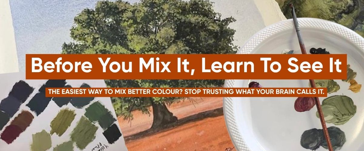
Look Twice: Your Brain Is Guessing Before You've Even Picked Up a Brush
Before you mix a single colour, there's a step that gets skipped more than any other: actually looking.
Your brain loves a shortcut. Show it an apple and it'll shout "red" before you've properly looked. Show it a black cat and it'll shout "black." The trouble is, your brain is answering from memory, not from what's actually in front of you.
Look closer at that apple and the red might lean purple, especially in the shadows. Look closer at that black cat sitting in the sun and the "black" often reads as a deep, dark blue.
This isn't a trick reserved for tricky subjects. It happens with every colour, every time, because naming something is faster than studying it.
The fix: pause before you mix. Ask what colour you're actually seeing, not what colour the object is "supposed" to be. Once you're really looking instead of labeling, the mixing gets a lot easier, because you're matching what's in front of you, not what's in your memory.
.png)
Before We Start: Stop Trying to Name the Colour
Looking properly is step one. Step two is what to do with what you see, because naming a colour and describing a colour are two different skills.
Here's the trap: you look at a gum tree, think "green," and grab the greenest green on your palette. You look at the ocean, think "blue," and suddenly you're mixing primary-school blue paint. Neither one matches what's actually in front of you.
The fix: stop naming the colour and start breaking it down. Ask yourself:
Warm or cool? Does the green lean more yellow, or more blue? Does the red lean orange, purple, or brown?
Bright or muted?
A Whitsundays turquoise can be beautifully saturated. A gum leaf usually isn't. If your mix looks fluorescent next to your reference, you probably don't need a different colour at all. You likely just need to mute the one you've already got.
Then ask one more question, and this one matters most: is it light or dark?
That's your value, and getting value right matters more than getting hue exactly right. A blue that's slightly too warm or cool can still read as convincing. A value that's dramatically off never will, no matter how close the hue is.
|
The Art Shed Black-and-White Trick Mix your colour and paint a small swatch beside your reference. Photograph both together, then switch the image to black and white on your phone. Without colour to distract you, it's much easier to see whether your mix is too light or too dark. If your reference reads as dark grey and your swatch looks almost white, you've found the problem. Fix the value first, then switch the colour back on and fine-tune hue and saturation. Your phone camera just became a colour-theory tool. You're welcome. |
Read Our Full Colour Theory Guide
.png)
A Quick Colour-Mixing Cheat Sheet
You'll see us use a handful of the same fixes throughout these recipes. Here's your cheat sheet.
| If your mix looks... | Try this |
| Too bright or artificial | Add a tiny amount of the complementary colour to knock back the saturation |
| Too bright or artificial (still glowing?) | Add a touch of Burnt Sienna or Burnt Umber to mute it further |
| Too blue | Warm it with a touch of yellow, ochre, orange, or an earthy red |
| Too green | Add a touch of red, magenta, or Burnt Sienna |
| Too purple | Warm it with a touch of yellow, ochre, or a warm red |
| Too warm | Cool it with a touch of blue |
| Too dark | Add white, gradually |
| Too pale or chalky | You've added too much white. Remake a stronger version of the original mix and add that back in, rather than trying to rescue it with five more colours |
And when we say a tiny amount, we mean tiny. Colour theory has a habit of going from "nothing's happening" to "well, that's completely green now" in about half a brushstroke.
|
Want the Colour Without the Mixing? Shop our Aussie collection for every paint in this guide, or grab a Matisse Australian Colours Set and let the palette come pre-sorted. Prefer to keep it local? Our Australian-Made Paints collection has you covered. Shop Aussie Collection · Shop Matisse Australian Sets · Shop Australian-Made Paints |
Uluru Red / Outback Red Dirt
|
|
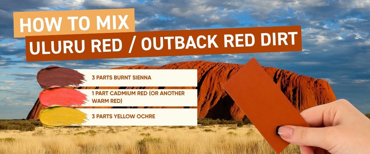
Uluru Red 3 : 3 : 1, Yellow Ochre / Burnt Sienna / Cadmium Red Approximate colour reference · screen calibration may vary |
To mix Uluru Red, combine 3 parts Yellow Ochre, 3 parts Burnt Sienna, and 1 part warm red such as Cadmium Red. The result is a dusty, earthy terracotta, not a true red.
Starting recipe
3 parts Yellow Ochre
3 parts Burnt Sienna
1 part Cadmium Red (or another warm red)
Mix the Yellow Ochre and Burnt Sienna first, you'll already have a warm, rusty terracotta. Then slowly introduce the red until the colour feels richer, without tipping into bright or cherry-red territory.
What colour is the outback, really?
The key word is earthy. If you're working from a reference photo, don't just ask whether the dirt is red. Ask what kind of red it is: orange-red or brown-red? Dusty or clean? Muted or saturated? Catching direct sun, or in shadow? The Red Centre is almost always less saturated than a red straight from the tube. If your mix immediately screams "red," you've likely gone too far.
Why does my Uluru Red look too bright?
Add more Yellow Ochre or Burnt Sienna. You're pulling the colour back into the earth, not flattening it into mud.
Why does my Uluru Red look too brown?
Add a small amount more of your warm red to bring the vibrancy back.
Why does my Uluru Red look too orange?
Add a touch more Burnt Sienna to shift it toward red-brown, or, depending on your range, the tiniest hint of a cooler red.
How do you adjust Uluru Red for different light?
Midday light is flatter and dustier, so try 4 parts Yellow Ochre, 2 parts Burnt Sienna, 1 part warm red and 1 to 2 parts Titanium White. Sunset light is warmer and more saturated, so head the opposite way: reduce the white and increase the Burnt Sienna and red.
And remember, your reference wins. There's no single official "Uluru Red" waiting to be discovered. Light changes everything.
Shop Yellow Ochre · Shop Burnt Sienna · Shop Reds
How to Mix Whitsundays Blue
|
|
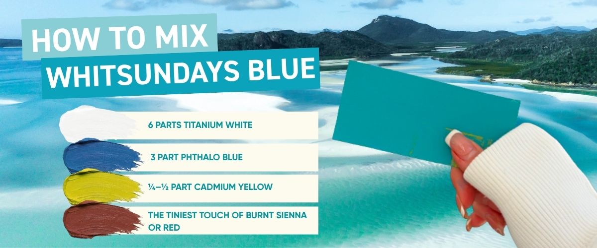
Whitsundays Blue 6 : 2 : ¼ to ½, Titanium White / Phthalo Blue / Cadmium Yellow Approximate colour reference · screen calibration may vary |
To mix Whitsundays Blue, combine 6 parts Titanium White with 2 parts Phthalo Blue, then add just ¼ to ½ part Cadmium Yellow. The yellow is the secret step: it shifts the blue toward a bright turquoise instead of leaving you with a flat, generic ocean blue.
Starting recipe
6 parts Titanium White
2 parts Phthalo Blue
¼ to ½ part Cadmium Yellow
Yes, that's a lot of white. And yes, adding yellow to make blue feels wrong. Trust the process: start with the white and Phthalo Blue, then add the smallest touch of yellow.
How do I know if I've got Whitsundays Blue right?
Hold your mix beside your reference. It should feel bright, clean and tropical, not pale baby blue. If it looks pastel and powdery, you've likely got enough white but not enough saturation. Add a touch more Phthalo Blue and reassess.
Why does my Whitsundays Blue look too pale?
Add a little more Phthalo Blue. If the hue still feels too cool, add another tiny touch of yellow.
Why does my Whitsundays Blue look too green?
You've added too much yellow. Rather than fixing the whole batch, pull a portion aside and add more Phthalo Blue to that.
Why does my Whitsundays Blue look too dark?
Add more Titanium White.
Why does my Whitsundays Blue look bright but unnatural?
Check its value against your reference using the black-and-white phone trick. What feels like a hue problem is often actually a value problem.
How do you paint depth into ocean water?
Don't mix one blue for the whole ocean. Build three variations:
shallow water (8 parts Titanium White, 2 parts Phthalo Blue, tiny touch of yellow),
mid-water turquoise (5 parts white, 2 parts Phthalo Blue, tiny touch of yellow),
and deeper water (2 to 3 parts white, 2 parts Phthalo Blue, tiny touch of yellow). That's depth before you've even touched the canvas. Don't be afraid if they look too contrasted, it's usually better to have too much contrast than not enough.
.jpg)
How to Mix Gum Tree / Eucalyptus Green
|
|
Gum Tree Green 3 : 2 : ½, Yellow Ochre / Ultramarine Blue / Burnt Sienna Approximate colour reference · screen calibration may vary |
To mix eucalyptus green, combine 3 parts Yellow Ochre and 2 parts Ultramarine Blue, then soften with ½ part Burnt Sienna. The Burnt Sienna is what stops the green from looking fluorescent against real bushland.
Starting recipe
3 parts Yellow Ochre
2 parts Ultramarine Blue
½ part Burnt Sienna
Start with the ochre and blue. You'll get an olive-like green, then use the Burnt Sienna to soften it.
How do you identify eucalyptus green?
Try not to think "green." Instead, look for: Blue, is there a cool, grey-blue quality?
Yellow, is it warmer and more olive? Grey, how muted is it? Value, is the foliage catching light or sitting in shadow? Most gum trees contain several greens rather than one.
Build a small family: sunlit gum green (4 parts Yellow Ochre, 2 parts Ultramarine Blue, ½ part Burnt Sienna, 1 to 2 parts Titanium White), mid-tone gum green (3 parts Yellow Ochre, 2 parts Ultramarine Blue, ½ part Burnt Sienna), and cool shadow green (2 parts Yellow Ochre, 3 parts Ultramarine Blue, ½ part Burnt Sienna).
Why does my gum green look too bright?
Add the smallest amount of Burnt Sienna. Because reddish-orange sits opposite blue-green on the colour wheel, it reduces saturation without simply darkening the mix.
Why does my gum green look too brown?
You've muted it too far. Add back a little of your blue-and-ochre mixture.
Why does my gum green look too yellow?
Add Ultramarine Blue.
Why does my gum green look too cold or blue?
Bring Yellow Ochre back in.
What about the bark?
Start with Yellow Ochre and Titanium White for the warm cream sections, then experiment with small amounts of Burnt Sienna, Ultramarine, and muted pink-grey for the rest. The closer you look at gum bark, the less "brown" it actually is.
|
Art Shed Tip Don't judge your mix while it's sitting in a wet pile on your palette. Brush out a small swatch, hold it beside your reference, and step back. A colour can look completely wrong surrounded by twelve others on your palette and look perfect the moment it's next to the reference it was mixed for. Then run the black-and-white phone check before you touch the colour again. |
Explore Ultramarine Blue & Yellow Ochre
.jpg)
How to Mix Jacaranda Purple
|
|
Jacaranda Purple 2 : 1 : ½, Titanium White / Ultramarine Blue / Quinacridone Magenta Approximate colour reference · screen calibration may vary |
To mix jacaranda purple, combine 2 parts Quinacridone Magenta with 1 part Ultramarine Blue. For lighter blossom tones, add 2 to 4 parts Titanium White. Which red and blue you use matters more than the ratio: the wrong warm, orange-leaning red will neutralise the mix into a dull brown instead of a bright violet.
Starting recipe
2 parts Titanium White
1 part Ultramarine Blue
½ part Quinacridone Magenta (or a cool red / crimson)
tiny touch of Dioxazine Purple (if you have it, optional)
How do you read jacaranda purple?
Check whether your reference leans pink-purple (increase the Magenta), blue-violet (increase the Ultramarine), soft lavender (add white), or muted shadow purple (neutralise slightly rather than adding black).
Why does my jacaranda purple look muddy?
Check the red you've used first. A warm, orange-leaning red is usually the culprit. Start a fresh test with a cooler red like Quinacridone Magenta rather than trying to rescue the muddy batch.
Why does my jacaranda purple look too blue?
Add more Magenta.
Why does my jacaranda purple look too pink?
Add more Ultramarine.
Why does my lavender look too pastel and chalky?
You've added too much white. Mix a stronger batch of your original purple and blend that back in gradually.
One more thing: don't paint an entire jacaranda tree with one purple. Use several values: lighter blossoms feel like they're sitting forward, while deeper violet shadows recede into the canopy.
Explore Quinacridone Magenta & Ultramarine Blue
How to Mix Golden Wattle Yellow
|
|
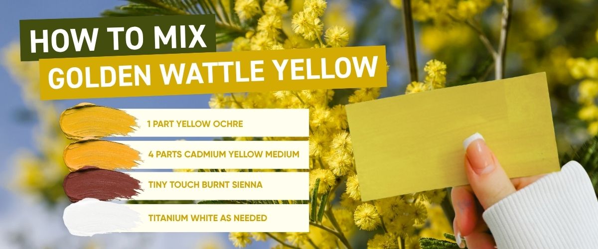
Golden Wattle Yellow 4 : 1 : ¼, Cadmium Yellow / Yellow Ochre / Burnt Sienna Approximate colour reference · screen calibration may vary |
To mix Golden Wattle yellow, combine 4 parts Cadmium Yellow with 1 part Yellow Ochre and ¼ part Burnt Sienna. This gives a warm, golden yellow rather than a fluorescent lemon.
Starting recipe
4 parts Cadmium Yellow
1 part Yellow Ochre
¼ part Burnt Sienna
For an earthier version: 3 parts Yellow Ochre, 1 part Cadmium Yellow, tiny touch of Burnt Sienna.
Why does my Golden Wattle yellow look too bright?
Add Yellow Ochre first. If it still needs warming and muting, add the tiniest touch of Burnt Sienna.
Why does my Golden Wattle yellow look too orange?
Bring more Cadmium Yellow back into the mix.
Why does my Golden Wattle yellow look too brown?
You've gone too hard on the Burnt Sienna. Mix a fresh batch of yellow and ochre and add that back in.
Short on time? Boom Gel Golden Wattle Yellow gives you an Australian-inspired golden yellow already mixed and ready to use. We're all for learning colour theory, and equally all for taking the easy win sometimes.
Shop Boom Gel Golden Wattle Yellow
How to Mix Bondi Beach Blue
|
|
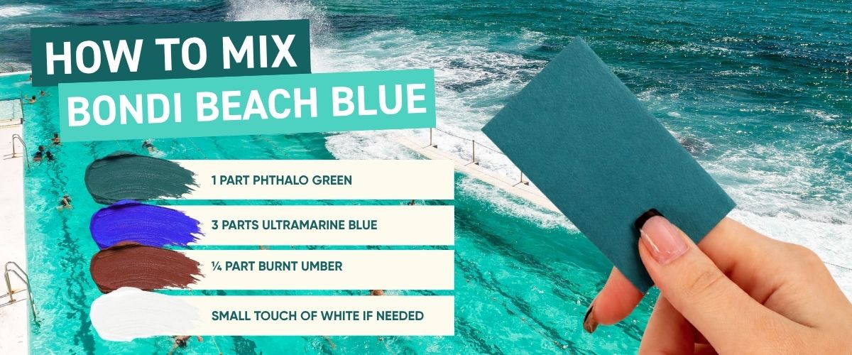
Bondi Beach Blue 3 : 1 : ¼, Ultramarine Blue / Phthalo Green / Burnt Umber Approximate colour reference · screen calibration may vary |
To mix Bondi Beach Blue, combine 3 parts Ultramarine Blue with 1 part Phthalo Green and ¼ part Burnt Umber. This creates a deeper, moodier ocean blue than Whitsundays Blue, closer to the colour Bondi takes on under real Sydney light.
Starting recipe
3 parts Ultramarine Blue
1 part Phthalo Green
¼ part Burnt Umber
(For brighter sections) 1 to 3 parts Titanium White as needed
Why Burnt Umber instead of black?
Black flattens an ocean colour fast. Burnt Umber deepens and neutralises the blue-green while letting the mix keep more complexity.
Why does my Bondi Blue look too turquoise?
Add more Ultramarine Blue.
Why does my Bondi Blue look too purple-blue?
Add a little more Phthalo Green.
Why does my Bondi Blue look too bright?
Add another tiny amount of Burnt Umber.
Why has my Bondi Blue turned to grey sludge?
You've neutralised it too far. Mix a fresh batch of Ultramarine and Phthalo Green and blend that back in, rather than adding more Burnt Umber to the sludge.
Check your actual reference photo, too. Bondi under cloud cover looks dramatically different to Bondi in harsh afternoon sun. This isn't really about learning one "Bondi Blue." It's about learning to look at blue water and understand what's actually in front of you.
Explore Ultramarine Blue & Burnt Umber
How to Mix Blue Mountains Haze
|
|
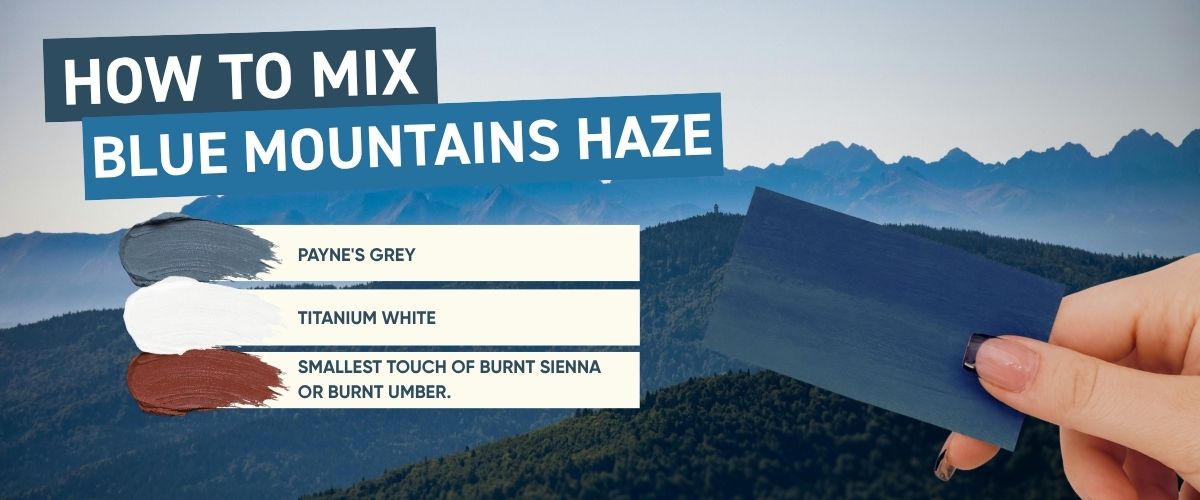
Blue Mountains Haze 1 : 4 : ¼, Ultramarine Blue / Titanium White / Burnt Sienna Approximate colour reference · screen calibration may vary |
To mix Blue Mountains haze, combine 1 part Ultramarine Blue with 4 parts Titanium White and ¼ part Burnt Sienna. The Burnt Sienna neutralises the blue into the soft blue-grey associated with distant landscape, and this principle applies to almost any landscape painting, not just this one.
Starting recipe
1 part Ultramarine Blue
4 parts Titanium White
¼ part Burnt Sienna
What is atmospheric perspective?
Things further away generally appear lighter, cooler, less saturated, lower in contrast, and less detailed.
How do you paint distance into a landscape?
Mix three mountain colours and layer them one behind another: foreground range (2 parts Ultramarine, 3 parts Titanium White, tiny touch of Burnt Sienna), middle range (1 part Ultramarine, 4 parts Titanium White, tiny touch of Burnt Sienna), and distant range (1 part Ultramarine, 6 to 8 parts Titanium White, slightly more Burnt Sienna to soften the saturation).
Paint those three shapes one behind the other and a flat canvas can suddenly feel kilometres deep.
Why does my distant mountain look like it's jumping forward?
It's probably too dark, too saturated, or both. Add white and soften the colour.
Why has my distant mountain disappeared completely?
You've pushed the value too light. Bring in a slightly stronger blue mixture. This is another good moment for the black-and-white phone test. Your distant range should sit much closer in value to the sky than your foreground does.
Explore Ultramarine Blue & Burnt Sienna
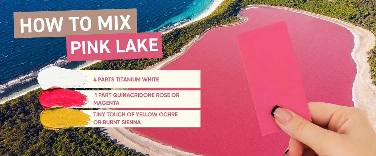
How to Mix Australian Pink Lake Pink
|
|
Pink Lake Pink 1 : 5 to 8, Quinacridone Rose or Magenta / Titanium White Approximate colour reference · screen calibration may vary |
To mix pink lake colour, combine 1 part Quinacridone Rose or Magenta with 5 to 8 parts Titanium White, then adjust to match your reference photo. It's worth checking your reference carefully. Australia's pink lakes don't all look pink anymore.
Starting recipe
1 part Quinacridone Rose or Magenta
5 to 8 parts Titanium White
Why does my pink lake colour look too purple?
Warm it slightly. A tiny amount of warm red can help, depending on your palette.
Why does my pink lake colour look too hot pink?
Add more white first. If the saturation still feels too strong, neutralise it very carefully.
Why does my pink lake colour look too pale?
Don't add a large amount of magenta straight into the pale mix. Make a stronger pink separately and introduce it gradually. You'll have far more control.
Explore Quinacridone Rose paints

FAQ
How do you mix Uluru red?
A warm ochre-red base from Yellow Ochre and a red oxide like Burnt Sienna, pushed warmer with a touch of Cadmium Red.
How do you mix Whitsundays blue?
Phthalo Blue with a small amount of Cadmium Yellow and Titanium White. The yellow shifts it toward turquoise.
How do you mix Great Barrier Reef turquoise?
Phthalo Blue with a touch of Phthalo Green or Viridian and white, slightly cooler and deeper than a Whitsundays mix.
How do you mix gum tree green?
Ultramarine Blue and Yellow Ochre, muted with a touch of Burnt Sienna or red. Straight blue-and-yellow green looks synthetic against real foliage.
How do you mix jacaranda purple?
A cool-toned red such as Quinacridone Magenta with Ultramarine Blue, lightened with white for paler blossom tones.
What colour is golden wattle?
A muted, medium golden-yellow rather than a pure bright yellow. Mix Yellow Ochre with a touch of Burnt Sienna to get it right.
Why is Uluru red?
Iron oxide in the rock's surface has rusted over time; the original rock underneath is grey, confirmed via Parks Australia.
Is Lake Hillier still pink?
Not consistently. Several of WA's pink lakes, including Lake Hillier, have recently turned blue-grey due to rainfall and changing salinity.

Final Thoughts
You've got a photo saved somewhere: the Uluru sunset, the gum tree outside your window, that Whitsundays shot where you're still not entirely convinced the water was real. Pick one.
Look at it properly first. Not just "that's red" or "that's blue." Actually break it down the way we've talked about. Then mix the starting recipe, paint a swatch, and hold it up beside your reference.
If it's wrong, adjust it. If it's still wrong, adjust it again. That's not failure, that's the process.
And if your first attempt is genuinely horrific? Congratulations, you've just taken part in the ancient artistic tradition of mixing a colour, staring at it, and wondering how on earth it turned brown. Try again. It happens to everyone, every time.
Colour theory is learned on the palette, not by memorising a chart. These recipes will get you started. Your eyes will get you the rest of the way.
Shop the Colours of Australia · Discover more from Aussie August
Stuck on a mix? Bring your reference and your palette into Art Shed, or send us a photo. We'll happily nerd out over it with you.
.jpg)