


Abstract Acrylic Painting Tutorial
Author: Dana McGorlick-Appelman Date Posted:17 March 2022
Wondering how to create an abstract painting using acrylic paints? Keep reading!
For this tutorial, we’re going to be drawing inspiration from the abstract expressionist movement, creating a bold and dimensional abstract piece that’s focusing on the power and interplay of colours and expressive gestural brushstrokes.
Abstract Expressionism is a movement that emerged during the 1940s and 50s in New York City. It is characterised as art that is abstract but expressive, and emotional in its effect, both for artist and viewer.
The movement is not known for a single cohesive style, but rather the interest in the use of abstraction to express emotion and feeling, with the process of art-making more important than the final result. Abstract expressionist paintings are often large scale works that absorb the viewer, and allow emotion to be projected by the artist.
Abstract expressionism relates chiefly to gestural, action, and colour field abstract painting, however also abstract sculptures and drawings, and is characterised by unconventional techniques.
Action painting
Action painting is a gestural and somewhat spontaneous form of abstract expressionism, where the artist's hand and movement is highly evident. It is characterised by the use of a large-scale canvas and impulsive action, often using large brushes and palette knives to sweep, splash, splat and push paint around the piece.
Examples of action painting include Jackson Pollock’s drip paintings, which were created by pouring paint out of a can or using a brush to dance, drip and pour paint onto a canvas that was placed on the ground. Joan Mitchell used similar splashing or dripping techniques with sharp movements of her wrist, elbow or shoulder to move paint around her large-scale canvases.
Materials
The early abstract expressionists worked primarily with oil paints, but we’re going to be working with acrylics today.
Acrylics are great for abstract work as they dry significantly faster than oils. Working with thick oil paints in the textured way that we’ll be using paint can take weeks or even months to dry, so acrylics will allow us to focus on the composition and expressive nature of the piece.
You can opt for a heavier bodied paint and go straight from the palette to the canvas, or you can add an acrylic medium.
You’ll also need a canvas, a palette, palette knives, and some abstract expressions brushes.
We used Art Shed’s Abstract Expressionism Kit for this painting, which includes a 16 x 20” canvas, impasto, 24 acrylic paints, plastic palette knives and a 50mm Taklon abstract expression paintbrush.
Many abstract expressionists wouldn’t just stick to paints but involved the use of pastels and charcoal for alternative textures and colours. You can choose to include these, but for the purposes of today's exercise, we’re going to be focusing on using acrylics and creating loose and dynamic movements with the paint.
The process
The best part about creating your own Abstract Expressionist style action painting is that the application and techniques of paint and colour are entirely up to you! The beauty of the style lies in its impulsivity and expressive, gestural nature, meaning no two works will be the same.
As this style of painting is focusing on the process and action of artmaking, we’ll be building up the work in expressive layers. This process of painting in layers is similar to how one of arguably the most iconic abstract expressionists created his work, Willem De Kooning. Willem worked primarily with oils and built his paintings up over multiple sessions, constantly adding and editing his works. His pieces would sometimes take years to create.
What we’re aiming to create is a piece that is somewhat considered yet mostly spontaneous, but contemplative for the viewer in the final result.
When it comes to choosing your colours, opt for colours that speak to you. They might represent colours found in nature, or you might choose colours that symbolise an emotion or feeling.
While we’re going into the work with a semblance of a plan, it’s really important to allow flexibility in the process and allow for true moments of expression.
- I began by covering the canvas with a base colour to help reduce the stark whiteness of the canvas. I used a variety of reds and yellows, along with titanium white to create a peachy tone.
- Using a palette knife, I applied the background colour roughly in random areas across the canvas and used the paintbrush to smooth out the paint and cover the canvas. I also wanted to mark out the areas that I want to focus on in future layers using titanium white. This is a loose way of planning the piece, yet still allowing moments of spontaneity to occur.
- Once this has dried, I then created an orange shade and mixed this with impasto medium, and then applied the paint in very thick strokes of acrylic paint that has been mixed with impasto, going in the areas that we previously marked out with titanium white. The impasto medium adds a lot of dimension to your work and really makes the layers of colour pop.
TIP: When marking out your composition, it’s nice to think about the rule of thirds. I like to create a large, organic swipe of colour that takes up two-thirds of the composition, and then a smaller swipe that takes up a rough third on the opposite side of the canvas.
- I then went in with the Taklon brush to smooth out some areas of the orange in random areas to create a variety of textures.
TIP: Feel free to experiment with different techniques, such as scratching and swiping to create unique textures. You can also remove any areas of colour you don’t like while the paint is still wet using water and a paper towel if you don’t like the composition. This can also create a nice foggy effect.
- Once this previous layer has dried, I then added in random areas of a light grey mixed with impasto that creates contrast with the other tones in the piece. This adds a bit more visual interest.
- Once the grey dried, I then mixed a nice deep blue shade to add more contrast. I created reference swatches prior to painting that really help test colours and composition before adding paint to the canvas.
- I then added a large area of the blue, as well as smaller areas on the canvas to help balance the composition.
- Once the blue has dried, I made a lighter peachy shade. For this, I used yellow, white, and adding some orange to create a light yellow, and adding it to areas of the canvas. I also diluted the colour with water to create a light wash over the areas of negative space of the canvas to create a foggy effect. If you’re not happy with how it looks, remember you can use paper towel and water to wipe up some of the paint while its wet.
- I also experiment with using my fingers to create organic shapes and smooth out areas of colour
- I felt like the piece needed lightening up, so I mixed some titanium white with impasto to add some expressive gestures over some darker areas of colour to bring the piece forward.
- I then created a soft pink colour using crimson, yellow ochre and titanium white and applied it with our Taklon brush and paper towel to lighten up more areas of the canvas.
- I then went in with some of our grey colour and added another area for visual interest, as well as using palette knives to create texture by scratching away at some areas of paint
- I decided to play around with another technique, diluting our titanium white with water and using our paintbrush and palette knife to drip and splash colour onto the canvas. Some of the drops are a bit big for my liking, so I used paper towel to diffuse the drops.
TIP: It’s important to always step back from your work and consider how the colours and composition are working together. You can also use your phone to photograph the piece and look at it from a flat perspective.
- After looking at the piece, I decided that the bottom right corner needs a bit more balance, so I added more titanium white and used the Taklon brush to fog out the area.
- After more consideration, I also realised it needs a stronger focal point, so I took a red shade and used my fingers and a Taklon brush to build up more areas.
- I also added a darker shade to create more contrast in some areas.
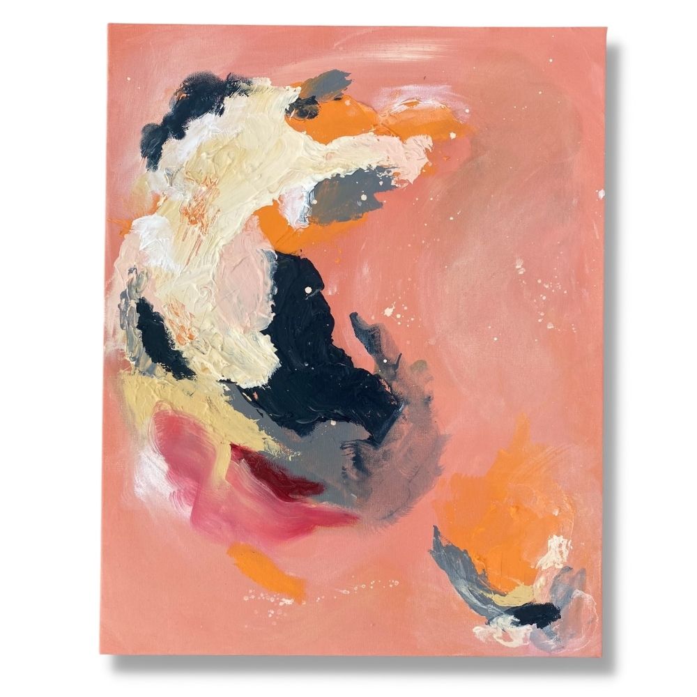
And voila! We have our very own abstract acrylic artwork.
Don’t forget that abstract painting is all about experimenting, so feel free to have fun and trial new techniques and materials.
Don't forget to show us your art by tagging us on Instagram @artshedonline for your chance to be featured!
Got questions? Send us an email at customerservice@artshedonline.com.au and our friendly team of artists will do their best to assist you.
Have fun, and happy creating!