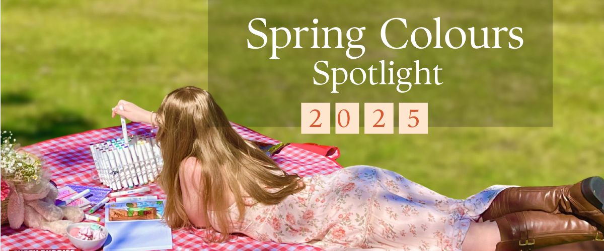
Spring 2025 Colour Trends: How to Bring Them Into Your Art
Author: The Art Shed Team Date Posted:1 September 2025
Butter yellow, blush pink, baby blue, lavender, herb green, and bold fuchsia, these aren’t just cute colour names, they’re the backbone of 2025’s biggest aesthetic shift. If you’re an artist, DIY-er, décor junkie, or just spring-cleaning your soul, you’ll want to meet your new palette besties.
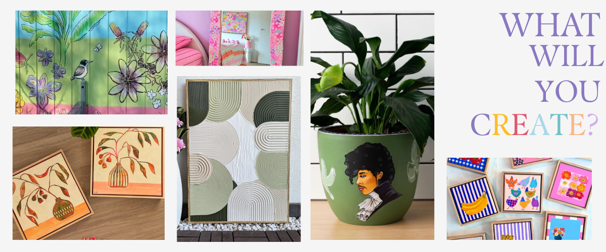
Spring 2025 is all about soft energy meets bold self-expression, think dopamine decor, painterly gallery walls, pastel maximalism, and calming colour therapy. These trending hues are dominating everything from interior design moodboards to TikTok art tutorials, and lucky for you, they’re insanely fun to paint with.
At Art Shed, we don’t just follow colour trends, we break them down into brush-ready palettes and turn your inspo into art you can hang, wear, or gift. Whether you’re painting a wall panel, curating a pastel pop gallery wall, or making spring clay earrings, we’ve loaded this guide with:
The top 6 spring colours of 2025 (and why they’re everywhere)
Real artist tips and combo hacks
Room + trend-inspired projects (that aren’t “just paint a pot”)
Top paint brands & tools to try now
Shed FAQs to answer the things everyone’s Googling
Meet the Spring 2025 Colour Crew
This season’s palette is full of modern pastels and bold accents that play nice with neutrals and still pack personality. Each shade below is versatile enough to use across acrylics, watercolours, pastels, clay, or mixed media.
Let’s go shade by shade—with tips, tricks, and what to pair them with.
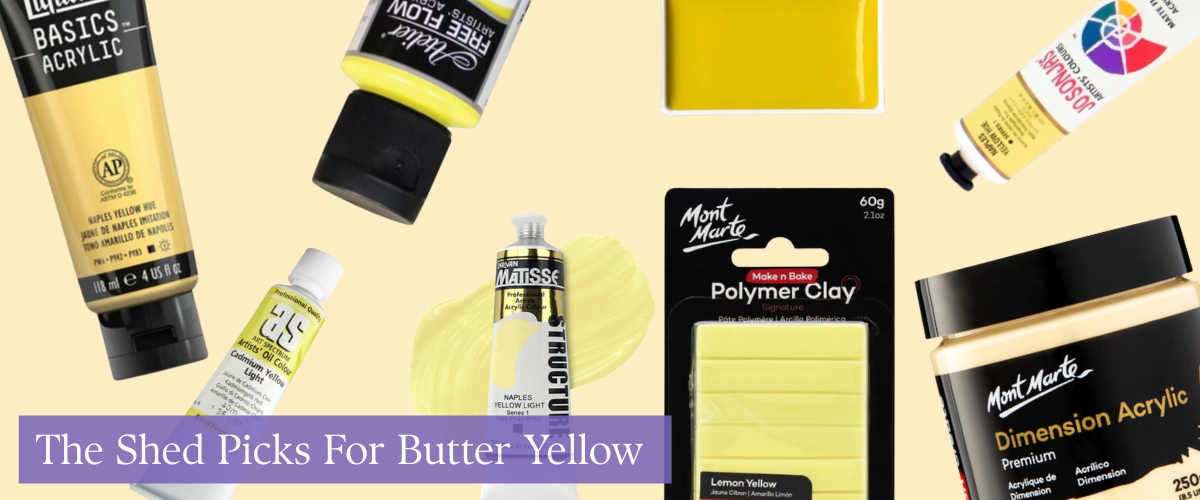
Butter Yellow
Buttery yellows bring warmth without being loud, and they’re set to replace stark whites and greys in 2025 interiors.
Try it with:
Jo Sonja Acrylic Paint 75ml S1 – Naples Yellow Hue
Art Spectrum Oil 40ml S4 – Cadmium Yellow Light
Mont Marte Dimension Acrylic Paint 250ml Pot – Naples Yellow
Liquitex Basics Acrylic Paint 118ml – Naples Yellow
Atelier Free Flow 60ml S3 – Arylamide Yellow Light
Matisse Structure Acrylic 75ml S1 – Naples Yellow Light
Mont Marte Make N Bake Polymer Clay 60g – Lemon Yellow
Kuretake Gansai Tambi Watercolour Pan – Cadmium Yellow
Tips From The Shed:
Use butter yellow backgrounds in still life and portrait work to soften harsh shadows.
Try a tone-on-tone moment with creamy oat or camel in sketchbooks or wall art.
Paint the back of canvases or frames yellow to add a subtle glow to white walls.
Elevate a boring tote with yellow clay pins and fabric markers.
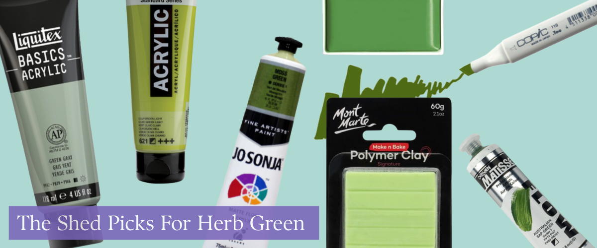
Herb Green
Soft sage, dill, and olive tones are giving “calm, curated, and maybe I own a mortar and pestle.” They’re grounded, clean, and the fastest way to make your work look modern.
Try it with:
Amsterdam Acrylic Paint 120ml Tube – Olive Green Light
Jo Sonja Acrylic Paint 75ml S1 – Moss Green
Copic Original Art Marker – YG99 Marine Green
Matisse Flow Acrylic 75ml S3 – Australian Sap Green
Kuretake Gansai Tambi Watercolour Pan – Ivy Green
Liquitex Basics Acrylic Paint 118ml – Green Grey
Mont Marte Make N Bake Polymer Clay 60g – Pastel Green
Tips From The Shed:
Use herb green as your base layer wash in landscape work, it’s the new neutral.
Mix sage with lavender or blush for that earthy-but-elevated girlcore vibe.
Sketch urban nature scenes, think plant shops, community gardens, sun-dappled balconies.
Clay trend alert: Sculpt chunky earrings or trinket dishes in herb green, then glaze with gold.
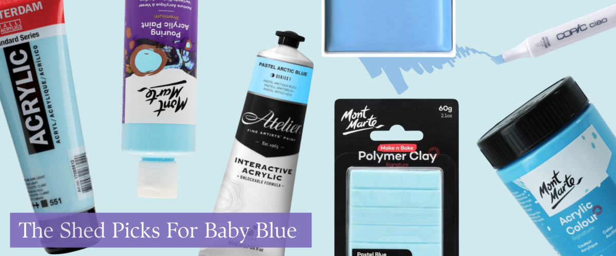
Baby Blue
Soft, airy, and surprisingly versatile. Baby blue is making waves in minimalist palettes, coastal vibes, and modern nostalgic art.
Try it with:
Amsterdam Acrylic Paint 120ml Tube – Sky Blue Light
Atelier Interactive Acrylic Paint 80ml S1 – Pastel Arctic Blue
Mont Marte Signature Acrylic Paint 300ml Pot – Sky Blue
Copic Ciao Art Marker – B23 Phthalo Blue
Mont Marte Acrylic Pouring Paint 240ml Bottle – Light Blue
Kuretake Gansai Tambi Watercolour Pan – Horizon Blue
Mont Marte Make N Bake Polymer Clay 60g – Pastel Blue
Tips From The Shed:
Use for negative space, baby blue backgrounds help warm tones pop.
Paint or draw digital-core elements like clouds, cursors, or stylised windows.
Try wet-on-wet techniques with watercolours, perfect for dreamy skies and oceans.
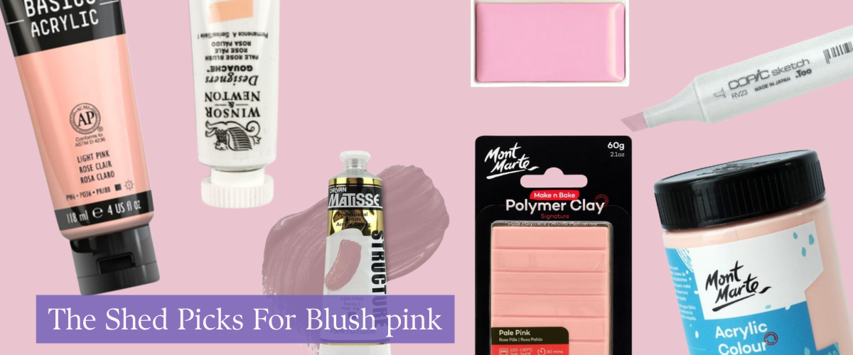
Blush Pink
Still trending, still stunning, blush pink is gentle, nostalgic, and oddly powerful when paired with deeper tones.
Try it with:
Liquitex Basics Acrylic Paint 118ml – Light Pink
Winsor & Newton Designers' Gouache Colour 14ml S1 – Pale Rose Blush
Mont Marte Signature Acrylic Paint 300ml Pot – Yellow Pink
Matisse Structure Acrylic 75ml S2 – Ash Pink
Kuretake Gansai Tambi Watercolour Pan – Pale Pink
Copic Sketch Art Marker – RV23 Pure Pink
Tips From The Shed:
Use blush in duo-tone artwork, try pink + clay, pink + sage, pink + rust.
Add blush pink to typography prints for that Pinterest-meets-gallery-wall look.
Paint abstract line art florals on linen or canvas, frame with oak or birch.
Sculpt Korean-inspired bubble candle holders from blush pink polymer clay.
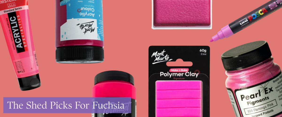
Fuchsia Pink
Loud, proud, and no longer trapped in the 2010s. Fuchsia is now used in intentional pops across art and interiors, hello, dopamine décor.
Try it with:
Amsterdam Acrylic Paint 120ml Tube – Reflex Rose
Mont Marte Signature Acrylic Paint 300ml Pot – Magenta
Mont Marte Kids Poster Paint 500ml – Pink
Permaset Aqua Screen Printing Ink 300ml Standard – Glow Pink
Kuretake Gansai Tambi Watercolour Pan – Gem Pink
Mont Marte Make N Bake Polymer Clay 60g – Fluoro Pink
Pearl Ex Pigment 14g – Flamingo Pink
Uni Ball Posca Pen Medium Bullet Tip 2.5mm PC-5M – Pink
Tips From The Shed:
Use fuchsia to highlight negative space or as a final top-layer detail.
Balance with lavender or butter yellow to keep it punchy, not jarring.
Paint on clothing, totes, aprons, jeans, with fuchsia accents for festival season.
Collage trend: cut bold organic shapes in fuchsia-toned papers and layer over pastel backgrounds for DIY wall panels.
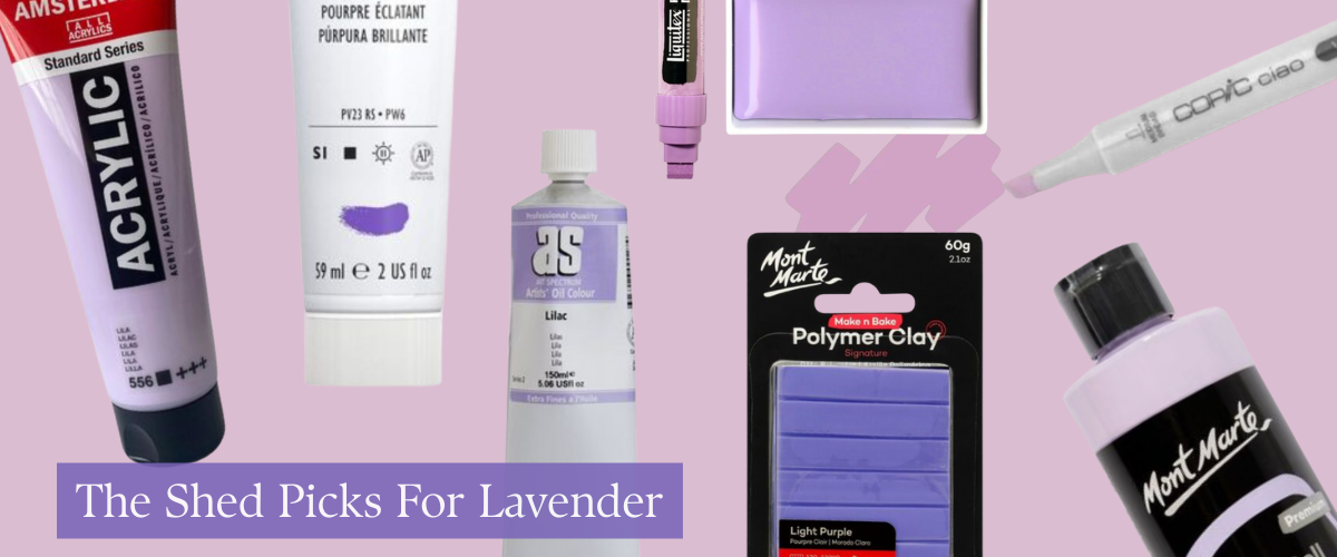
Lavender
The wellness queen of the palette. Lavender is soft, spiritual, and very 2025 in both studios and bedrooms.
Try it with:
Amsterdam Acrylic Paint 120ml Tube – Pastel Lilac
Mont Marte SuperCell Pouring Paint 240ml Bottle – Light Purple
Liquitex Heavy Body Acrylic Paint 59ml S1 – Brilliant Purple 590
Liquitex Paint Marker Wide 15mm Nib – Brilliant Purple
Mont Marte Make N Bake Polymer Clay 60g – Light Purple
Art Spectrum Oil 150ml S2 – Lilac
Copic Ciao Art Marker – V05 Azalea
Tips From The Shed:
Paint moon phases or dreamy astrology symbols with lavender and silver.
Use it in colour blocking for abstract work, it vibes with oat, sage, and blush.
DIY coasters, incense trays or candle holders in lavender clay.
Create your own art affirmation cards with calming colours and handwritten prompts.
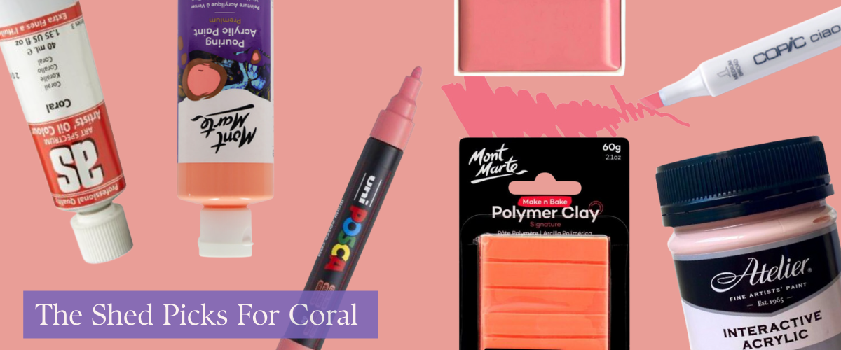
Coral
Halfway between a peach bellini and the inside of a shell, coral’s that perfect “not-too-pink, not-too-orange” hue. It’s bold without being bratty, and it’s showing up in modern coastal palettes, DIY makeovers, and sketchbooks all across Australia.
Try it with:
Mont Marte Acrylic Pouring Paint 240ml Bottle – Coral
Kuretake Gansai Tambi Watercolour Pan – Coral Pink
Copic Ciao Art Marker – R35 Coral
Mont Marte Kids Metallic Poster Paint 500ml – Metallic Coral
Mont Marte Make N Bake Polymer Clay 60g – Coral
Uni Ball Posca Pen Medium – Coral Pink
Atelier Interactive Acrylic Paint 250ml S1 – Pastel Coral
Art Spectrum Oil 40ml S3 – Coral
Tips From The Shed:
Paint your terracotta pots with coral details and pop them on a windowsill, it's giving spring herb garden glow-up.
Add coral accents in abstract works with masking tape shapes or swipey texture, it pairs beautifully with sage or blush.
Try coral polymer clay for earrings or fridge magnets, its stunning in natural light.
Use as a focal pop in collage art, gel print pulls, or over gessoed wood panels to brighten neutral rooms.
Spring Colour Theory in Action
If you’re unsure how to mix and match these hues, follow this:
Primary palette: Baby blue + butter yellow + blush
Grounded palette: Herb green + blush pink + oat
Bold girl palette: Fuchsia + coral + lavender + white
Chic palette: Lavender + sage + charcoal + gold
Digital-core palette: Baby blue + blush + millennial grey
Trend-Forward DIY Project Ideas (That Aren’t Boring)
Here are trendy, viral-worthy projects you can try with this spring palette:
Painted mirror edges – Use butter yellow or coral for a vintage-modern vibe.
DIY wall “tapestries” – Paint linen offcuts with abstract blobs and mount with wood rails.
Mixed media canvas letters – Hot glue your name in rope, paint over in pastel ombré.
Mood match jars – Paint mini jars to match your emotional palette and label them.
Painted trays – Layer fuchsia and blush in floral strokes, coat in resin for a glass-like finish.
Room-by-Room Colour Cheat Sheet
In the kitchen, warm things up with butter yellow and herb green for a fresh, earthy vibe.
The living room is your coastal escape coral, blush pink, and soft sage bring chill summer energy without the paint fumes.
For the bedroom, think calm and dreamy: lavender and blush work magic against oak or oat-toned neutrals.
Want a crisp and soft feel in the bathroom? Baby blue, white, and oat create a spa-day atmosphere.
In the studio, lean into reflective, creative tones like lavender and herb green to help ideas flow.
And for the kids’ or playroom, keep it fun and bright, fuchsia, butter yellow, and baby blue are perfect pops of joy.
Art Shed FAQs
Q: What are the trending paint colours in Australia for spring 2025?
A: Butter yellow, baby blue, blush pink, herb green, lavender, and fuchsia pink are leading the spring 2025 colour trends in Australia.
Q: What art supplies match spring 2025 trends?
A: Look for acrylics, watercolours, markers, clays and inks in pastel and punchy tones. Top brands include Mont Marte, Amsterdam, Liquitex, Matisse, and Kuretake.
Q: How do I mix a spring pastel palette?
A: Mix white into warm reds, yellows and blues—use Naples Yellow for butter tones, and Cobalt or Arctic Blue for soft sky hues.
Q: How do I use trending colours in small artworks?
A: Focus on accessories, frames, borders, layers, accents, and even backgrounds. Pastels shine best when layered.
Final Thoughts from the Shed
Trends come and go, but colour has staying power, and when used with intention, it transforms not just your art, but how you feel in your space. This spring, lean into joy, softness, and a little chaos.
Because your brush doesn’t care if you're an art school grad or a weekend doodler, it just wants to move.
Explore our full spectrum of colour on our website or better yet, come see us in-store for a cheeky swatch and a chat. We're your colour-obsessed creative crew, and we’ve got you covered.